Analyzing the Brutalist Visual Strategy of the Secret Lair x MSCHF Zeta Set
If you've ever wondered what happens when a print-art collective gets handed the keys to one of the most recognizable card catalogs in tabletop, the new Secret Lair x MSCHF drop is the case study.
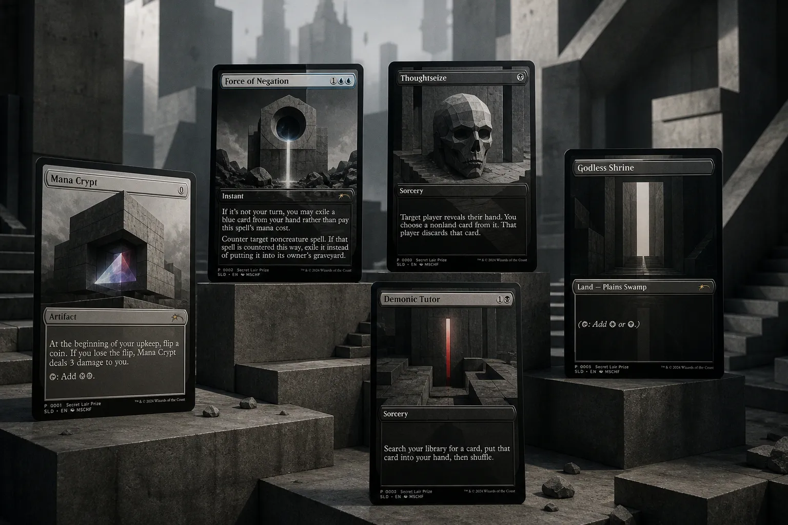
According to Bleeding Cool, Wizards of the Coast has partnered with MSCHF for The Zeta Set, a 121-card release built around photocopier aesthetics — and the art direction here is the real headline for anyone watching how TCG visuals get made.
The Art Direction, and Why It Matters for Your Portfolio
The set is art directed by Jacob Covey in partnership with MSCHF, and the brief is unusually specific: take public domain imagery and original photography from MSCHF, then run it through a photocopied visual treatment that nods to the handmade look of early Magic playtest materials. In practice, that means three distinct finishes live inside the same product — Photocopy, Photocopy Negative, and Color Banding, the last of which borrows the CMYK distortion you'd see from a misaligned office printer.
For you, the takeaway isn't the gimmick. It's that the team committed to a single visual through-line and carried it across every card in the set. When you're building a portfolio around a personal style, that's the move: one decision, executed with discipline, instead of ten ideas fighting for attention on a single piece.
How the Product Was Built Around That Look
The treatment extends past the cards themselves. Each Zeta Booster ships in a sealed envelope with a visual design from MSCHF meant to evoke the early days of Magic, and the booster contains seven randomized cards drawn from 52 cards across common, uncommon, rare, and mythic rarities. The product went on sale at 9 a.m. PT on September 2, 2026, through the Chaos Vault, priced at $19.92 — a deliberate nod to the year before Magic's official release — with a cap of twelve per customer.
That's a useful reminder that packaging, pricing, and scarcity decisions are part of the art brief too. Collectors read the envelope before they read the cards.
What to Watch Next
Two things. First, whether the Color Banding treatment — the CMYK-distorted version — gets picked up by other art directors as a reference point for "imperfection as a visual language." We've already seen grit and halftone creep into TCG illustration over the last few cycles; photocopier noise is a logical next step. Second, keep an eye on Jacob Covey's name. A credit like this, on a release this visible, is exactly the kind of line item that reshapes a commissioning art director's inbound over the next quarter.
If you're an artist building toward this kind of work, the homework is simple: pick one finish you can defend in a review, and make ten pieces that prove you can carry it. That's what this drop is doing, at scale.