Analyzing the Visual Design of Magic: The Gathering’s Newest Commander Set
Mashable reports that the first 25 cards from the upcoming Mystery Booster: Commander Edition were revealed, and they’re a goldmine for understanding how art serves chaotic, rule-breaking gameplay.
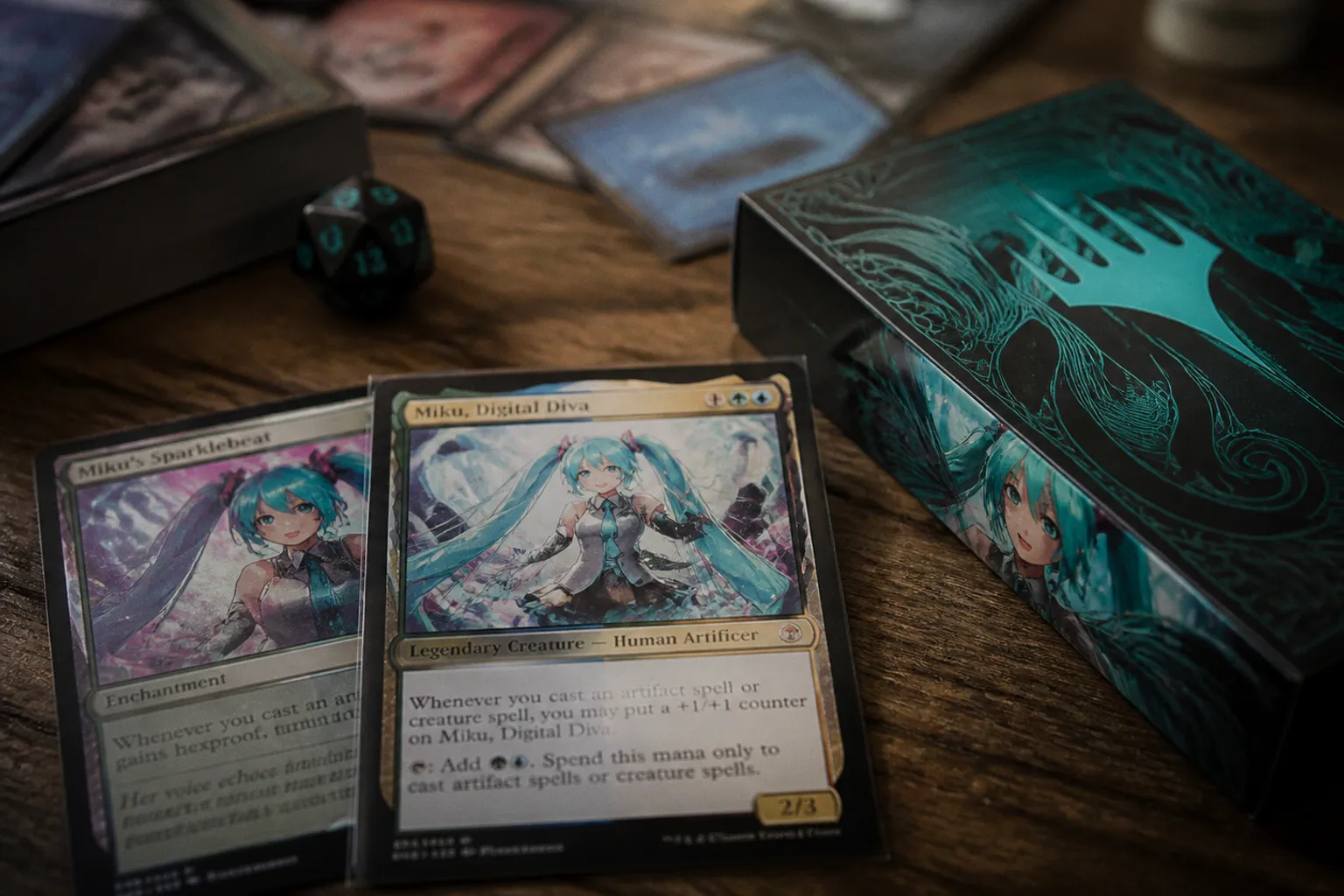
You know that moment when a new Magic set drops, and you immediately start analyzing the art direction for your own portfolio? Well, step away from your sketchbook for a second, because what Wizards of the Coast just unveiled at Gen Con isn’t just a new set—it’s a masterclass in bending the rules of visual design within a rigid system. Mashable reports that the first 25 cards from the upcoming Mystery Booster: Commander Edition were revealed, and they’re a goldmine for understanding how art serves chaotic, rule-breaking gameplay.
Rulebreaker Mechanics Demand Rulebreaker Art
The headline here is the new “Rulebreaker” keyword, which lets legendary creatures like Tsagan, Raider Warlord literally alter Commander’s deckbuilding rules. From an art director’s perspective, this is huge. When a card’s function is this unconventional, its visual identity can’t just rely on a standard fantasy silhouette. You’re not just painting a warrior; you’re painting a concept. The art needs to visually communicate that this character operates outside the established order. For your portfolio, it’s a lesson in creating figures that feel disruptive—their pose, their environment, even their color palette might need to clash intentionally to tell that mechanical story.
The Return of Future Sight Frames and What It Means for Readability
Remember the alternate frame from Future Sight? It’s back for 134 reprints in this set. As artists, we often focus on the painting itself, but this is a direct reminder that your work lives within a graphic design ecosystem. That frame changes the canvas, the placement of the text box, the available negative space. A composition that pops in a standard frame might get muddied or lose its crucial silhouette in an alternate layout. When you’re creating card art, especially with these wild layouts in mind, you have to consider how the piece reads at thumbnail size across different templates. Does your focal point survive?
A Niche for Niche Archetypes
What really excites me about this batch is that it’s designed for the weird, deep-cut deckbuilding puzzles—niche archetypes and forgotten mechanics that don’t see print in standard sets. This is where art direction gets to play. It’s not about a generic epic dragon; it’s about capturing the specific, sometimes awkward, essence of a mechanic. For aspiring illustrators in the TCG space, this is your chance to shine. Developing a portfolio piece around a hypothetical, hyper-specific brief (“a warlord who recruits from your opponent’s discard pile”) shows clients you can solve unique visual problems, not just paint cool stuff.
Keep your eyes on the full art reveals as they drop. The playtest cards, styled after internal mockups, might offer raw, unpolished inspiration, while the foil treatments will show how the same painting communicates differently under various finishes. This set is a reminder that in commercial fantasy art, your voice is most powerful when it’s in conversation with the game’s rules—even, and especially, when those rules are being broken.