Mastering Recursive Composition: Lessons from Magic: The Gathering’s Meta-Art
According to Kotaku, Magic: The Gathering's newest set features a card whose illustration depicts a graded copy of that very card — the kind of recursive brief that would make any art director stop…
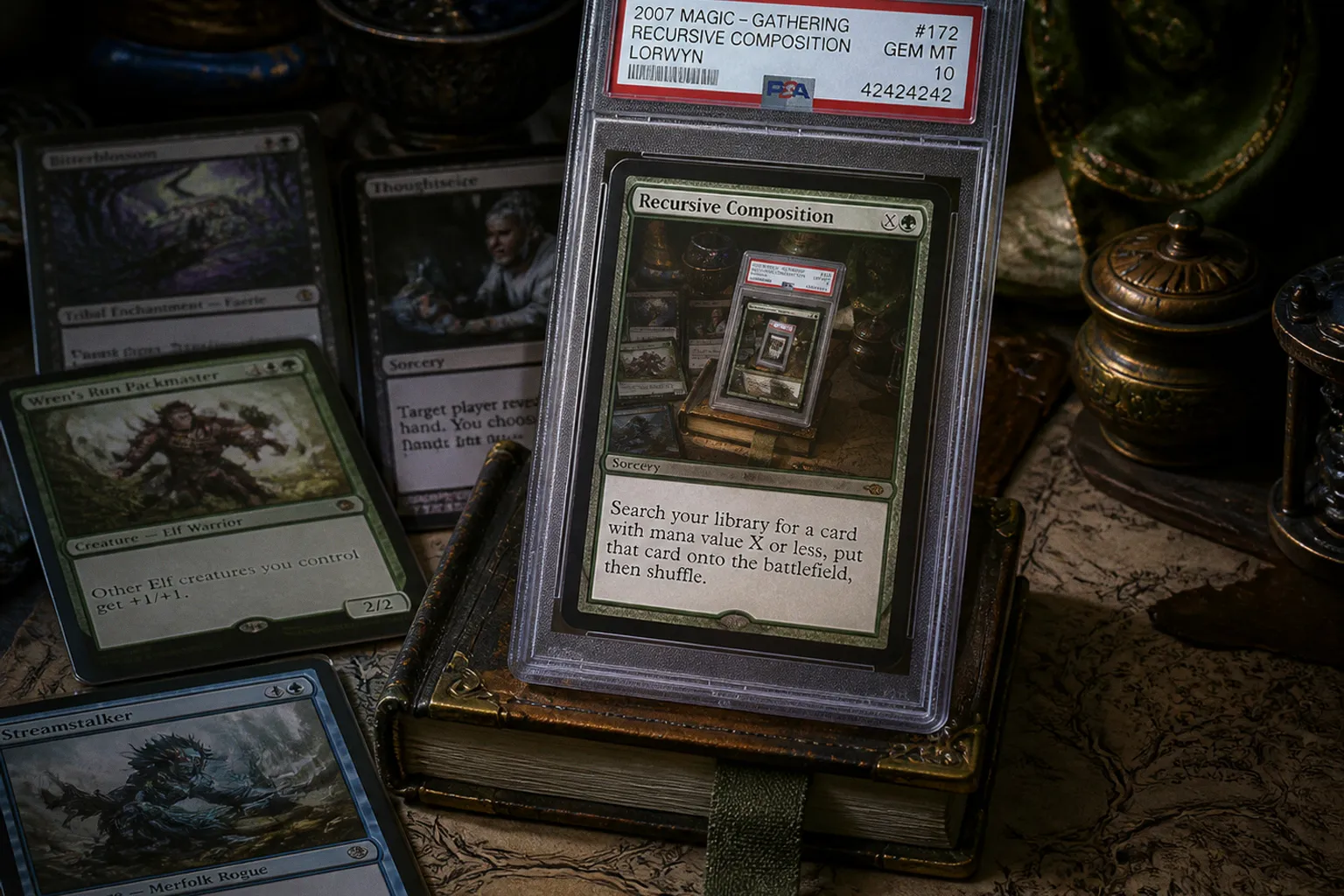
According to Kotaku, Magic: The Gathering's newest set features a card whose illustration depicts a graded copy of that very card — the kind of recursive brief that would make any art director stop mid-coffee and ask how you'd actually pull it off at card scale. If you work in TCG illustration, this is the most interesting art-direction challenge to surface in months, and the principles behind it translate directly into your portfolio.
The Composition Problem You'd Be Solving
Here's what the illustrator was handed, in plain terms. A graded card lives inside a sealed rigid holder — a clear plastic slab with a printed label running along the bottom showing the grading company, a numerical score, and a certification number. The card sits framed behind that window. So the artist wasn't just painting a card; they were painting a card framed by its own protective case, with the label legible enough to sell the gag and the original art dominant enough that the viewer registers the subject before the meta layer kicks in.
That's three readability tests stacked on top of each other. Does the slab read as a slab at thumbnail? Does the card-inside read as the focal point? Does the label read as a label, not as noise? Most portfolio pieces fail one of those at two inches across. Whoever painted this had to clear all three, and at trading-card scale that's genuinely brutal work.
For your own development, treat this as a study exercise, not a curiosity. Pick a card you already love — ideally one from your own portfolio — and paint it inside its own graded slab. Crop tight. Show the piece at three sizes in your presentation: full illustration, card-sized crop, and thumbnail. If the concept survives all three, you've built a portfolio piece that demonstrates composition discipline, not just rendering chops. That's the difference between an artist who can paint anything and an artist an art director trusts with a weird brief.
Context Worth Watching
While the Kotaku piece is making the rounds, the official Magic site has just published a long read on the "Lorwyn Five" — Ajani, Jace, Liliana, Chandra, and Garruk — the five characters who appeared on the very first planeswalker cards back when Richard Garfield was still writing about "magicians" rather than planeswalkers in the 1993 Alpha rulebook. The article traces the planeswalker concept from that first mention through Antiquities and Revised Edition and into the multiverse as players know it today, and it teases Reality Fracture preview season as about to start.
That's where I'd be spending my time as an aspiring TCG artist. Watch the official card galleries as they drop and pay attention to two things: how each illustrator handles the planeswalker frame (it's a design constraint that keeps evolving), and whether the recursive concept from the Kotaku story lands inside this set or a parallel one. Either way, the editorial direction in this space is clearly leaning into meta and self-reference in ways that simply weren't part of TCG illustration a decade ago. Your portfolio can either acknowledge that shift or quietly get left behind by it. I'd rather be the artist with three graded-card studies on their page than the one waiting for someone else to brief them on it.