Visual Hierarchy in Tabletop Games: Lessons from Miskatonic Tales
If you've ever wondered whether board game art actually gets looked at — really looked at — IGN's recent review of Miskatonic Tales: Journey to Innsmouth settles the question without trying to.
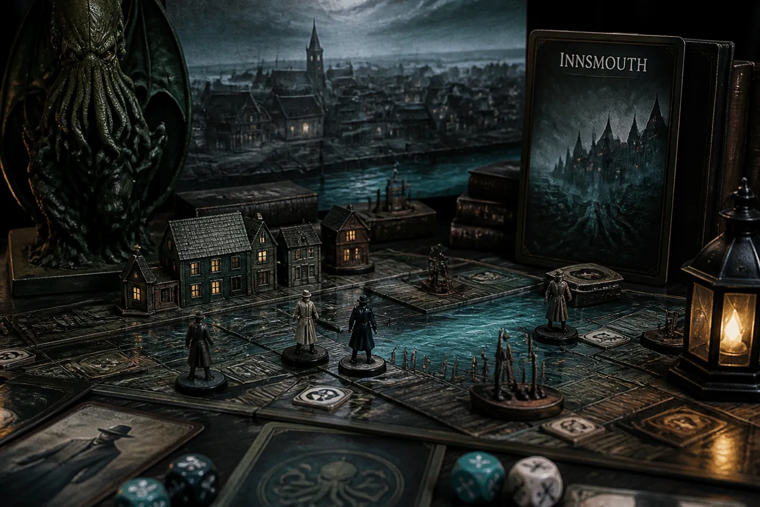
Buried inside a hands-on write-up of this Lovecraftian storytelling game sits a detail that should make every aspiring fantasy illustrator sit up straighter: the location cards carry "darkly evocative artwork," while nearly everything else in the box trades in clean, functional graphic design.
That's a signal worth parsing. Let me walk through what this game's visual hierarchy tells you about commissioning standards in the tabletop space right now.
Where the painting gets to breathe
The reviewer at IGN makes a telling distinction. The tarot-sized encounter cards, the condition cards, the skill decks — all of it is described as "purely informational, with solid graphic design that favors function over form." Then, almost as an aside, they note the square location cards are "graced with darkly evocative artwork." Same box, same budget, same art director presumably — but only one card type gets to be a painting.
If you're building a portfolio aimed at tabletop publishers, study that hierarchy. The location cards are doing atmospheric work. They sit on the table longer than encounter cards do, players reference them repeatedly across a session, and they anchor the mood of every location the party enters. That's where the art director justifies hiring an illustrator who can handle mood, value, and narrative atmosphere in a single composition — not just a competent draftsperson.
Variety of "types" is a brief, not a vibe
The second visual takeaway lives in the character boards and their punch-out standees. IGN calls out "an excellent variety of character types in every sense of the word, brought to life nicely in all their 1920s glory." That phrase — in every sense of the word — is doing heavy lifting. It means the publisher wanted range across gender, age, build, and silhouette, all filtered through period authenticity.
This is exactly the kind of brief you'll receive if you break into TCG or board game commissions. "Variety of types" isn't a polite suggestion. It's a production requirement, because the standees have to read as distinct figures at table distance, under variable lighting, often held in a player's hand at arm's length. Your sketchbook should show you can pivot between a weathered dockworker and a society dilettante within the same visual vocabulary.
Readability versus atmosphere — both, in different spots
Here's the practical lesson hiding in the review: this box contains both kinds of art, and it uses them deliberately. The informational cards get graphic-design treatment because they're read quickly, parsed for mechanical meaning, and discarded. The location cards get illustration because they're lingered over, studied, and used as scene-setting anchors.
When you're preparing portfolio pieces, ask yourself honestly where each piece belongs on that spectrum. A piece built around mood, silhouette, and a single narrative beat — that's your location-card submission. A clean, legible character turnaround with strong silhouette readability — that's your standee and character board submission. Mixing the two briefs in one image is the most common mistake I see in portfolios from artists new to the tabletop market.
What to actually do this week
Pick one finished painting from your portfolio and audit it against three questions. First: could a player identify the location's mood in under two seconds of looking at it on a cluttered table? Second: does your figure work survive a reduction to roughly two inches tall, where subtle glazing and small facial features vanish? Third: if I cropped out everything except your central silhouette, would the character still read as a distinct 1920s archetype?
If any answer is no, you now know exactly which piece to revise before your next submission round. The Lovecraftian tabletop market is crowded, yes — the IGN review itself points to Arkham Horror: The Card Game as the benchmark. But crowded means publishers are actively hiring illustrators who can hit these specific visual targets. Show them you understand the hierarchy, and your portfolio stops looking like everyone else's.