Why Illustrators Should Study the Visual Language of Torchlit
A new Tabletop Gaming review of Torchlit caught my attention this week, and not just for the gameplay.
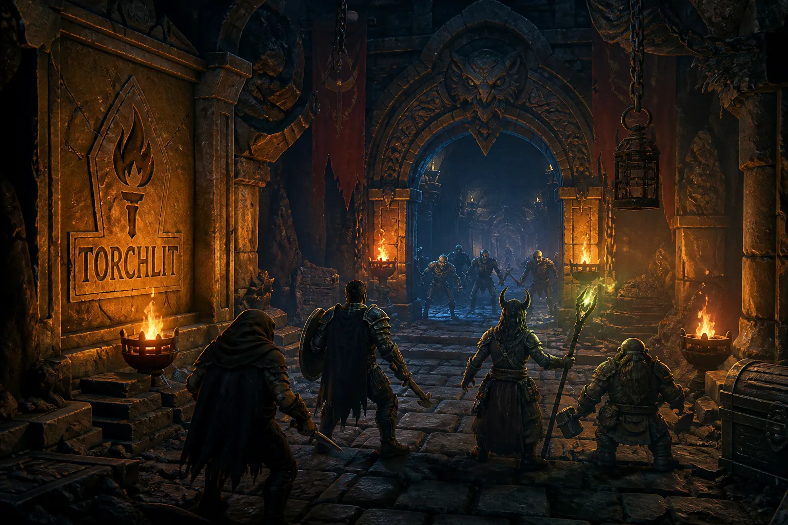
The reviewer describes the monster suits — goblins, mimics, skeletons — as "suitably nasty but beautifully illustrated," which is exactly the kind of brief any serious TCG illustrator should be studying.
What the game is doing with its art
Torchlit is a dungeon-crawling trick taker, and the Tabletop Gaming piece spells out how the art serves the mechanics at every turn. Seven dungeon doors sit in the center of the table; each round, the player holding the lowest card becomes the Torchbearer and tucks chosen creatures beneath those doors to score bonus points later. That puts a lot of visual real estate in front of players, and the reviewer's note about pacing — the game can slow down between tricks, with a roughly 40-minute playtime — actually works in the illustrator's favor. When the table is quiet, players study the card art longer. That's an opening most portfolio pieces underuse.
The review also makes clear that Torchlit builds on Skull King's classic trick-taking core, with dungeon-themed twists layered on top. For anyone pitching into established TCG lines, that is the part worth underlining. Publishers commissioning into a lineage want artists who can honor a visual grammar that already exists — same proportions, same lighting logic, same hierarchy of detail across rarities. Imitating a look you haven't studied is one thing; speaking the dialect fluently is what gets you the gig.
What this means for your portfolio
Here's where I get practical, because this is the part I nag my freelancers about every commission cycle. A game like Torchlit needs each monster suit to hold together as a family while every individual card still has its own personality — a goblin three has to feel like the same faction as a goblin ten at a glance across a crowded table. Before you worry about which single piece is your hero shot, lay three cards from the same suit side by side and ask whether they read as a set. Silhouette, palette temperature, value structure — those have to rhyme across the faction. I see too many portfolios where every creature looks like it wandered in from a different studio, and the artists almost never notice it themselves.
If you want to take this seriously, the Tabletop Gaming review is worth reading in full. The reviewer walks through the betting, the torchbearing, and the dungeon-door scoring in enough granular detail that you can reverse-engineer what the illustrator was briefed to deliver. Treat it like a free portfolio review, because that's effectively what it is — a working game showing you exactly how monster suits are expected to behave under play.