Cyberpunk illustration: a roadmap from sketch to neon glow
The technical failure in most cyberpunk images occurs before the first neon sign is painted. The perspective is weak. Buildings do not carry weight.
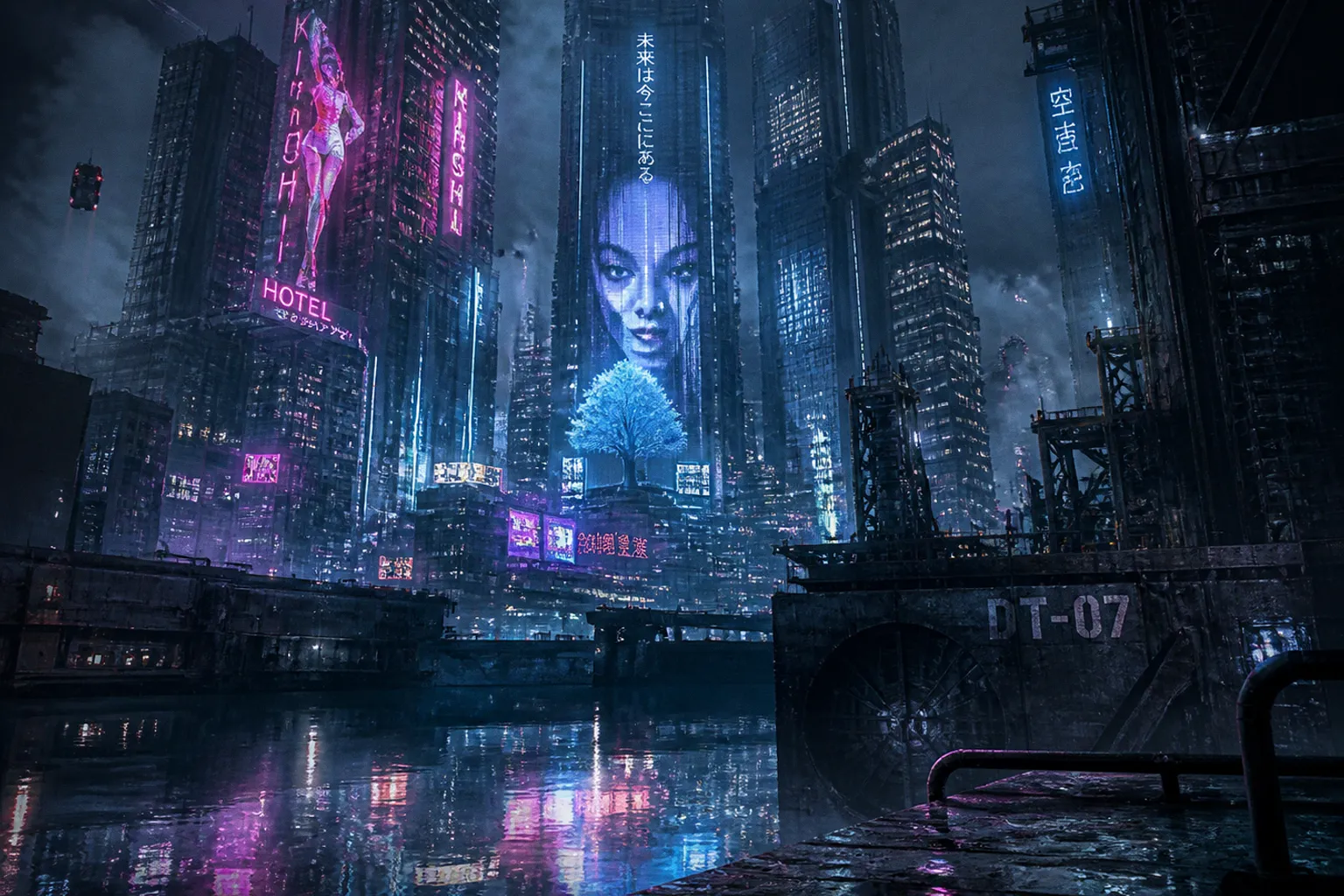
Light is applied as decoration instead of behaving as emitted energy against a constructed surface.
Cyberpunk illustration is not a palette preset. Magenta plus cyan does not produce a city. A black canvas with scattered glow brushes does not produce depth. The image needs a disciplined sequence: spatial framework, architectural mass, value hierarchy, local light, reflected light, and controlled degradation.
These cyberpunk illustration process steps are transferable across Photoshop, Clip Studio Paint, Procreate, and comparable software. The interface changes. The visual physics do not.
Start with perspective, not the skyline
A cyberpunk cityscape is usually asked to do three jobs at once: establish scale, carry a dense information load, and leave room for a figure, vehicle, or narrative focal point. Perspective is the structure that prevents those jobs from collapsing into visual noise.
Two-point perspective is the stable choice for a street-level or elevated view. Vertical edges remain vertical. The viewer can read storefronts, suspended walkways, stacked façades, and road planes without fighting the drawing. It is particularly effective when the design relies on repeated rectilinear architecture: slab towers, transit gantries, billboard frames, service ducts, and window grids.
Three-point perspective should be used with restraint. Place the third vanishing point low when the image looks upward and the city needs oppressive height. The verticals will converge. Towers become less like buildings and more like loaded columns. This is useful for a low-angle composition, but it punishes inaccurate drawing immediately. A tower that misses the perspective grid by a few pixels can appear to buckle.
Before detailing, establish four measurements:
- Horizon line. This determines the viewer’s eye level. A low horizon makes the city dominant; a high horizon exposes street geometry and traffic systems.
- Primary vanishing points. Keep them far enough apart that the architecture does not show cartoonish convergence unless distortion is intentional.
- Foreground overlap. At least one large form should interrupt the midground: a sign, a vehicle roof, a pipe bundle, a figure, or a wet awning.
- Scale reference. Small human silhouettes placed low in the frame are efficient. A 20-pixel figure beside a tower tells the eye more than another hundred windows.
The scale reference must be structurally credible. If the doorway is two storeys high, the figure cannot be painted at ordinary human scale unless the building is explicitly monumental. This is basic drafting. Cyberpunk art often conceals such errors with haze and colored light. It does not correct them.
Neon is not a substitute for perspective. It only makes a defective perspective easier to see.
The horizon controls the city’s psychological weight
For a broad establishing shot, place the horizon near the lower third and build upward in layered bands. The skyline then occupies the image as a mass rather than a backdrop. This favors science fiction book illustration and panoramic concept work.
For street scenes, lift the horizon toward the center or upper half. The road, pavement, market stalls, drainage channels, and reflected signage can then carry the eye toward the focal zone. The vertical city remains present, but it is no longer the only subject.
The mistake is to treat every building as equally important. A readable image needs a hierarchy:
1. Primary silhouette: the dominant tower cluster, corporate block, reactor stack, or transport hub.
2. Secondary architecture: bridges, terraces, signage frames, utility structures, adjacent buildings.
3. Tertiary texture: windows, vents, cables, antennae, decals, light modules, surface damage.
4. Atmospheric interruption: rain, steam, distant traffic, holographic distortion, smoke, low cloud.
Paint in that order. Reversing it is expensive. Rendering individual windows before locking the dominant masses is the digital equivalent of glazing cadmium red light over a flawed underpainting: technically active, structurally useless.
Block architecture as mass before treating it as design
A strong cyberpunk digital painting workflow begins with hard-edged value shapes. Not line art. Not brushed haze. Large planes.
Use a neutral grayscale block-in or a restrained two- or three-value study. At this stage, every building should read as a simple object under limited illumination. A high tower may be a dark trapezoid interrupted by one pale plane. A midground façade may be a compressed rectangle. The road may be a tapering wedge. The image should remain legible at thumbnail size.
A practical value arrangement is simple:
| Zone | Value role | Typical treatment |
|---|---|---|
| Foreground | Darkest or highest-contrast field | Large cropped silhouettes, wet structures, sign backs, figures |
| Midground | Main design information | Storefronts, transit lanes, architecture, primary signage |
| Background | Compressed contrast | Simplified tower blocks, haze-muted light clusters |
| Focal point | Sharpest value separation | Bright sign, face, vehicle light, doorway, figure edge |
This is not an aesthetic preference. It is an information-routing system. The eye goes first to sharp contrast, then to recognizable geometry, then to repeated detail. If every façade has equal contrast and equal saturation, the eye has nowhere to land.
Use geometric families, then break them
Cyberpunk architecture benefits from repetition, but pure repetition becomes sterile. Build forms in families:
- Long vertical slabs for institutional or corporate structures.
- Heavy horizontal bands for transit decks and elevated roads.
- Narrow projecting boxes for signage, HVAC housings, capsule apartments, and maintenance platforms.
- Cylindrical or angled interruptions for industrial systems, ducts, tanks, and antenna arrays.
- Irregular retrofits attached to the original geometry: patched shutters, cables, scaffold frames, improvised stalls, exposed conduits.
The first pass should look almost too clean. That is correct. Surface disorder belongs after the architecture has a readable load path.
A useful method is to separate the painting into functional layer groups:
1. Perspective and drawing layer. Guides, grids, measured building edges.
2. Major value masses. Flat blocks with no texture.
3. Structural detail. Windows, ledges, ducts, signage supports, street furniture.
4. Material pass. Metal, coated concrete, glass, plastic, wet asphalt, oxidized surfaces.
5. Lighting pass. Emission cores, local color, spill, haze interaction.
6. Atmospheric and correction layers. Rain, mist, smoke, grain, selective edge loss.
The grouping matters because glow layers should not be used to repair drawing layers. They should describe light falling on forms that already exist.
Material separation is where the city stops looking synthetic
Many digital city scenes fail because every plane receives the same soft brush treatment. Concrete, brushed aluminum, oily water, acrylic signage, smoked glass, and painted steel do not share the same edge behavior or reflectance.
The relevant distinction is not “detailed” versus “simple.” It is how each surface handles light.
- Matte concrete takes broad, low-intensity color shifts. Its highlight edges are broken and dry.
- Wet asphalt produces elongated, fragmented reflections that follow the street plane and surface irregularities.
- Glass carries sharper reflected shapes but loses clarity when the interior is brighter than the exterior.
- Painted metal can show crisp edge accents, especially along panels catching a grazing light.
- Translucent plastic and vinyl diffuse their own internal color. They should not read like polished chrome.
- Holographic or projected imagery needs an imperfect support: scan lines, bloom, partial transparency, occlusion by mist or objects.
Traditional painters recognize the logic immediately. An oil passage built with opaque titanium white impasto behaves differently from a thin scumble over a dark ground because the physical layer changes how light scatters. Digital rendering has no physical paint film, but it still needs equivalent separation in opacity, edge softness, and contrast.
Do not blur every distant object. Distance compresses contrast and chroma, but it does not erase perspective or material category. A distant tower can remain geometrically hard while becoming lower in contrast and less saturated.
Construct neon as a light source, not a colored outline
The usual neon mistake is simple: the artist paints a saturated pink line, adds a large blur, and calls it illumination. The result resembles colored fog. Real emissive signage has a hierarchy.
First, there is the source. Then there is the hottest core. Then the local bloom. Then the cast light on adjacent surfaces. Finally, there is the secondary bounce in rain, glass, puddles, and haze.
The core is frequently near white, not fully saturated. This is the part many images avoid because pure hue looks more dramatic in isolation. It is also less convincing. A sufficiently intense colored lamp overwhelms local color near its center. The eye reads that region as pale or white-hot, with saturation concentrated around the core and in the spill.
In Procreate, a direct manual approach is reliable: paint the sign letters or tube shapes with a white base, then surround them with a highly saturated color using a soft airbrush. The white must remain visible. If the colored halo covers it completely, the source loses temperature and becomes a sticker.
In Photoshop, Layer Styles can establish the same structure efficiently:
- Use Color Overlay for the tube or sign body.
- Add Inner Glow with a white center and Linear Dodge behavior to establish the hot core.
- Build an Outer Glow for the immediate bloom.
- Paint additional cast light manually on walls, pavement, faces, and nearby metal. Automated glow does not understand form.
In Clip Studio Paint, place the luminous drawing on a layer set to Add (Glow). Duplicate it, move the duplicate underneath, and apply Gaussian Blur. The upper layer preserves the hard source. The lower blurred layer carries the bloom. Again, the layer stack is only the start. Light must be painted onto the receiving surfaces separately.
The blur is not the light. The blur is only the light’s failure to remain optically contained.
A controlled neon sequence
Work from small, hard information to broad, soft information. This order preserves edge control.
1. Draw the sign accurately. Use a hard brush—100% hardness is appropriate for tracing the base form of letters, tubes, or panels. If the sign cannot be read before effects, the design is unresolved.
2. Place the white emission core. Keep it narrow. It should occupy less area than the colored body around it.
3. Add saturated local color. Cyan, magenta, red, acid green, amber, or violet can work. The hue must have a job in the larger palette.
4. Paint the first spill. This is short-range illumination on the sign housing, wall seams, wet metal, and nearby figures.
5. Add a restrained bloom layer. Soft, low-opacity, and localized. A screen blending layer at roughly 40% opacity can leave a subtle cast rather than burying the structure.
6. Introduce occlusion. Sign glow should be interrupted by wires, window frames, rain, awnings, smoke, and passing forms. Unbroken bloom reads as an effect layer floating above the scene.
7. Reassert selected edges. After glow, restore a few hard dark edges. This is the corrective pass most artists skip.
The final step is analogous to scraping back a wet oil passage after an overbroad glaze. Without it, the painting loses pressure.
Do not give every light the same chroma
A city illuminated entirely by cyan and magenta is graphically obvious and materially weak. Split toning is useful: bright pink or magenta highlights against rich blue or cyan shadows can establish a high-contrast, retro-futurist field. But it requires neutral intervals.
Put dirty sodium amber, desaturated green, dull white, gray-violet, and near-black between the major hues. These quieter notes allow the saturated lights to register.
A limited palette is generally more severe and more convincing than a rainbow city. Consider assigning color by function:
| Light type | Functional color direction | Use |
|---|---|---|
| Corporate signage | Magenta, cyan, cold white | Focal zones, upper façades, branded surfaces |
| Utility lighting | Amber, faded green, dull white | Service corridors, stairwells, infrastructure |
| Vehicle lamps | White, red, amber | Moving accents and directional flow |
| Holographic projection | Cyan, violet, pale blue | Volumetric interruptions, information overlays |
| Ambient shadow | Blue-cyan, blue-violet, neutral charcoal | Spatial cohesion without flattening blacks |
Color grading comes last. If it comes first, the painting becomes dependent on an adjustment layer that conceals a weak value structure.
Reflections must obey the ground plane
Wet streets are one of the most abused devices in cyberpunk art. They are often painted as vertical colored streaks beneath every sign, regardless of camera angle, road slope, traffic, or surface interruption. That is not reflection. It is decoration.
A workable digital method begins with duplication: duplicate the city layers, flip them vertically, and place the result below the skyline or street edge. This provides a correct initial relationship between light sources and their reflected counterparts. It is not the finished reflection.
The duplicate must then be broken apart. Use a small Liquify brush or equivalent distortion tool to introduce subtle horizontal ripples. The distortion should follow the surface plane. A shallow puddle produces short, interrupted fragments. A deeper, calmer channel can hold longer vertical pulls. Tire tracks, curb drainage, pavement seams, and pedestrian traffic should fracture the reflection further.
The reflection requires lower contrast than the source in most cases. It also needs contamination from the road’s local color: black asphalt, brown grit, oil film, rainwater, painted lane markings. If the reflection is as clean and saturated as the sign above it, the ground becomes a mirror. Most streets are not mirrors.
The reflection checklist is physical, not stylistic
When assessing a wet street passage, inspect these relationships:
- The reflection begins beneath or near the source’s projected position, not arbitrarily across the pavement.
- Brightness decreases as the reflected path moves away from the most favorable angle.
- Long streaks are interrupted by road texture and moving objects.
- Vertical signage produces generally vertical pulls, but the pulls can wobble and fragment horizontally.
- Dark foreground objects cut into reflections and restore depth.
- The water surface receives more than color. It receives value, shape, and spatial direction.
A simple test: temporarily desaturate the image. If the wet street still directs the eye toward the focal point, the reflection is doing structural work. If it becomes a meaningless gray blur, it was merely color noise.
Control atmospheric depth without hiding the drawing
Cyberpunk imagery often uses rain, steam, vapor, screen noise, and dense urban haze. These are useful only when subordinate to the depth plan.
Atmosphere reduces contrast with distance. It can also shift color. A far building may move toward the ambient blue-cyan field, while a near sign remains high in contrast and locally saturated. But haze should not be applied as a uniform translucent veil. It accumulates by spatial layer and is affected by light sources.
Think in three atmospheric zones:
Foreground: hard interruption
The foreground should contain the strongest edge variation. Use cropped silhouettes, dark cables, close rain streaks, sign backs, railings, or the partial form of a vehicle. These elements act as a physical lens through which the viewer sees the city.
Keep the most opaque darks here, but do not seal every area into black. A foreground with no internal value information becomes a cutout.
Midground: readable design
This is the working zone. Architecture, figures, storefronts, traffic, and main signage belong here. It receives the clearest combination of hard and soft edges.
The main character or vehicle silhouette should usually sit against a value field that allows immediate separation. A dark figure against a pale sign, or a light helmet edge against a dark doorway, is sufficient. There is no need to trace the entire figure with neon rim light. That practice destroys silhouette economy.
Background: compressed evidence
Distant towers should merge selectively. Let rooflines, antennae, and occasional high-value signs survive. Suppress window detail. Reduce local contrast. Push saturation toward the ambient field, except where a major light source is designed to puncture the distance.
This is where many sci-fi city concept art steps become inefficient. Artists render thousands of background windows and then cover them with fog. The correct procedure is the reverse: decide what distance permits, then render only that amount.
The final pass is subtraction
At the end of a cyberpunk illustration, the instinct is to add: more rain, more cables, more signage, more bloom, more particles, more texture overlays. This is the wrong instinct in most cases.
The final pass should remove.
Remove repeated window patterns that compete with the focal area. Reduce glow around secondary signs. Darken empty zones until they function as rest. Sharpen only the edges that define the image’s visual route. Desaturate colors that are not carrying hierarchy. Break up reflections that look too clean.
A useful final inspection proceeds in this order:
1. View the image at thumbnail size. The focal point, city mass, and scale reference must remain legible.
2. View it in grayscale. The value structure must survive without magenta and cyan doing the work.
3. Turn off glow and adjustment layers. The architectural drawing must still stand.
4. Turn them back on and inspect where light hits physical surfaces. Every major source should affect something beyond itself.
5. Zoom to 100%. Correct repetitive brushes, cloned texture artifacts, and mechanically uniform rain.
6. Step back. If the image is louder but less readable than before the correction, subtract again.
The standard is not “more cyberpunk.” The standard is spatial authority. Perspective holds the city together. Value assigns importance. Material behavior prevents generic surfaces. Neon follows a hierarchy from core to spill to reflection. Atmosphere compresses distance without dissolving construction.
That is the verdict: a convincing cyberpunk illustration is built as a hard-edged architectural painting first. The neon arrives late, performs its specific task, and is never allowed to hide the evidence.