Dieselpunk concept art: from reference to final render
A dieselpunk image fails long before the final render. It fails when the artist treats riveted steel, painted timber, oxidised bronze, and soot-black glass as a collection of surface decorations. The result is a clean 3D room with pipes pasted onto it.
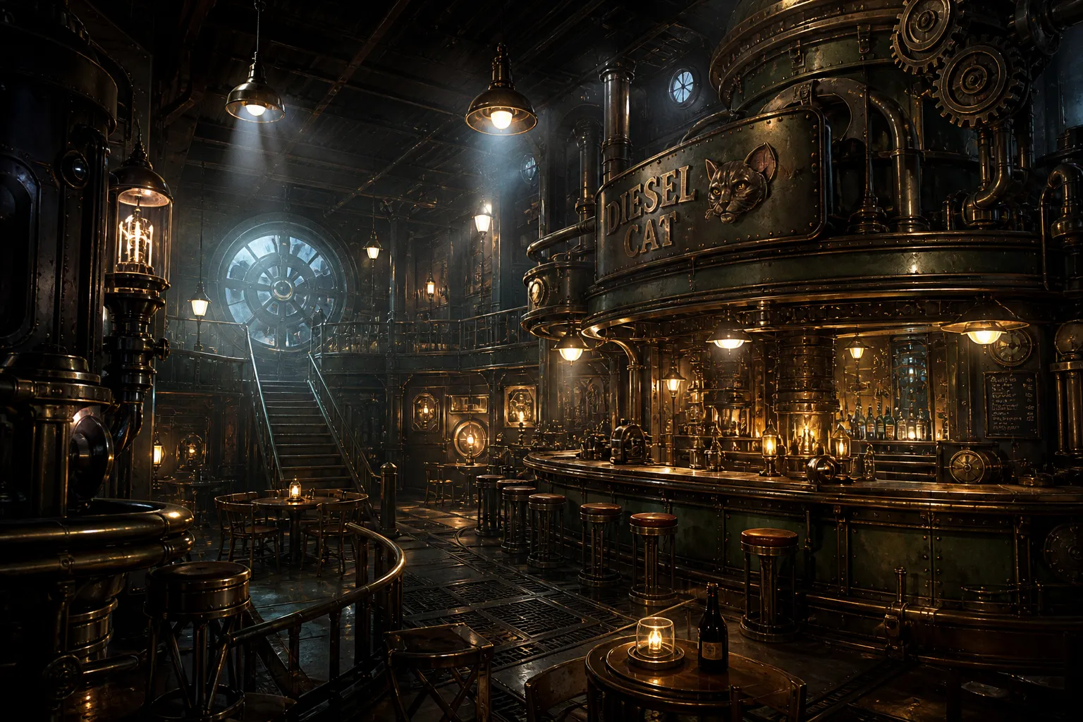
No weight. No thermal history. No hierarchy of materials.
A functional dieselpunk concept art workflow begins with constraint. The visual language draws from industrial technology of roughly the 1910s through the 1950s: pressed steel, vacuum tubes, mechanical gauges, engine-turned panels, cast brackets, heavy conduits, lacquered wood, and riveted seams. Those references are raw evidence, not a mood board to be sampled at random.
The objective is not merely to produce a retro-futuristic scene. It is to construct an image whose forms, light, wear, and compositional pressure all point in the same direction.
Dieselpunk is not “old machinery plus grime.” It is a controlled system of mass, heat, fuel, and repair.
Establish the industrial language before opening Blender
The first stage of a dieselpunk concept art workflow is reference sorting. Not collecting. Sorting.
A folder full of locomotives, bomber cockpits, radio cabinets, naval engine rooms, Art Deco cinemas, and 1940s diners has little value until it is divided according to function. An aircraft instrument panel answers a different design problem from a boiler hatch. A brass valve does not weather like a painted steel bulkhead. A decorative chrome strip does not carry the same visual load as a structural girder.
The artist should separate references into four working groups:
1. Structural mass: walls, decks, columns, hull plates, gantries, stair towers, suspended platforms. These establish scale and load-bearing logic.
2. Mechanical function: compressors, generators, cable runs, vents, tanks, switchgear, gauges, pulleys, exhausts. These explain what the space does.
3. Human contact surfaces: rails, doors, controls, chairs, counters, signage, floor paths. These determine where wear accumulates.
4. Finish and ageing evidence: paint failure, oil streaking, galvanic corrosion, smoke staining, polished edges, dust shelves, heat-discoloured metal.
Without this separation, the concept turns into indiscriminate visual noise. Every wall acquires pipes. Every pipe acquires rust. Every rust patch receives the same orange overlay. That is not material rendering. It is digital upholstery.
A coherent interior benefits from a restricted material rule. One useful arrangement is a dominant painted metal, a secondary wood or dark composite surface, and a limited accent such as bronze or brass. The proportions matter. If bronze appears on every hinge, pipe, trim piece, and instrument bezel, it stops operating as an accent. Its refractive behaviour becomes a visual alarm.
| Material role | Practical use in the scene | Surface treatment | Common failure |
|---|---|---|---|
| Dominant material | Bulkheads, cabinets, structural frames | Desaturated painted steel, chipped selectively at contact points | Uniform “rust texture” across every panel |
| Secondary material | Countertops, seating, wall inserts, control housings | Wood brown, dark rubber, oxidised composite | Too much clean wood; the scene becomes a tavern |
| Accent material | Bezels, handles, valve bodies, decorative inlays | Bronze, brass, dull nickel, limited polished edges | Gold-coloured trim scattered everywhere |
| Heat or fuel evidence | Exhaust zones, engine casings, vents | Soot, oil bloom, heat staining, dust interruption | Black airbrush fog with no source |
The design rule should be visible even in a greyscale blockout. Colour is not allowed to rescue weak hierarchy.
For exterior work, the same principle applies at larger scale. A five- or six-storey dieselpunk building needs an intelligible vertical system: base mass, access points, service zones, upper-level machinery, roofline silhouette. A stack of unrelated balconies and pipes is not architecture. It is an inventory.
Curves are particularly useful. Dieselpunk forms rarely benefit from uninterrupted 90-degree transitions. Curved cowls, chamfered doors, rounded vents, convex tanks, and arched supports interrupt the sterile orthogonality of default 3D construction. The curve must have a mechanical reason: pressure containment, access clearance, stamped production, airflow, or human movement. Ornament without load or function should be treated with suspicion.
Build the blockout as a compositional instrument
The 3D foundation is not there to finish the image. It is there to solve the expensive errors early: perspective, scale, silhouette, light direction, and spatial rhythm.
Begin with primitive masses. Cubes, cylinders, planes. No bolts. No trim sheets. No decals. At this stage, the correct question is not, “Does this look dieselpunk?” It is, “Does the silhouette survive at thumbnail size?”
The camera should be placed before detailed modeling begins. This is routinely neglected. Artists build an environment from a free-flying viewport, then attempt to find a frame inside it. That reverses the process. Concept art is a controlled view, not a navigable level.
Set the following in the first blockout pass:
- Primary viewing angle: eye level, low-angle industrial monumentality, overhead survey, or compressed corridor perspective.
- Horizon position: high horizons expose floor logic; low horizons amplify vertical machinery and suspended forms.
- Primary silhouette interruption: a gantry, chimney, vehicle nose, central bar, engine housing, or elevated walkway.
- Foreground obstruction: a rail, pipe cluster, hanging cable, control console, or shadowed machinery mass. This creates depth without filling the frame with debris.
- Human scale cue: door heights, rail dimensions, chair spacing, stair rises, windows, or a controlled crowd grouping.
Rule-of-thirds placement remains useful, not because it is sacred, but because it forces an early decision about the focal zone. In a pub interior, for example, the counter, the largest light source, and the densest human grouping should not occupy the geometric centre by default. Slight displacement produces tension and creates room for a secondary reading path.
Complex hard-surface work benefits from Blender tools that reduce repetitive modifier management. BoxCutter and Hard Ops are useful where boolean cuts, bevel control, mirrors, arrays, and edge treatments must remain editable. Group Pro can accelerate the placement of repeated assemblies: lamps, vent units, stools, switch boxes, wall modules. The principle is simple. Do not model a complex engine-room wall from one cube and then manually carve every feature into it. Build a small grammar of parts.
A productive blockout hierarchy may look like this:
1. Main architecture: floor, ceiling, walls, large openings, structural bays.
2. Mid-scale function: stairs, catwalks, tanks, exhausts, ducts, counter structures, vehicle bodies.
3. Repeated systems: valves, cable trays, lights, support brackets, chairs, screens.
4. Scale clutter: bottles, paperwork, tools, ashtrays, small gauges, signage, loose cabling.
The fourth tier remains absent until the first three tiers work. Tiny detail has a narcotic effect. It can make an unresolved composition feel busy enough to ignore. It does not make it resolved.
If the blockout reads only after the artist adds rivets, the blockout did not read.
There is no single mandatory software chain. Blender paired with Photoshop is common because it is fast, controllable, and adequate for hard-surface environments. Krita, 3DCoat, Modo, Cinema 4D, kitbash libraries, photobashing, and purely painted approaches can all occupy parts of the same retro-futuristic concept art process. The governing requirement is not software loyalty. It is editability at the point where the image changes.
Light must be fixed before the asset list expands
Lighting is the structural underpainting of the scene. In oil painting, a faulty imprimatura poisons every subsequent layer. In 3D concept work, late lighting does the same. The artist may have clean modeling, competent textures, and correct perspective; if the value structure is indecisive, the image remains inert.
Set a dominant light direction during blockout. One broad, cool ambient component can establish sky spill, exterior haze, or bounced light from glazed openings. A warmer, sharper source can then define the active zone: a bar lamp, furnace hatch, workbench fixture, engine bay, or sodium-vapour streetlight analogue.
The warm-versus-cool split is not decoration. It separates planes.
Warm light with a hard edge should strike forms that require attention: polished brass controls, a character grouping, a sign, a focal vehicle panel. Cool fill should remain weaker and softer, allowing shadow masses to retain their structure. If both sources carry identical intensity and softness, the scene becomes evenly illuminated. That is fatal.
A practical lighting hierarchy has three levels:
1. Key light: determines the focal route and strongest edge contrast.
2. Secondary light: supports depth, often cooler and softer; it prevents shadows from collapsing into empty black.
3. Practical lights: lamps, indicators, screens, tube glow, windows, furnaces. These must correspond to visible fixtures or plausible hidden sources.
Do not allow every practical light to behave like a key light. Rows of equally bright bulbs create a flat electrical wallpaper. Select one cluster to dominate. Suppress the rest.
Shadow edges require separate judgement. A hard shadow edge implies proximity, a small source, or an obstructing form close to the receiving surface. A soft edge implies distance, broad illumination, diffusion, or haze. Random mixes expose the render engine rather than the imagined space.
Dieselpunk scenes often benefit from dirty light, but not from indiscriminate fog. Atmospheric particulate should be placed where the scene gives it something to reveal: a beam cutting across a smoky room, backlit steam near a vent, dust in a roof opening. Grey haze pasted over the whole frame lowers contrast and destroys the carefully built focal ladder.
The viewer’s eye moves through value, not through asset count. A bright gauge cluster inside a dark machinery bay can carry more compositional force than thirty fully modeled pipes.
Render passes are not bureaucracy; they are leverage
Once the camera, blockout, and light are stable, render outputs become the interface between the 3D scaffold and the painted result. A flattened beauty render is efficient only until something needs changing. Then it becomes a sealed container.
A layered export gives the concept artist control during compositing and paint-over. The useful stack is not universal, but several passes consistently earn their place.
Keep an Alpha Output at the bottom of the Photoshop document. It permits silhouette corrections without extracting the environment again. If a roofline needs to rise, a tank needs to widen, or a smoke plume needs to interrupt the skyline, the alpha holds the selection logic in reserve.
Place Diffuse Color above it. This is a clean starting point for repainting local colour without fighting specular glare and light bloom already embedded in the beauty render. It is particularly useful when painted metal needs to shift from a neutral grey to a faded green or when timber requires a more controlled brown-red bias.
A hidden Surface ID Output near the top is efficient for rapid masks. Flat colour IDs allow the artist to isolate the window frames, brass trim, concrete floor, painted hull, or leather seating without manual lasso work. It is not glamorous. It prevents wasted hours.
Other useful outputs include:
- Ambient occlusion, used sparingly to reinforce contact zones rather than to dirty every crevice.
- Z-depth, for controlled atmospheric recession, lens-like depth effects, and selective haze.
- Normal pass, useful for relighting support and texture placement in some compositing methods.
- Cryptomatte or object masks, where available, for precise material and object selection.
- Specular or reflection data, useful when metal needs a restrained repaint rather than a complete rerender.
The paint-over stage should not simply blur the render until it resembles a painting. Blur is not brushwork. It removes evidence. The better procedure is selective correction: repaint the focal edges, break repeated geometry, alter perspective compression where needed, suppress overly literal detail, and add marks that explain material.
The painterly layer behaves like scumbling over a dry underpainting. A semi-opaque, broken pass can soften a distant wall or smoke-stained ceiling while allowing the structural value beneath to remain active. At focal points, the opposite is required: firmer edge control, higher chroma restraint, selective impasto-like highlights. A sharp light catch on a bronze valve is enough. A broad white streak is not.
This is where a dieselpunk illustration guide becomes more useful than generic “rendering tips.” The scene must retain manufactured order beneath its paint-over. If every edge dissolves, the image loses the pressure of machinery. If every edge remains mechanically perfect, it retains the deadness of a viewport.
Weathering must follow use, not taste
The final phase is where most dieselpunk work becomes dishonest. Weathering is applied as a global aesthetic filter rather than as a record of contact, moisture, abrasion, heat, and maintenance.
A painted steel door should not corrode evenly. Its lower edge may show abrasion from boots and carts. The handle zone may expose polished metal or darkened oils from repeated touch. A seam beneath a leaking pipe may carry vertical staining. Horizontal recesses may retain dust. A panel exposed to engine heat may yellow, dull, or carry a soot gradient near venting.
Each mark needs a cause.
For 3D surfaces that are too perfect, a subtle displace modifier with noise, cloud, or Musgrave-type textures can interrupt the mathematically clean surface. The word is subtle. Large displacement turns sheet metal into geological terrain. Dieselpunk machinery is fabricated, stamped, welded, repaired, and dented. It is not carved from rock.
The same restraint applies to edge wear. A bevel catches light. That is its primary purpose. If every bevel is additionally painted with bright chipped metal, the model becomes a diagram of its own topology.
Consider the difference between these surface states:
| Surface condition | Physical cause | Visual treatment |
|---|---|---|
| Polished edge | Repeated human contact or moving friction | Narrow, high-value highlight; limited exposed substrate |
| Paint chip | Impact, abrasion, failed adhesion | Irregular break with darker underlayer and occasional metal exposure |
| Oil staining | Leakage, handling, aerosolised lubricant | Semi-gloss darkening, directional streaking, accumulation near joints |
| Smoke deposit | Exhaust, combustion, poor ventilation | Soft but source-driven darkening, strongest near vents and ceiling traps |
| Oxidation | Moisture retained at seams or damage points | Reduced saturation, granular texture, concentrated in plausible zones |
Texture projection can remain simple in concept work. Cube Unwrap and Project from View are often enough for posters, screens, broad grime sheets, signage, and secondary wall detail. Fast mapping is acceptable when the final camera cannot inspect the reverse side of an object. This is concept art. The unseen side does not deserve equal labour.
But projected texture sheets must be interrupted. Repeated stains, duplicate posters, mirrored scratches, and cloned grunge patterns announce themselves immediately. Rotate. Mask. Repaint. Remove half of what was added.
The final image should also be checked at three scales:
- Thumbnail scale: Does the focal mass and light route remain clear?
- Working scale: Do materials separate without relying on labels or obvious texture tricks?
- Close scale: Are the sharpest details reserved for the intended focal zone, and do weathering marks have physical logic?
If the image works only close up, it is an asset sheet. If it works only as a thumbnail, it is a poster with no surface intelligence. Dieselpunk concept art needs both.
The final render is a decision, not a finish line
A disciplined dieselpunk concept art workflow moves from reference evidence to material rules, from blockout to lighting, from render passes to controlled paint-over. The sequence exists because each stage eliminates a different category of error.
Reference prevents arbitrary design. The blockout prevents spatial fraud. Early lighting prevents value collapse. Pass management prevents compositing paralysis. Material-specific weathering prevents the familiar disease of universal orange rust and black fog.
The final render should not display every hour of modeling. It should display only the decisions that survive the camera: a compressed silhouette, a measured light hierarchy, a restricted material family, and surfaces marked by believable use.
That is the verdict. Build the machine first. Then permit it to become dirty.