Speculative Fiction Art Styles: Which Fits Your Book?
The most expensive mistake I see in a cover brief is not a bad painting. It is a perfectly competent painting wearing the wrong genre’s clothes.
A sleek masked figure with cyan rim light may be handsome work, but put it on a brass-and-velvet gaslamp fantasy and readers will hesitate before they read a word of the blurb. That hesitation is the problem.
Compare car rental deals in United Kingdom
See available offersPartner link — DiscoverCars comparisonWhen I review a portfolio or commission a cover, I am looking for genre readability before I start admiring brushwork. Your image has a very small window to signal promise: this is the kind of world you came for; this is the emotional temperature; this is how fast the story moves. At thumbnail scale, the cover needs to do the job before the viewer can appreciate your lovely edge control or the subtle glazing in that distant sky.
Choosing among speculative fiction art styles for book covers is therefore less about picking the one you personally enjoy painting most, and more about matching the visual language to the reader’s expectation. The good news is that you do not need to flatten your style into a market template. You need to understand which parts of your visual voice carry the brief, and which parts are quietly pulling it off course.
The tech-driven future: cyberpunk versus retro-futurism
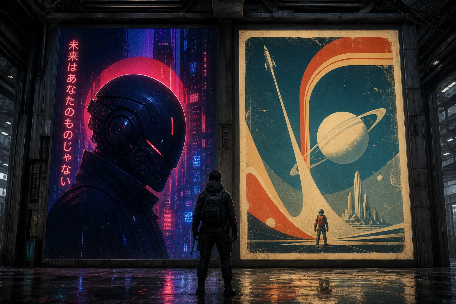
Cyberpunk illustration and retro-futurism are often thrown into the same neon bucket. They should not be. Both can use electric blue, hot pink, saturated red, and glowing signage. Both can feature machinery and stylised urban life. But their emotional architecture is entirely different.
Cyberpunk is friction. Its technology is intimate, invasive, and usually expensive in some human way. The visual language leans toward hard contrast, cool blue-red tension, rain-slick reflective surfaces, graphic silhouettes, and helmeted or masked figures. A profile view works particularly well here because it gives you a clean read: human face, machine interface, one decisive line of light across the visor. It is a very efficient cover device.
Retro-futurism, by contrast, is a future imagined from the past. Its machines tend to be chunky, rounded, optimistic, occasionally charmingly impractical. Think broad geometric shapes, analog grain, faded printing texture, friendly robot forms, and a colour palette that can be much more playful. The future is still strange, but it is not necessarily trying to eat the protagonist alive.
Here is the distinction I give artists when the brief simply says “neon science fiction,” which is not yet a brief—it is a weather report.
| Visual decision | Cyberpunk illustration | Retro-futurist illustration |
|---|---|---|
| Core feeling | Pressure, surveillance, speed, social fracture | Wonder, irony, nostalgic invention |
| Shape language | Sharp, narrow, streamlined, vertical | Rounded, modular, chunky, geometric |
| Figure treatment | Masked, augmented, isolated, often in profile | Explorer, technician, civilian, or stylised silhouette |
| Surface treatment | Wet reflections, screen glow, dense urban texture | Halftone, faded print, painted signage, analog wear |
| Technology | Sleek, embedded, proprietary, threatening | Visible controls, bulbous forms, tactile and legible |
| Best typography partner | Clean, bold sans serif with restraint | Strong display type, mid-century geometry, graphic arrangements |
The common failure is borrowing cyberpunk’s surface vocabulary—neon, cables, a little magenta haze—without its visual stakes. If the city is bright but the silhouette is soft, the focal hierarchy scattered, and the technology has no menace or consequence, you have produced a colourful generic future. It may still be a good image. It is not necessarily a useful cover.
The opposite mistake happens with retro-futurism: artists add a raygun and a bubble helmet, then render everything with grim, hyper-detailed realism. That can work for a deliberately revisionist project, but it drains the buoyancy from the concept. Let the design breathe. Leave larger graphic passages. Give the eye a poster-like route through the image.
A genre cue is not a prop. Goggles, neon, or a robot only work when the whole image agrees with them.
For your portfolio, I would show cyberpunk and retro-futurism as separate competencies, even if your painting method is identical. Art directors are scanning for whether you understand the difference in silhouette, composition, and mood—not whether you can locate the appropriate colour swatch.
Steampunk versus dieselpunk: similar machinery, different weight
Steampunk and dieselpunk book cover art are another pairing that gets blurred because both involve retro technology. But the engines are not the same, and neither is the air around them.
Steampunk draws from Victorian fashion and industrial fantasy: brass, clockwork, goggles, corsetry, leather, ornate instruments, steam pressure, polished fittings. It is often theatrical. Even when the story is dark, the world tends to invite close inspection. There are valves to turn, mechanisms to decipher, embellishments to enjoy.
Dieselpunk belongs to a later visual period, broadly drawing from the 1920s through the 1950s: Art Deco, Streamline Moderne, film noir, military propaganda design, oil-driven machinery, uniforms, aircraft, and looming civic architecture. The palette moves away from steampunk’s warm brass fantasy toward dark greens, metallic greys, rusty reds, earth tones, and smoke-stained cream. Its machinery feels heavier. It burns fuel. It occupies space with authority.
The term “dieselpunk” itself is relatively recent—it was coined in 2001—but the visual ingredients are immediately legible when they are handled with discipline. A dieselpunk cover often benefits from controlled geometry: a dirigible, a fighter silhouette, a monumental tower, a sharply tailored coat, a searchlight cutting through haze. You want mass and direction.
A few practical choices make the split much clearer:
1. Decide what powers the world before you paint the hero. Steam suggests pressure, craft, and visible mechanical intricacy. Diesel suggests industry, logistics, war, and infrastructure. If the engine logic is vague, the imagery becomes costume rack steampunk very quickly.
2. Use ornament differently. In steampunk, ornament can be a reward. A fine arrangement of gears, engraved metal, or a beautiful mechanical prosthetic can carry a great deal of appeal. In dieselpunk, ornament is usually subordinate to function, state power, or mass production. A riveted fuselage tells the story more cleanly than a decorative gear cluster.
3. Watch the figure’s silhouette. A steampunk protagonist may read through coat tails, a top hat, a corseted waist, goggles, or a hand-built device. A dieselpunk protagonist often reads through uniform, trench coat, pilot gear, angular shoulders, and a weapon or machine that feels industrial rather than artisanal.
4. Give the cover a period-specific light source. Gaslight and warm workshop glow suit much steampunk. Searchlights, sodium streetlamps, cockpit instruments, cinema-marquee illumination, and hard window light tend to push dieselpunk in the right direction.
I have seen strong artists lose a dieselpunk brief by painting every surface in gold. Brass is not a universal shorthand for “old technology.” It has a flavour, and that flavour is usually more whimsical, domestic, or artisanal than a dieselpunk story needs.
That does not mean a dieselpunk cover must be brown, green, and miserable. It means a bright accent should have a job. A red insignia, an electric instrument panel, or a cream-white searchlight can create terrific pop against an iron-grey field. The bright note lands because the rest of the palette has discipline.
Space opera and hard science fiction need different kinds of scale
Science fiction book illustration is where artists are most tempted to show everything. The planet, the ship, the crew, the battle, the alien city, the exact configuration of the engines, perhaps three moons for good measure. Then the cover is reduced to a two-inch thumbnail and becomes a handsome dark rectangle with some stars in it.
Space opera and hard science fiction both use celestial imagery, dark fields, bold typography, and the human figure set against immense environments. But their composition should answer different reader questions.
Space opera is interested in drama at scale. Its promise is emotional momentum: dynasties, rebellions, impossible journeys, war, romance, fate. You can let a ship cut dramatically across the frame, let a planet loom, let the figure stand at the edge of something enormous. There is room for operatic light and a sense of decisive movement.
Hard science fiction usually benefits from greater restraint. The wonder comes from plausibility, isolation, systems, distance, and the physical conditions of the world. Your spacecraft does not need a hundred labelled panels, but it should feel like it has mass, purpose, and a relationship to its environment. If the story is about an orbital habitat, make the habitat’s scale and structure the visual event. If it is about a mission to a hostile planet, let geology, atmosphere, or the fragility of the human presence do the storytelling.
For sci-fi concept design for book covers, I ask one question early: what is the scale anchor? The answer might be a tiny suited figure, a shuttle near a ringworld, a lit observation deck against black, or one clean line of a spacecraft crossing a planetary limb. Without that anchor, “vastness” is just empty space.
The thumbnail test is not optional
Traditional painting can be especially vulnerable here. A subtle value shift that looks marvellous at full size may vanish completely on a retailer page. Before you commit to the final, reduce the rough until it is close to the size of a postage stamp. Then check three things:
- Can you identify the focal object in a second?
- Does the dark mass hold together, or does it dissolve into visual static?
- Is there one unmistakable contrast event—a lit helmet, a planet edge, a bright engine trail, a title field—that gives the eye somewhere to land?
If the answer is no, do not rescue it by adding detail. Simplify the value structure first. Most covers need fewer stars, fewer windows, fewer secondary ships, and a more intentional silhouette than the artist initially wants to give them.
In a space cover, scale is not created by painting more universe. It is created by giving the eye one thing it can measure.
Why contemporary fantasy is moving toward symbols
Fantasy novel cover art styles have become more flexible, not less. Character-led action scenes remain very much alive, especially in urban fantasy, romantic fantasy, and stories that sell on immediate protagonist energy. But alongside them is a strong appetite for concentrated symbolic covers: a key, a dragon egg, a sword, a crown, a flower, a mask, a single impossible object held against saturated colour.
This shift is sometimes misunderstood as “minimalism is easier.” It is not. A symbolic cover has nowhere to hide. If the object lacks a distinct silhouette, the colour lacks conviction, or the type and image are competing for the same space, the whole thing feels thin. A crowded scene can survive a small compositional wobble; a single-object cover cannot.
The reason symbolism works is not that readers have stopped liking characters. It is that a symbol can create a compact question. Why is that key blackened at the teeth? Why is the egg cracked from inside? Why does the crown look grown rather than forged? The cover becomes an invitation rather than an illustrated synopsis.
For an illustrator, this can be a refreshing kind of brief. It demands object design, material understanding, and a strong sense of negative space. A hand-painted dragon egg, for example, can carry tremendous authority if its surface feels specific: mineral bloom, shell pores, metallic veining, strange internal light. But the painting must remain readable. The object needs an outer contour that survives reduction, and the background must support it rather than audition beside it.
Colour is doing much of the genre work in these covers. Saturated pinks, electric blues, and lush purples can signal contemporary fantasy energy beautifully, particularly when paired with an iconic central form. That does not mean every fantasy project should be neon. A quiet literary speculative novel may need a more restrained palette and type-led design. The point is to choose a visual volume that matches the prose and the readership, not to chase whichever colour treatment is appearing most often in a bookstore window.
Character scene or design-led cover? Read the story’s promise
There is no universal winner between a scene-setter cover and an abstract, design-led one. A detailed scene can be exactly right when the setting is part of the sale: an urban fantasy heroine moving through a dangerous city, a post-apocalyptic convoy crossing a ruined landscape, a dragon rider banking over a recognizable kingdom. In those cases, atmosphere and action are the product.
But scene-setters ask a lot of the illustrator. You must establish character, place, conflict, lighting, depth, and title accommodation without turning the image into a poster for a game expansion. The art drop may be beautiful at full resolution and still fail the cover because every inch is claiming equal importance.
I usually advise artists to make the decision through the story’s clearest promise:
| If the book sells on… | Cover direction that often helps |
|---|---|
| A charismatic, visually distinctive protagonist | Character-forward image with a firm silhouette and controlled environment |
| A dangerous city, strange landscape, or world premise | Scene-setter composition, with environment doing narrative work |
| An object, mystery, curse, or secret lineage | Minimal symbolic image with strong negative space |
| Big political or military conflict in a future world | Space opera scale, graphic movement, bold type field |
| Interior tension, ambiguity, or literary speculation | Restrained imagery, quieter palette, design-led typography |
| A playful alternate future | Retro-futurist shapes, analog texture, vivid graphic colour |
Notice the word “often.” Cover art is not a sorting machine. A literary novel can use a figure; a high-action fantasy can use a tiny emblem; an urban fantasy book can be type-led and still feel commercial. What matters is that the decision looks intentional from the first rough.
When you build your portfolio, show that intentionality. Do not present five moody portraits and call yourself versatile because one has goggles. Give us a cyberpunk image with a hard graphic hierarchy, a retro-futurist image with genuine period shape language, a dieselpunk image with industrial weight, a fantasy symbol cover with disciplined negative space, and a space image where scale reads instantly. Even better, show a sketch and a final for one or two pieces. It tells a commissioning editor that you can solve the brief, not merely produce an attractive finished painting.
Let the brief set the visual rules
I love a painterly cover. I also love a lavishly detailed scene when the story earns it. But neither is inherently more “proper” than a stripped-back design with one glowing object in the centre. The correct choice is the one that gives the right reader a fast, confident signal while leaving enough mystery to make them open the book.
Start with subgenre, then emotional temperature, then the story’s selling image. From there, choose your shape language, palette, focal point, and amount of visual information. Only after those decisions are settled should you worry about whether the goggles are brass, the city is neon, or the spaceship has enough antennae.
Your portfolio will become much stronger when every piece can answer a simple question without hesitation: what kind of reader is this image calling in? If the answer is clear at two inches, you are no longer decorating a cover. You are helping the book find its shelf.