Illustrator Portfolio Review: Checklist Before You Submit
Most illustrator portfolios do not fail because the artist lacks talent. They fail because the artist lacks an editor.
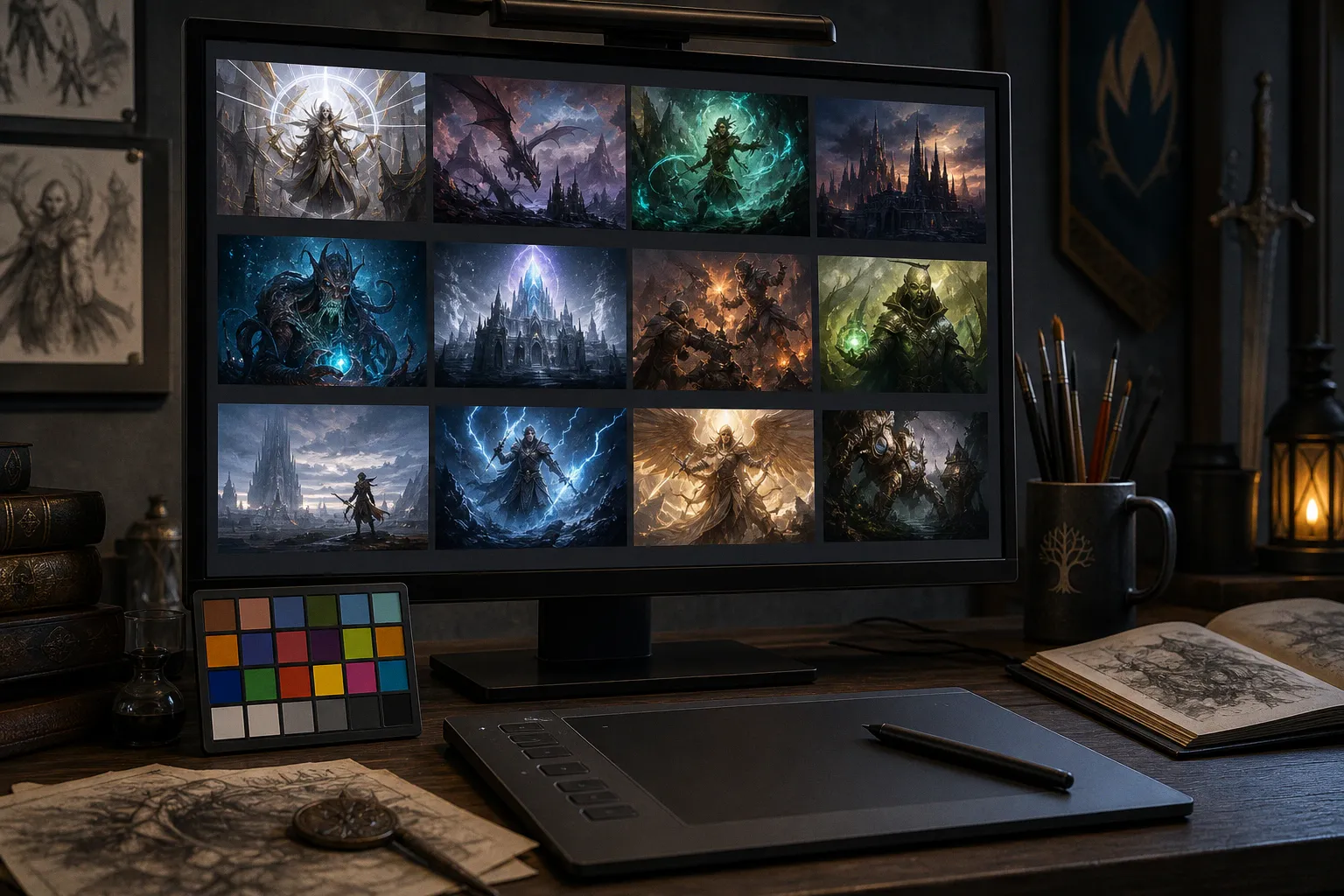
The brushwork may be immaculate, the composition competent, the color handling rich — but the work arrives beside a great deal of other work, often during a fast review between meetings. You may get a few seconds before the next click. Those seconds are not a referendum on your potential. They are a test of whether the portfolio makes its case immediately.
That is the uncomfortable center of an illustrator portfolio review checklist: nobody is hiring an abstract category called “talent.” They are looking for evidence that you can make the kind of images they need, at a consistent level, in a recognizable visual language, and with enough clarity to survive a production brief.
Your best image gets attention. Your least convincing image explains the risk.
Curation Strategy: Quality Over Quantity in Fantasy Art
A focused fantasy art portfolio is usually stronger than an archive. Ten excellent pieces with a clear point of view can do more work than fifty images that document every visual phase you have passed through. Curation is subtraction. It is deciding what the viewer does not need to see in order to understand what you do well.
For fantasy illustration, range does not mean throwing every genre into one folder. It means proving that you can handle different demands within a coherent practice: a figure under pressure, an environment with atmosphere, a creature with a readable silhouette, a narrative beat that feels like it happened just before or just after the frame.
A portfolio is not a museum of your effort. It is a precise argument for the work you want next.
The useful question is not, “Is this one of my favorite pieces?” It is, “What job does this piece perform in the portfolio?”
A strong selection might include:
- A character-driven image with clear expression, costume logic, and a confident focal hierarchy.
- An environment that establishes place rather than merely displaying background rendering.
- A scene with multiple figures, where the story remains readable without captions.
- A creature or piece of visual development that shows design thinking, not just surface detail.
- An image that demonstrates command of light: firelight, moonlight, spell glow, a hard noon sun, a room lit by a single window.
- One or two quieter images, if they add emotional range rather than simply lowering the temperature of the set.
The common failure is duplication. Three armored heroes facing left against a burning horizon are not range because the armor changes. They are one answer repeated three times. Keep the version with the strongest silhouette, the cleanest value structure, and the most legible emotional beat. Let the others go.
For fantasy art portfolio preparation, it helps to lay the work out as a sequence rather than judging each painting in isolation. A portfolio is read cumulatively. The first image establishes a promise. The middle proves you can sustain it. The final image should leave the reviewer with an afterimage: a piece that makes them remember your name when a suitable assignment lands later.
A practical way to edit without becoming sentimental:
1. Pull everything into one view. A wall, a slide deck, a contact sheet, or a private web page will do. The point is to see repetition and inconsistency at once.
2. Sort for the intended market. A deck for card games should not be identical to a deck for children’s publishing, novels, or tabletop role-playing books. The core may overlap; the emphasis should not.
3. Remove unfinished decisions. A beautiful painting with a vague hand, uncertain perspective, unresolved face, or muddy lower third is still an unresolved painting.
4. Check the thumbnail rhythm. If the whole grid is dark-blue fantasy gloom, the individual images may be fine but the portfolio will feel flat. If every image is a different rendering style, it may feel like several artists sharing one login.
5. Ask what the next client can imagine. A reviewer should be able to point at an image and think, “This artist could handle our monster, our cover, our world, our dramatic scene.”
Recent work generally gives the clearest picture of your present ability. Older pieces can remain if they still represent your standard and your current direction. They should not stay merely because they once earned praise, likes, or a place in your personal mythology.
The hardest cut is often the “maybe” pile: work that is technically competent but does not sharpen the read. That pile is where portfolios become long.
Technical Specifications for Digital and Email Submissions
A polished portfolio can still arrive badly. Wrong file type, oversized attachments, strange color shifts, anonymous filenames, a link that asks for access: these are small technical frictions, but friction is not your friend when someone is reviewing quickly.
The submission is not separate from the work. It is part of the professional impression the work makes.
For digital and email submissions, follow the receiving organization’s instructions first. If a publisher, agency, or art director specifies dimensions, formats, naming conventions, or a portal, that brief outranks every general rule. If they do not provide detailed specs, make the material easy to open, easy to identify, and easy to review on an ordinary screen.
| Parameter | Email or Shared Folder | Online Portfolio | Print or In-Person Review |
|---|---|---|---|
| Image format | JPEG is usually practical | JPEG or PNG as appropriate | High-quality print or PDF, if requested |
| Color handling | Export for standard web viewing | Use consistent web-ready color | Match the requested print workflow |
| Image size | Large enough to inspect, light enough to load | Detail-friendly without punishing load time | Sized for the intended physical presentation |
| File naming | Numbered and descriptive | Clear project titles and captions | Consistent labels or a printed index |
| Sequence | Curated, finite, intentional | Strong opening image and clear navigation | Easy to turn through without explanation |
The phrase “72dpi” has become portfolio folklore. Screen viewing is primarily about pixel dimensions, display behavior, and file weight; the number in a resolution field does not rescue a tiny image or make an enormous attachment more considerate. What matters is whether the viewer can see the image clearly without waiting for it to load or wrestling with a massive download.
A sensible digital export should preserve the focal area and enough detail to show finish, while remaining manageable in an inbox or browser. The reviewer needs to see that you understand edges, materials, and anatomy. They do not need a file so large that it behaves like a production delivery.
Color is the quieter trap. A painting made in a wide-gamut workspace can shift when viewed in ordinary web contexts. Before sending, inspect the export on more than one screen if you can. If the receiving brief does not request a specialized profile, a standard web-friendly export is usually the safest route. The goal is not laboratory purity. The goal is for your values and palette to arrive intact enough that the scene still reads as you intended.
File names should be boring in the best possible way:
01_EmberKnight.jpg02_FloodedTemple.jpg03_StarshipChapel.jpg
That is enough. Numbering controls order. A descriptive title helps the reviewer find a piece later. Avoid filenames that narrate your panic: final_final_USETHISONE_revised2.jpg does not make the art worse, but it does make the submission feel less resolved.
Your portfolio site benefits from captions too. A brief line can identify the medium, the project type, the personal or commissioned context, and any relevant collaborators. Do not make viewers hunt through social posts to learn whether an image was a book cover, a card illustration, a personal piece, or a shared production.
Accessibility descriptions are worth treating with the same care. Useful alt text is plain, specific, and visual: “A white-haired ranger stands on a ruined bridge above a green-lit cavern, drawing a bow toward a winged serpent.” It is not a sales pitch. It is a description that lets more people understand the image and gives the page meaningful context.
Navigating Submission Guidelines for Major Publishers
Every publisher has its own door, and the door matters. Some invite submissions through a formal portal. Some work through agents or existing freelance contacts. Some announce open calls occasionally. Some are not seeking unsolicited work at all. The first professional move is to read the current submission page rather than relying on advice passed around in old threads.
Publisher guidance can change. A requirement that was accurate for one cycle, one department, or one type of work may not be the rule when you submit. Treat fantasy illustrator submission requirements as live documents: read them close to the date you send, and follow their stated limits exactly.
Wizards of the Coast has published portfolio guidance for freelance artists, including expectations around showing strong recent work and identifying collaborative contributions. If a piece was made with another artist, say what you did. If you painted the character while someone else designed the environment, credit that clearly. If you inherited a layout, photobashed licensed elements, or worked from an art director’s supplied concept, describe the role honestly where context is needed.
Clear credits do not weaken a portfolio. They demonstrate that you understand production.
Collaboration is not a stain on the work. Unclear authorship is the problem.
This is especially important in card games, role-playing games, and entertainment art, where an image may pass through concept, sketch, line work, paintover, graphic treatment, and final production under several hands. An art director needs to know what they are actually evaluating. “Character illustration; environment by X” is useful information. A vague caption that implies total authorship where the work was shared creates uncertainty nobody needs.
The same principle applies to generative tools where a publisher’s guidelines address them. Do not guess, rationalize, or assume that one company’s policy applies everywhere. Read the stated policy for the opportunity in front of you and comply with it. If the guidance is unclear, choose transparency over cleverness.
A submission brief is also a test of reading. If a publisher asks for a certain number of images, send that number. If it asks for a particular file format, use it. If it asks for a portfolio link rather than attachments, do not bury the contact in a download folder. The goal is not to prove that you have more work than they requested. It is to show that you can work within a constraint without making the other person clean up after you.
A cover letter, if requested, should be short and useful. It can say:
- What kind of illustration you make.
- Which part of the publisher’s list or visual world your work is suited to.
- Where the portfolio can be viewed.
- Whether you are available for freelance work, if relevant.
- Any necessary credit or representation information.
It does not need a childhood origin story. It does not need to describe your artistic soul in six paragraphs. The art should carry the emotional weather. The note should make it easy to understand who you are and how to contact you.
Publishers may not reply to unsolicited submissions, and they may not provide individual feedback. That silence is frustrating, but it is not a diagnosis of your ability. Keep records of where and when you submitted, respect any stated resubmission timing, and continue building the work. A portfolio should not be frozen while it waits for an answer.
Designing for the Card: Readability and Cinematic Impact
Card art has one of the harshest viewing conditions in illustration. A dramatic scene may be painted large, but it often has to work in a small crop, under interface elements, beside rules text, or as a thumbnail in a digital collection. Fine detail can enrich a close look; it cannot be the only thing holding the picture together.
This is where cinematic thinking matters. Not cinematic as in “put lens flare on it.” Cinematic as in directing attention.
The card image needs a readable hierarchy:
1. A primary subject or action. The eye should know where to land.
2. A value structure that supports that landing. Dark against light, light against dark, or a controlled color contrast can do more than another layer of texture.
3. A silhouette that survives reduction. If the knight, dragon, ship, or spell effect disappears into the background at small size, the design is doing too much and saying too little.
4. A secondary beat. This can reward a longer look: an enemy shape behind the hero, a distant city, a reflected face in a blade, a hand reaching from the edge of the frame.
5. Atmosphere that stays subordinate. Fog, rubble, magical particles, intricate armor, foliage, and ruins all have their place. They cannot all demand the same volume.
If the story vanishes when the image gets small, the rendering is carrying weight the composition should carry.
A quick test is to reduce the image until it is roughly thumbnail-sized and look away for a moment before looking back. What do you notice first? If you cannot answer that, neither can the viewer. The focal point may be too evenly lit, too similar in value to the surroundings, or crowded by equally sharp details.
This does not mean every card painting should have a centered hero against a soft background. A strong image can be asymmetric, strange, quiet, or deliberately obscured. But it still needs a controlled read. A horror card may use confusion as a feeling while retaining a clear visual anchor: an eye, a hand, a doorway, a pale face, a break in the darkness. Mystery is not the same thing as visual indecision.
For covers, the conditions change but the principle survives. A cover must coexist with type, trim, metadata, and a small storefront thumbnail. Leave space intentionally where typography may sit. Test crops before you commit to a full rendering pass. Do not place the only important face in the area most likely to be covered by a title treatment.
A useful review exercise is to make three versions of a composition before rendering:
- A small value thumbnail in grayscale.
- A simple color comp with the intended temperature and focal contrast.
- A reduced-size test that approximates the final use.
If all three versions point the eye to the same place, the painting has a strong spine. If each one reads differently, stop before you start detailing. The problem is structural, not decorative.
The Role of Sketchbooks and Process in Professional Reviews
Finished art shows taste and execution. Process work can show how you think when the first solution is not enough.
That distinction matters in professional reviews. An art director may need an illustrator who can respond to a vague brief, develop options, revise the composition, clarify a narrative moment, and preserve the work’s energy after a note changes the center of gravity. A polished final painting is evidence of one successful destination. Process can reveal whether you know how to travel there.
A sketchbook does not need to be a sacred object full of beautiful pages. It needs to show useful thinking. For an interview, portfolio review, or process-focused submission, select material that connects to finished work and makes decisions visible.
Strong process material may include:
- Thumbnail compositions that explore different camera angles, figure placement, and story emphasis.
- Value studies that solve readability before local color and rendering take over.
- Color keys that test mood: cold dawn versus firelit night, poisoned green versus holy gold, calm weather versus a storm front.
- Reference gathering and studies that demonstrate observation rather than indiscriminate copying.
- Early design passes for creatures, costumes, props, or architecture.
- Brief notes that identify the problem being solved: “push the rider forward,” “make the portal read as a threat,” “reduce background contrast,” “hold room for title.”
Those notes can be brief and unglamorous. That is part of their value. They indicate that you can name visual problems, not merely feel that something is “off.”
What does not help is process as bulk. A stack of unrelated doodles, half-finished anatomy drills, old fan sketches, and studio photographs will not create depth by sheer volume. Neither will a perfectly staged process page that shows no alternatives, mistakes, or decisions. The point is not to perform messiness. The point is to show intelligent iteration.
For a portfolio website, process can sit beside a few key final images rather than becoming its own endless archive. One finished card-style scene accompanied by thumbnails, a value pass, and a color study tells a more persuasive story than twenty disconnected progress screenshots. It says: this artist can originate, assess, revise, and finish.
The Final Cut Before You Send
Before submission, look at the portfolio as if it belonged to someone else. This is difficult, which is why outside eyes are useful. Ask a trusted peer — ideally someone who understands illustration briefs rather than simply admiring your work — to move through the sequence without commentary at first. Watch where they linger, where they hesitate, and where they begin to explain away an image for you.
Then ask a few direct questions:
- Which image made you want to keep looking?
- Which image felt least resolved?
- What kind of work do you think I want to be hired for?
- Did any image feel redundant?
- Did you understand my role in collaborative pieces?
- Could you name the focal point of each image at thumbnail size?
The answers may sting. Good. A portfolio is supposed to be sharpened before it reaches someone who has no obligation to explain their reaction.
Sleep on the final sequence. Reopen the links. Test the images on a phone and a laptop. Check that your contact information is visible without becoming the first thing on the page. Read the publisher’s instructions one last time. Make sure your collaborators are credited. Then send the work cleanly and let it leave your desk.
The portfolio in your folder cannot be reviewed. The portfolio you submit may receive no reply, and it may receive no feedback, because publishers and art directors often cannot respond individually to every submission. That uncertainty is part of the process, not proof that sending was pointless.
The work is still simple, even when it is not easy: cut anything that does not serve the brief. Make the small image read. Credit the hands involved. Deliver the files with care. Show enough process to prove there is an engine under the paint.
Then make the next piece better than the last one.