How MTG Designers Adapted The Hobbit: Lessons for Illustrators
According to a GamesRadar+ interview with Magic: The Gathering designers Gavin Verhey, Annie Sardelis, and Zakeel Gordon, the team behind the upcoming Universes Beyond: The Hobbit set spent years…
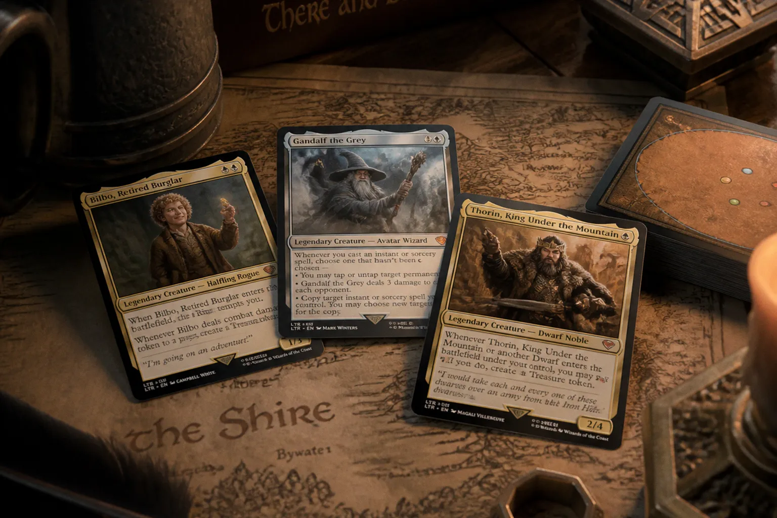
According to a GamesRadar+ interview with Magic: The Gathering designers Gavin Verhey, Annie Sardelis, and Zakeel Gordon, the team behind the upcoming Universes Beyond: The Hobbit set spent years figuring out how to translate Tolkien's novel into cards—and their process is worth studying closely if you're building a TCG illustration portfolio.
The set releases August 16, following pre-orders that have already seen some items sell out or run at inflated prices. The interview lands at a useful moment: not just because Tolkien fans are queueing up, but because how a major studio handles "faithful adaptation" tells you exactly what art directors in this space are looking for from new talent.
The brief was the novel, not the films
The most interesting line in the whole piece is how clearly the team drew a line between Tolkien's book and Peter Jackson's movies. Sardelis, who led the set, said the designers deliberately didn't reach for material from the prior Lord of the Rings release—they wanted The Hobbit to stand on its own, sourced from the source text itself. Verhey added that, structurally, the set feels closer to a sequel years later than a companion piece.
For your portfolio, that's a working principle: when you're handed a brief, find the closest primary source you can. Movie stills feel like a shortcut, but they lock you into someone else's silhouettes, costume choices, and color decisions. The text itself gives you room to invent with intention. Verhey described it like a completeness check: "if it's in The Hobbit, it's in the set somewhere." That's a discipline you can borrow for any client project—when in doubt, default to the brief's source material, not the most familiar reference.
Specificity beats grandiosity every time
Sardelis's quote is the one I want framed on your studio wall: "Anytime we made up a creature, we would search through the book for a characteristic we could evoke because we can get so specific with it." She gives the example of a Mirkwood elf—instead of painting "a Mirkwood elf," the team designed the specific elf who served drinks, or the one who guarded the gates of the cells.
That's the move. Macro characters get you nowhere in TCG. Micro characters get you reprints. When you're sketching a card concept, push yourself one rung further down the specific ladder. What is your thief holding? What did your cleric eat for breakfast? Those tiny answers are what give an illustration pop at thumbnail size—and what gets a set lead to greenlight your second commission.
What to actually study when the set goes live
When the cards drop this weekend, resist the urge to scroll only the showcase treatments. The real education is in the commons and uncommons—how the art director solved readability at two inches, where they placed the focal contrast, and what silhouette choices survived the shrink. Compare a Gandalf common to a Gandalf alternate-art and you'll see exactly what gets lost when an oil painting's subtle glazing is reduced to a trading card surface. That gap is where art directors like me are constantly looking for artists who understand the medium, not just the genre.