Lessons from 1988 Adeptus Titanicus: Why Scrappy Design Wins
According to belloflostsouls.net, a retrospective on the original 1988 Adeptus Titanicus is circulating — the Warhammer 40K titan game that, yes, actually used styrofoam buildings as terrain.
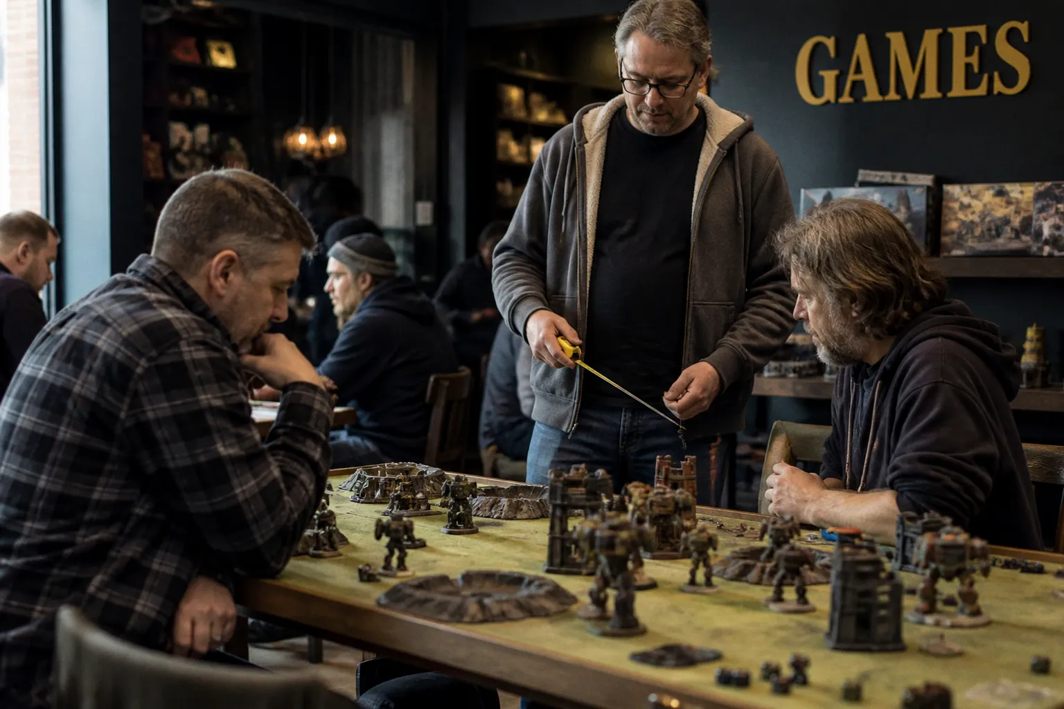
It's a charming slice of gaming archaeology, and for anyone working on a TCG or tabletop portfolio right now, it's a quietly useful reminder of something we tend to forget when we get lost in rendering.
Constraints are where the brief gets interesting
I've been commissioning tabletop and card art long enough to know that the "low production value" era had one massive advantage: the brief was brutally honest. Pieces were small, terrain was improvised, and every illustration had to read instantly from across a table. You couldn't hide behind texture or finish — silhouette, palette pop, and a clear pose did the heavy lifting.
The 1988 Adeptus Titanicus aesthetic, styrofoam cities and all, was built around exactly that constraint. When you look at original titan work from that window, what stands out isn't refinement. It's how confidently the shapes read even when the techniques were scrappy. That's the muscle every art director is quietly testing when they flip through your portfolio — and it's the thing most submissions, honestly, fumble.
What to actually do this week
Here's where I'd push you to act, because a retro post only earns its keep if it changes something on your hard drive:
- Shrink test. Open your last finished piece and resize it to thumbnail. Strip away all detail and ask: does the subject still announce itself? If the answer is "kind of," your silhouette needs love, not more rendering hours.
- Value audit. The original Titanicus range reportedly lived on a handful of strong values because anything more got muddy at table distance. Count how many distinct values you're actually using in your current piece — if it's more than five, you're probably overworking it.
- Card-size print. Print one illustration at playing-card size and tape it next to a couple of competitors' work. The "does this read at two inches" test is brutal, and it's the test clients run in their head long before they ever email you back.
The styrofoam detail is fun trivia, and the nostalgia is well-earned. The real takeaway is older than 1988 and still applies: great tabletop art earns its keep at thumbnail size, not at full screen. If your portfolio can survive that, you're already ahead of most of what's landing in my inbox.