Legacy artist retrospectives: career traps for illustrators
A retrospective and a commission-ready illustrator profile are built for different jobs. Confusing them is a career error.
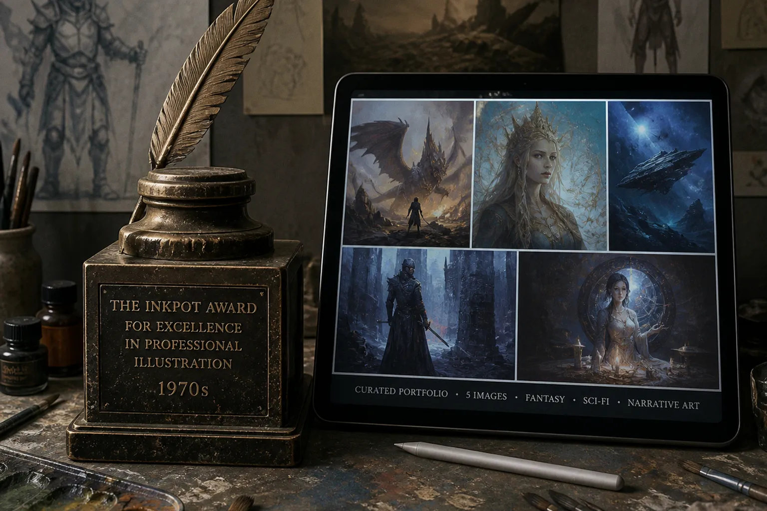
Legacy Artist Retrospectives vs Modern Illustrator Profiles
A retrospective accumulates evidence. Dates. Covers. Awards. Exhibitions. Reproductions. It proves that the work existed and that it mattered at a given point in the field. A modern profile must do something narrower and harder: it must let an art director identify a usable visual solution, locate the artist, and understand the route from inquiry to licensed image.
Compare car rental deals in United Kingdom
See available offersPartner link — DiscoverCars comparisonThat distinction is often blurred in fantasy illustration. The genre has a long memory. A single cover can circulate for decades. A 1977 award, a 1988 Chesley, a Spectrum appearance, or a convention catalogue can remain visually persuasive long after the practical conditions behind the work have changed. But pigment does not remain wet because a reproduction is admired. Neither does an artist’s commission pipeline remain open because an archive is impressive.
Craig Maher’s portfolio offers the more useful model for present tense: a painter and illustrator working across pencil, digital tools, and traditional oils for games, albums, movie posters, book covers, and private commissions. The material range is legible. The application range is legible. That is not a historical monument. It is a working surface.
The archive paradox: recognition is not availability
Legacy artist retrospectives are necessary. They establish lineage. They show where the visual grammar of fantasy illustration was assembled: the controlled contour, the theatrical crop, the opaque body color laid over a colored ground, the hard-edged highlight that survives reduction to paperback-cover scale.
They fail when readers, collectors, or prospective clients treat historical recognition as proof of present relevance.
Michael William Kaluta’s 1977 Inkpot Award is a clean example of a retrospective fact. It is dated. It is independently verifiable. It belongs in a timeline because it identifies a documented point of industry recognition. It does not reveal current availability, preferred commission size, delivery format, rights terms, or whether a particular visual approach remains part of his active practice. An award is a fixed layer. A commission brief is a moving one.
The same applies to Jody A. Lee’s career markers. She graduated from the Academy of Art College in 1980 and moved to New York to pursue professional work. Her 1988 cover for Mercedes Lackey’s The Oathbound earned a Chesley Award; she later received a Jack Gaughan Award in 1992. These are strong anchors for learning from art history retrospectives. They tell us where to look, what to study, and which professional thresholds were crossed.
They do not function as a current services page.
This is the first of the modern illustration industry traps: converting a historical record into an implied sales proposition. A visitor sees a vast gallery of old work, perhaps organized by decade, and has no answer to four immediate questions:
- Is the artist taking work now?
- Which part of the archive resembles the client’s present brief?
- What is being licensed: an existing image, a new illustration, a sketch, or an original painting?
- Who handles the inquiry, the estimate, and the production schedule?
A career archive can leave all four unanswered while still looking authoritative. In fact, the more complete the archive, the easier it is to conceal the absence of current information. Hundreds of images produce visual mass. They do not produce operational clarity.
A retrospective proves provenance. A modern profile proves fit.
The distinction matters especially in speculative art, where viewers often arrive through nostalgia. They may want the 1980s cover-painting density: a compressed arrangement of figures, a hot cadmium red light accent against a blue-black field, metallic trim resolved with high-value impasto. But the actual assignment may require a vertical game-card illustration, layered character assets, a six-week schedule, and worldwide digital usage. The visual desire is historical. The transaction is contemporary.
A profile that cannot separate those two conditions risks wasting the client’s time and the artist’s own.
Curation is not omission; it is edge control
The standard archive instinct is additive. Put everything online. Every cover. Every preliminary drawing. Every convention photograph. Every reproduction crop. The result resembles a painting with no hierarchy of edges: all passages equally sharp, all details given equal pressure. The eye cannot settle. The art director cannot select.
The Association of Illustrators recommends a small selection of five to six images for editorial outreach, paired with a link to the illustrator’s website. That is not a universal law for every portfolio. It is a practical benchmark for a specific contact situation. Its value lies in compression.
Five or six images force decisions.
A current illustrator profile should not imitate a retrospective gallery’s scale. It should create a controlled sequence. The first image establishes the dominant handling. The next few establish range without dissolving the identity. The final image should remove doubt about production competence: figurative anatomy, architecture, costume logic, environment, typography integration, or whatever the intended market actually purchases.
For an illustrator combining oils and digital work, the difference can be mapped directly.
| Profile component | Retrospective function | Modern commission function |
|---|---|---|
| Large chronological gallery | Documents output across decades | Useful only as a secondary archive |
| Award and publication list | Establishes historical standing | Supports credibility but does not define current services |
| Five to six selected images | Too narrow for career history | Efficient proof of visual fit in outreach |
| Process images | Shows development of an artist over time | Demonstrates deliverables, revisions, and medium control |
| Contact route | Often absent or buried | Must be immediate and unambiguous |
| Licensing language | Rarely addressed | Defines the commercial boundary of the image |
The selected works should not merely be “the best.” That phrase is too loose. They should be the most diagnostic.
A strong six-image set for a fantasy illustrator might contain:
1. A full-figure character composition showing anatomy, costume construction, and silhouette control at thumbnail scale. If the weapon hand disappears into the torso mass, the problem will also appear on a card frame.
2. An environmental narrative image that proves depth staging: foreground interruption, midground activity, and a distant value plane held without gray collapse.
3. A close-cropped portrait or cover candidate demonstrating facial structure and edge hierarchy. Hair may be scumbled; the eye socket cannot be vague.
4. A high-chroma image in which saturated passages are controlled rather than sprayed across the surface. Cadmium red light, phthalo blue, and yellow oxide have different visual aggression. The artist must show restraint.
5. A low-key image where shadows retain drawing. This is where weak digital work usually fails: black overlays erase form instead of reducing chroma and value in a measured sequence.
6. A work revealing the production hybrid—pencil, oil, digital finishing, or all three—if that hybrid is part of the actual offer.
Craig Maher’s stated use of pencil, digital tools, and traditional oils is significant here because it names a process range rather than making a vague claim of versatility. The client does not need a romantic account of medium. The client needs to know whether the image can begin as a graphite structural drawing, move through an oil underpainting, and arrive as a reproducible final file without losing the particular surface behavior that made the original compelling.
A portfolio sequence should answer that visually. Captions can then carry the remaining load: title, year, client or category where appropriate, medium, and whether the piece represents private work, published work, or a licensing inquiry. No inflated biography is required.
Milestone fatigue and the false weight of old dates
The legendary fantasy artist career paths most often discussed online are built from milestones because milestones are easy to repeat. Award year. Book title. Convention appearance. Magazine feature. They are also easy to misunderstand.
A milestone has evidentiary weight only within its category.
An Inkpot Award in 1977 establishes one type of recognition. A Chesley-winning cover in 1988 establishes another. Publication in Spectrum: The Best in Contemporary Fantastic Art or Infected By Art indicates that an artist’s work has entered visible contemporary-art channels. Llewellyn identifies Craig Maher as an illustrator of fantasy and tarot art and notes his study with Joe Kubert at The Kubert School. These are meaningful facts. They reveal training, placement, and professional context.
None of them should be stretched past their material limit.
The common mistake is milestone stacking. A profile places twenty years of dates in the opening screen, then treats the density of the list as a substitute for present evidence. It is the written equivalent of over-varnishing: every layer increases gloss, but eventually the surface obscures its own structure.
A useful retrospective separates three registers.
Historical record
This includes awards, dated covers, schools, exhibitions, and documented publications. It belongs in a timeline or archive section. Precision matters. If the date is uncertain, do not sharpen it into a false fact.
Visual influence
This is where the reader studies the work itself. Not what it “means” in a broad narrative sense, but how it is constructed. Where does the contour harden? Which planes are carried by transparent glaze and which are rebuilt opaquely? Does the figure sit in space because of atmospheric perspective, or because the artist has simply darkened the background? These are different mechanisms.
Current professional signal
This is the smallest but most decisive register: recent work, active contact path, named project categories, and clear rights expectations. If any of these are unverified, the profile should say less, not imply more.
The restraint is not a weakness. It prevents the reader from inferring commission availability from a static archive.
This applies to collectives as well. The Changeling Artist Collective has described itself as an international group of fantasy artists and has directed audiences toward a newsletter for auction updates. A documented April 2020 Changeling Con announcement described an online event with an auction, artist alley, livestreams, and demonstrations; it reported 243 auction items from more than 50 artists.
That is useful historical scale. It is not a current auction calendar, a current roster, or a current buying procedure.
The distinction may appear fussy. It is not. Anyone who has tried to purchase original art knows the damage caused by stale event pages: old bid windows, vanished payment routes, outdated shipping assumptions, and artist names that no longer correspond to the group’s public structure. A retrospective must label its dates. A marketplace must state its present terms. Mixing the two creates avoidable confusion.
Licensing is where the archive becomes dangerous
The most expensive error in a legacy portfolio is not visual. It is legal.
Clients regularly see a finished illustration online and assume that visibility implies availability. It does not. An image may be a commissioned cover, a private painting, a sold original, a licensed design, or a personal experiment. Those categories have different rights structures even when the same JPEG represents them on screen.
The Graphic Artists Guild’s estimate framework separates usage by medium, geographic area, time period, and number of uses. That separation is not bureaucratic decoration. It is the commercial anatomy of an illustration agreement.
Consider the difference between these requests:
| Request | What appears simple | What must be specified |
|---|---|---|
| Reuse an existing fantasy image on a book cover | “We only need the file” | Print and digital formats, territory, language editions, term, exclusivity, promotional use |
| Commission a new card-game illustration | “One finished painting” | Number of cards, crop variants, production schedule, revision stages, digital asset delivery, game and marketing usage |
| Purchase an original oil painting | “Buy the artwork” | Physical object only or rights included; reproduction rights are separate unless purchased |
| Use art for an album and merchandise | “Cover plus a few extras” | Album formats, streaming, apparel, posters, geographic distribution, term, quantities or repeated uses |
Original artwork, sketches, and copyright remain with the illustrator unless separately transferred or purchased. The artist also retains portfolio-display rights under the Guild’s stated framework. This is the point at which a beautiful legacy site can mislead both parties. A client sees an old image and contacts the artist—or, worse, a third party—with a casual reuse request. The site contains no visible indication of whether the original is available, whether the image is licensable, or whether prior exclusivity blocks further use.
The fix is not a wall of legal prose. It is precise labeling.
A modern profile can mark works as “published commission,” “private collection,” “licensing inquiries considered,” or “original sold.” Where a work is an example of a new-commission direction rather than an available image, say so. If the artist does not currently offer licensing, silence is cleaner than an ambiguous invitation.
The image on a screen is not the right to reproduce it.
For traditional oil work, another technical complication enters. The physical painting and the reproduction file are not identical products. A varnished oil surface may carry impasto ridges, semi-opaque scumbling, and subtle shifts in refractive index that compress poorly under flat digital lighting. The client licensing a file is purchasing a defined use of a reproduction. The collector purchasing the panel or canvas is purchasing a physical object with its own conservation requirements. Those transactions intersect. They do not merge automatically.
A competent profile acknowledges this boundary without turning itself into a contract template.
Hybrid practice: oils are not a nostalgic credential
The phrase “traditional and digital” is often used as filler. It says almost nothing. Every competent illustrator now needs to specify where the handoff occurs.
Does the digital stage begin after a graphite drawing? After a monochrome underpainting? After a fully resolved oil image is photographed? Is digital work used for compositional iteration, color-key testing, cleanup, type-safe cropping, or final delivery? Is the oil painting the original master, or one layer in a predominantly digital process?
These questions affect cost, schedule, revision logic, and output quality.
Maher’s stated combination of pencil, digital tools, and traditional oils makes sense because narrative illustration often requires several incompatible forms of control. Pencil provides rapid structural correction. Digital tools provide reversible compositional testing and file preparation. Oil permits a different surface logic: broken scumble over a dry layer, translucent darks, opaque accents, and physical edge modulation that cannot be generated by simply adding texture overlays.
But oil also imposes limits. A thick impasto highlight cannot be revised as casually as a digital layer mask. Stand oil lengthens handling and changes flow. A lean underpainting must remain structurally subordinate to later, fatter passages. A dark area built with too much black may reproduce as dead mass, particularly after compression and small-scale display. These are not romantic inconveniences. They determine whether the artist can meet the brief without sacrificing the painting’s internal structure.
For a client, the relevant question is not, “Is this made traditionally?” It is, “Which stage is fixed, which stage is revisable, and what will be delivered?”
For an artist, the relevant question is harsher: does the portfolio show the actual workflow, or only the most photogenic endpoint?
A hybrid profile earns trust when it exposes enough of the process to establish control:
- A preliminary pencil drawing shows the compositional skeleton before color makes weak design look persuasive.
- A value study demonstrates whether the focal path survives without hue.
- An underpainting image reveals whether the later surface is built over sound form or merely decorated.
- A final reproduction crop proves that the work holds at the scale at which a game card, book listing, or streaming thumbnail will be seen.
- A detail photograph of the original can distinguish genuine oil handling from generic digital texture, when that distinction is relevant to collectors or galleries.
Not every client needs every stage. The portfolio needs only enough evidence to prevent misclassification.
Build the archive behind the profile, not instead of it
The proper relationship between legacy artist retrospectives vs modern illustrator profiles is not opposition. It is sequencing.
The profile is the front room. It is selective, current, and functional. It gives a visitor a clear visual sample, a defined category of work, and a route to contact or licensing discussion. For editorial outreach, five to six images may be sufficient to start that conversation. The archive is the deeper room. It holds chronology, out-of-print covers, preliminary studies, award history, old interviews, and the long record required for serious study.
Both are valuable. Their failure begins when one impersonates the other.
Retrospectives should preserve dates, credits, and historical context with disciplined restraint. They should not manufacture present commercial claims from old applause. Modern profiles should show current fit, medium competence, and rights boundaries without pretending that a compact selection contains an entire career.
The verdict is simple. Keep the old work visible. Keep the old dates accurate. But do not ask a 1977 accolade, a 1988 cover, or a static gallery to perform the work of a current commission page. History establishes the ground. The active profile must show where the artist can still place the next mark.