Mastering Mood and Readability in Modern Fantasy Board Game Illustration
Issue 119 of Tabletop Gaming is out now, and the cover feature tells you everything you need to know about where fantasy board game art direction is leaning this season.
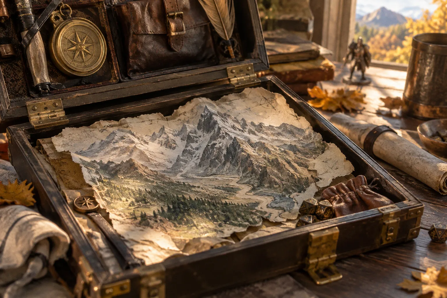
Avalon: The Riven Veil by Shadowborne Games picks up where Arthurian legend ends — King Arthur's body ferried to the Misty Isle after his final battle — and lands as an area-control title that blends exploration with combat. Game designer Jamie Jolly walks through the design on page 16, and if you're an illustrator reading briefs, that's the page you dog-ear first.
What the Avalon cover is really commissioning
Avalon leans hard on a mood most clients struggle to put into their brief: post-legend melancholy, fog-heavy silhouettes, knights who look tired rather than triumphant. That's a very specific commission, and the artists who read it correctly will be turning in moodboards full of muted glazes and low-chroma palettes rather than the screaming primaries that flooded Kickstarter covers a few years back. If you're aiming at this kind of work, pay attention to how an area-control format punishes weak silhouettes — player counts stack up, miniatures pack tight across the board, and your job as the illustrator is to win readability without the typical everything-saturated cheat. Arthurian fantasy is also one of the most over-painted subjects in the genre, so anything you bring to it has to earn its keep against a century of reference.
The TCG signals hiding in the table of contents
Disney Lorcana announcing an upcoming digital client is the headline every TCG art director should be watching, because it quietly resets what a premium trading card game looks like in 2026. Stack that against the magazine's coverage of Pokémon's 30th anniversary and a deep-dive into Magic: The Gathering's latest set — where Jace apparently decides to rewrite the entire multiverse — and you've got three very different IPs all pushing the same brief to their stable of artists: dynamic compositions, character-forward framing, and art that survives being shrunk to two inches on a card sleeve. There's also a 25-year retrospective on the Warhammer 40K Tyranids faction, a useful reminder that the alien-design language Games Workshop built in the late '90s still dictates how sci-fi creatures read at thumbnail scale today. If your portfolio is light on creature work, that retrospective is a free masterclass in economical silhouette.
Your move this week
Pull the magazine, flip to page 51 first to scan the thirty reviewed titles, then circle back to page 16 for the Avalon design interview. Build yourself a three-image mock exercise — moodboard, silhouette study, final comp — for an Arthurian mist-isle scene, and you'll know within an hour whether your portfolio is reading as table-ready or gallery-only. Honestly, that's the distinction a commissioning editor like me makes in the first thirty seconds, and no amount of polish hides it. The Avalon brief is unusually forgiving if your work has atmosphere; it's unusually unforgiving if your work is all spectacle.