Hard sci-fi and space opera: which visual path suits your world?
The portfolio mistake I see most often in science-fiction work is not "getting the genre wrong." It is building a beautifully rendered image that makes two incompatible promises at once.
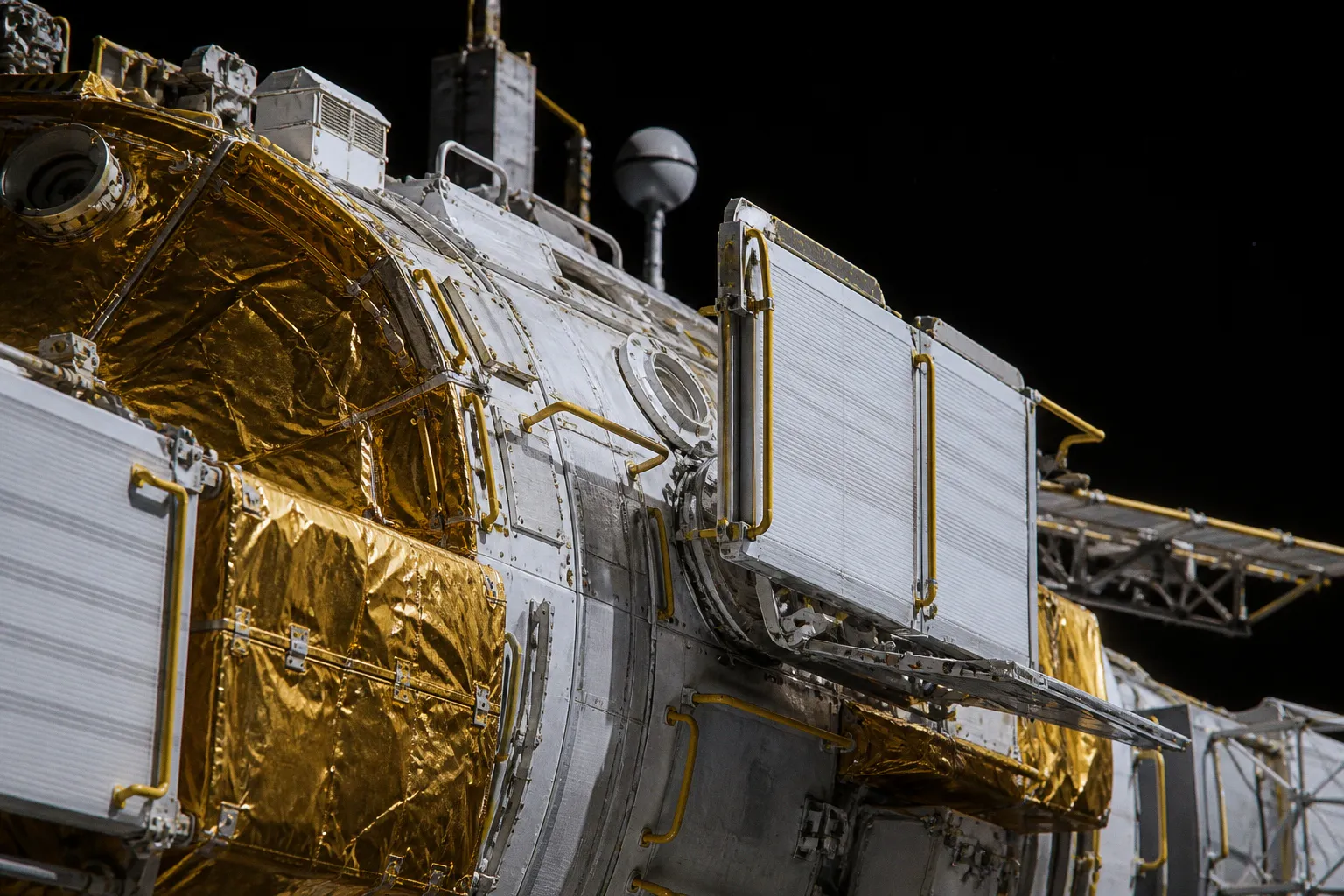
The ship has the foil blankets, exposed radiators, handholds, and service panels of a near-future engineering project—then it is flying in formation like a ceremonial fleet, backlit by three suns, with no sense of mass, mission, or operational constraint.
Compare car rental deals in United Kingdom
See available offersPartner link — DiscoverCars comparisonThat can work, but only if you understand what the image is asking the viewer to believe.
The useful distinction in hard sci-fi vs space opera visual characteristics is not a rigid palette chart or a list of compulsory ship shapes. Hard SF does not require gray hulls, and space opera does not automatically need a giant moon on the horizon. What changes is the visual contract. In hard science fiction, every visible decision should suggest that somebody had to solve a physical problem. In space opera, the decision should make the story feel larger, clearer, and more emotionally charged—whether or not the viewer can diagram the cooling loop afterward.
When I am reviewing a portfolio, I ask a simple question: if I shrink this image to the size of a card illustration or a bookshop thumbnail, what survives? In hard SF, it should be the mission logic. In space opera, it should be the drama.
Engineering the real: surfaces that tell us what a ship does
A believable hard-SF ship does not need to look ugly, cluttered, or strictly contemporary. It needs to look like its surfaces have jobs.
This is where many otherwise capable painters fall into generic "sci-fi hull" treatment: a smooth gray object, beveled panels everywhere, tiny windows, perhaps a blue engine glow. It reads as science fiction because we have all learned the shorthand. But it does not yet read as a vehicle designed to survive a specific environment.
Thermal control gives you a much stronger starting point. Spacecraft do not simply sit in a comfortably cold void. They deal with sharp changes in radiation and temperature, and their outer skin often makes that battle visible. Multilayer insulation can appear as crinkled, foil-like blankets. Radiators are designed to shed heat, so their surfaces should be visually distinct from the protected or insulated sections around them. White-painted or mirror-like radiator assemblies are not decorative accents; they tell the viewer that heat is being managed.
That one choice gives you material hierarchy, and material hierarchy is one of the fastest ways to make realistic science fiction art feel expensive rather than merely detailed.
| Visual decision | Hard-SF reading | Space-opera reading |
|---|---|---|
| Hull surface | Differentiated by function: insulation, radiator, sensor, access panel, docking interface | Unified around faction, ceremonial design, menace, or hero silhouette |
| Exterior detail | Repeated where crews or systems would need it | Concentrated where it improves scale, rhythm, and visual theatre |
| Damage | Scorching, torn insulation, punctured panels, patched infrastructure | Sweeping battle scars, dramatic ruptures, symbolic wear |
| Engine treatment | Suggests propulsion architecture and heat management | Creates thrust, momentum, color contrast, and emotional force |
| Composition | Makes the craft's task readable | Makes the moment unforgettable |
I would not copy a real spacecraft one-for-one. That is reference gathering, not concept design. But I would borrow the principle: make each category of surface legible at a glance.
For example, a survey vessel may have a dense sensor cluster facing its direction of travel, radiators positioned where they do not interfere with instruments, a protected docking collar, and insulated sections around vulnerable equipment. A warship in the same world may still be stylized and imposing, but if it belongs to a hard-SF setting, the audience should feel that weapons, cooling, crew access, and propulsion are negotiating for the same limited body.
In hard SF, detail earns its place by explaining pressure, heat, movement, maintenance, or risk.
This is particularly useful for artists moving from fantasy into science fiction. In fantasy, ornament can communicate culture, wealth, or magic. In hard SF, the equivalent visual pleasure often comes from function made beautiful: a radiator wing catching hard sunlight, gold insulation wrinkling around a module, a docking arm folding into its locked position.
That is not less imaginative. It is a different source of imagination.
Human factors make the environment believable
If your scene includes people, do not let the humans become decorative scale markers floating beside a ship. Their bodies are your best tool for establishing the world's rules.
In microgravity, people need ways to arrest motion, orient themselves, carry equipment, and work with both hands. Handrails, footholds, tether points, and restraints are not fussy technical garnish. They are the grammar of the scene. Remove them from an orbital workshop and you may still have a handsome painting, but the crew will look as if they are posing in a zero-g showroom.
NASA guidance on mobility aids is useful here because it frames them as a system, not as scattered props. A crew member needs to start or stop movement, change direction, control speed, and move equipment. That means your interior needs a readable route through it.
One specific measurement is especially handy for artists: an Artemis compatibility standard specifies that continuous handholds or handrails, along with integral tether attachment points, should be within 0.61 metres—24 inches—of the relevant standoff area. The rationale is beautifully human: it is a comfortable arm reach for a crew member in a pressurized suit.
You do not need to write "0.61 m" on your painting. But you can use that number to check your design.
1. Build a path before you render machinery. Where does a suited worker enter, secure themselves, turn, and reach the task area? If there is no answer, the environment has not yet become a workplace.
2. Give the figure a job. A hand on a rail, a boot hooked into a restraint, or a tether running to a clear anchor point will say more about zero-g than a dozen floating holograms.
3. Keep aids visually consistent. If every rail, tether socket, and foothold looks different, the viewer cannot quickly learn how the environment operates. Standardization is good visual storytelling.
4. Use orientation deliberately. In microgravity, "up" is a local agreement, not a law. Lighting, rail direction, labels, equipment bays, and the crew's posture should establish the preferred orientation.
5. Let inconvenience show. A bulky suit around a tight corner, a tool bag attached to a waist tether, or a worker bracing against a panel creates credibility and narrative pressure.
This applies to lunar and Martian scenes as well, but the body language changes. NASA commonly frames 0 g, the Moon's one-sixth gravity, Mars's three-eighths gravity, and Earth's 1 g as distinct mobility environments. That gives you a useful range for sci-fi world building aesthetics. A lunar technician may move with careful, buoyant momentum but still need to manage footing. On Mars, lower weight, gravity, and momentum management produce a different gait. In orbit, the scene becomes about anchoring and controlled drift.
The mistake is treating these as cosmetic variations: floaty for space, bouncy for the Moon, dusty for Mars. Start with what the body must do to work there. The visual language will follow.
Space opera begins with emotional priority
Space opera is often described as futuristic melodrama involving space travelers and extraterrestrial beings—a term whose first known use dates to 1941. The word "melodrama" sometimes makes artists flinch, as if it means shallow. I think it is more helpful to understand it as permission.
Permission to make the reunion happen in front of a burning capital ship. Permission to design a fighter that reads as reckless from one silhouette. Permission to stage a royal fleet arrival so that the audience feels the political weight before they understand the technology.
In space opera concept design, a ship can be realistic enough to feel solid without being visually obligated to explain every subsystem. Its truest purpose may be to embody a faction, a dynasty, a moral position, or a character's appetite for risk.
A narrow, blade-like cruiser tells a different story from a cathedral-bellied ark. A vessel with tall vertical fins can feel imperial, ceremonial, retro-futurist, or predatory depending on its proportions and context. A small craft with an oversized engine block can sell desperation and speed. You are composing identity first.
This is why space opera benefits from ruthless silhouette design. If I cover the surface detail with my hand, can I still identify the hero ship? Can I separate the enemy formation from the civilian convoy? Can I understand where the emotional center of the image is?
For an illustration intended for a novel cover, card game, or editorial slot, I would prioritize these questions:
- What is the viewer meant to feel first: awe, dread, longing, triumph, or panic?
- Which object owns the frame?
- Does the main ship have a silhouette that still pops at thumbnail size?
- Is the scale relationship instantly clear between character, craft, planet, and fleet?
- Are color and light serving the emotional beat rather than merely decorating the sky?
Space opera can absolutely include believable engineering. In fact, a few grounded details often make the grander liberties land better. A flagship with visible radiator structures, docking seams, and exterior access points can feel more convincing than a perfectly smooth fantasy object. The trick is not to let those details steal the hierarchy.
A common failure is equal-detail syndrome: every ship in a fleet receives the same lovingly rendered panels, engines, and antennas. The result is technically impressive and compositionally flat. Your focal ship needs the cleanest read, the sharpest contrast, and the strongest directional movement. The rest of the armada can become rhythm, scale, and atmosphere.
Space opera does not ask, "Could this exist exactly as drawn?" It asks, "Does this make the stakes feel enormous?"
Lighting the void without painting by cliché
"Space is black" is true in a specific and useful way: without an atmosphere to scatter sunlight, outer space does not produce an Earth-blue sky. For a hard-SF scene, that black field can be a powerful compositional asset. It gives sunlit forms a hard edge and lets you use reflected light with discipline.
But black does not mean empty, and it does not mean that stars must be absent.
A dense starfield may be visually defensible depending on the exposure and intended image language. NASA's Psyche mission, for instance, has presented starfield imagery made with five-second exposures. That does not mean every human observer, cockpit window, or spacecraft camera sees the same crowded field at every moment. It means you should understand that the stars in your painting are a choice of exposure, mood, and point of view.
For hard SF, I tend to encourage restraint around the brightest light source. If the sun is striking a ship, that side should command attention. The shadow side can still hold information, but do not casually rim-light every object from nowhere. Deep space is a wonderful place to let darkness do actual work.
For space opera, you can push further—planetshine, nebular color, multiple stellar sources, weapon flashes, engine trails, reflected fleet light. Just keep the hierarchy clean. If everything emits, flares, glows, and sparkles, nothing has authority.
Here is the practical split I use when briefing artists:
Hard-SF lighting
The image should make the environment feel measurable. Use strong directional illumination, clear thermal or material contrast, controlled reflections, and shadows that reinforce form. A starfield might be sparse, dense, or nearly invisible depending on the camera logic, but the choice should feel intentional.
Space-opera lighting
The image should make the event feel mythic. Backlight can separate a hero cruiser from a planet. A saturated engine plume can pull the eye through a battle. A red eclipse can turn a diplomatic arrival into a threat. Physical plausibility still helps, but atmosphere and emotional readability lead.
There is no official hard-SF palette and no official space-opera palette, which is good news for your portfolio. You are not applying for permission to use gold, magenta, or emerald in a hard-SF piece. You are deciding whether those colors arise from a functional environment, a cultural system, a story beat, or simply a strong compositional need.
Choose gravity before you design the room
Habitats are where genre intent becomes impossible to hide.
A hard-SF habitat should reveal its gravity condition quickly. In zero-g, corridors need handholds and restraint logic. Objects need retention. Work surfaces need attachment points. In a rotating habitat, the outer rim has different implications from the hub; a figure's posture and the room's architecture should acknowledge that. On a low-gravity world, the ceiling height, stairs, cargo handling, furniture, and even the casual stance of a character can communicate the setting.
You do not need to turn every interior into an engineering cutaway. But you do need to decide which physical problem the room has solved.
Space opera can simplify that problem when the story needs a grander stage. A throne room on a flagship may operate more like a palace set than a realistic pressure vessel, and that is fine if the visual language is consistent. Give it monumental verticals, ceremonial processional space, a window that frames the empire, and a floor pattern that directs us toward the ruler. The room is doing political work.
The strongest hybrid designs are honest about which rule they are bending. If you want a vast, operatic command deck in an otherwise grounded setting, give it a reason: a rotating section, a large acceleration-based ship, a ceremonial chamber used only during stable flight, or a culture that accepts inefficiency for spectacle. One clear premise lets you keep the drama without making the whole world feel accidental.
The right path is the one your image can sustain
I would never tell an artist to choose hard SF because it looks smarter, or space opera because it looks more marketable. Both paths have room for extraordinary design, and both can fail when they are reduced to surface shorthand.
Choose hard SF when your best ideas are about constraints: how heat leaves the ship, how a crew moves through a zero-g repair bay, how a habitat adapts to one-sixth gravity, how one practical compromise changes the shape of a whole vessel. Those are not limitations. They are your visual engine.
Choose space opera when your best ideas are about scale, allegiance, iconography, and emotional impact: the fleet that arrives too late, the lone pilot against a planet-sized threat, the impossible palace carried through the void. Let the silhouette carry the feeling before the viewer reaches the fine detail.
And if your world needs both, do not apologize for it. Build the engineering where the audience will inspect it. Build the spectacle where the story needs to sing. Your portfolio becomes much stronger when each image knows which promise it is making—and has the visual discipline to keep it.