Lessons from the Vampire Survivors Board Game for Aspiring Tabletop Illustrators
DualShockers ran a piece at Gen Con 2026 claiming the Vampire Survivors board game adaptation "outsmarts veteran tabletop designers" — and as someone who spends her week reviewing artist portfolios…
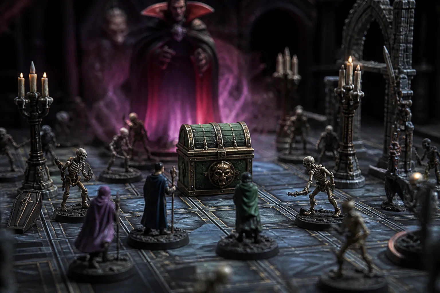
DualShockers ran a piece at Gen Con 2026 claiming the Vampire Survivors board game adaptation "outsmarts veteran tabletop designers" — and as someone who spends her week reviewing artist portfolios for TCG publishers, that headline is exactly the kind of thing worth pulling apart before you reshuffle your commission priorities.
What the reporting actually gives us
The DualShockers piece dropped on August 19, and the framing is bold: not "is fun" or "faithful to the source," but a direct challenge to seasoned tabletop designers. IMDb picked up the same coverage a few hours later, which tells you the story traveled, though neither feed in front of me carries the full design breakdown. No publisher name, no lead artist's name, no mechanical specifics I can hand you — just the claim and the venue.
That's worth sitting with for a second. Vampire Survivors is a visual property at its core. Every weapon evolution, every caped survivor, every swarm of cartoon undead reads at thumbnail size. That's not luck — that's an art director who understood silhouette and pop before the roguelike boom made those words slide into every Kickstarter pitch deck. Translating that into cards, a board, and rulebook spot illustrations is a genuinely different problem than designing for a screen, and the people doing it well are the ones you want studying.
What to actually watch for if you build tabletop work
Here's where I'd point you, practically. When video IP crosses into tabletop, three things decide whether the art team succeeded or muddied the brand:
Silhouette compression. A character that popped at 1080p with animated particles has to survive on a card sleeve or a two-inch mini. If your portfolio doesn't yet have a piece that reads at postage-stamp scale, that's the gap to close this month.
Icon clarity over flourish. Screen UI carries weight the table can't. The Vampire Survivors look is busy in the best way on a monitor; on a card, that same density becomes mush. Watch which details the adaptation kept and which it cut.
Print-ready color language. RGB glow doesn't translate to CMYK cards. If your samples lean heavily on bloom and gradient, build a flat-print version for your next tabletop pitch.
The honest gap before you act
I'll be straight with you: I don't have the DualShockers body text, the publisher's brief, or the art director's name in front of me. Gen Con coverage usually deepens once review copies ship and demos hit hands, so the responsible move is to bookmark the piece, set a reminder a couple weeks out, and wait for the longer Tabletop Gaming follow-ups or the official art announcement.
In the meantime, the work that actually moves your career forward isn't reacting to headlines — it's pulling three existing portfolio pieces tonight and asking whether they'd survive a 2-inch test print. That's the same brief the Vampire Survivors art team is working through right now, and it's the brief worth solving before the next adaptation lands.