Mark Rosewater Discusses Magic The Gathering Hobbit Set Design Challenges
According to TheOneRing.net, Mark Rosewater, Magic: The Gathering’s Head Designer, has discussed the forthcoming Magic: The Gathering | The Hobbit set in a new interview.
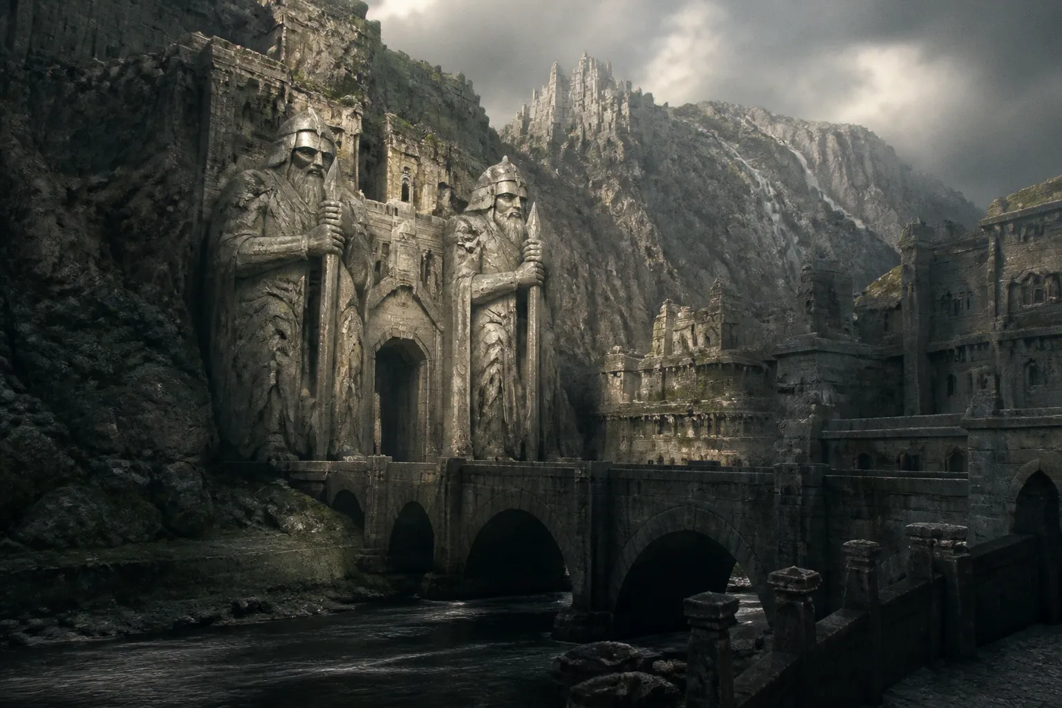
For TCG artists and portfolio watchers, the useful part is not simply that Middle-earth is returning to the card frame: it is a clear look at the design problem a licensed fantasy set must solve before the art brief ever reaches an illustrator. A beloved world can have enormous visual range and still need every card to earn its place.
A smaller story still needs a full game set
Rosewater’s accompanying Vision Design article explains the central constraint: The Hobbit is a far more compact, playful tale than The Lord of the Rings, yet it has to support a draftable Magic release. That changes the creative job considerably. A card set needs a large supply of distinct concepts—especially creatures, which make up more than half of a typical Magic set.
For artists, this is the bit worth underlining in your own portfolio. “Fantasy” is not a brief. A client needs readable, differentiated visual hooks that can survive a small crop, sit inside a frame, and communicate quickly across a table. The strongest character or creature concept is not always the most ornate one; it is often the one with the cleanest silhouette, clearest action, and most immediate story beat.
Rosewater describes returning to Tolkien’s text and identifying people and animals that could become creature cards. The team also found short phrases written by Tolkien that could serve as distinctive card names, leading to names such as Little Bear, Ordinary Bear, Large Bear, and Gigantic Big Bear. That is a nice reminder that specificity can start in the words—but the image must do the heavy lifting once the card is in a player’s hand.
Design structure becomes an art-direction constraint
The official design account also says that The Hobbit was conceived as a draftable “medium-sized” set, a format Magic had already used for other Universes Beyond releases. Medium-sized sets support five draft archetypes rather than the ten two-colour archetypes typical of larger sets. The number five had an obvious thematic connection to “The Battle of Five Armies.”
This is the practical lesson I’d take to a portfolio review: art direction is rarely a collection of isolated cool paintings. It is a system. Your dragon, your travelling company, your woodland encounter, your battlefield vignette—they need to feel individually memorable while helping a larger visual programme read as one world.
When you are building sample work for card games, show that you understand both sides. Include the high-impact “hero shot,” certainly, but also demonstrate that you can design supporting creatures, quieter narrative moments, and assets with enough visual identity to carry a card name. A gorgeous oil-style finish is valuable; a concept that remains legible at card size is more valuable still.
What to watch in the art drop
The interview reportedly covers the team’s approach to iconic characters, memorable moments, and the themes of The Hobbit. Rosewater’s Vision Design piece adds the more useful production lens: the designers had already avoided representing Hobbit material in The Lord of the Rings: Tales of Middle-earth, leaving room for a later return to that part of Tolkien’s world.
That restraint matters. It suggests a deliberate attempt to give the new set its own pool of ideas rather than treating Middle-earth as one undifferentiated library of references. When the card art appears, look for how that separation is handled: which parts of the book become creature-focused images, how playful fairy-tale texture is balanced against Magic’s established visual language, and whether the set’s recurring concepts create a coherent rhythm rather than a string of famous scenes.
For your portfolio, that is the benchmark. Don’t just paint the recognisable moment. Show a client you can build the connective tissue around it—the creatures, props, locations, and visual motifs that make an entire release feel designed.