Retro-futurism art: choosing the right subgenre for your project
When a client brief lands in your inbox saying “retro-futurism” and nothing else, you already have a problem. The phrase is doing too much work.
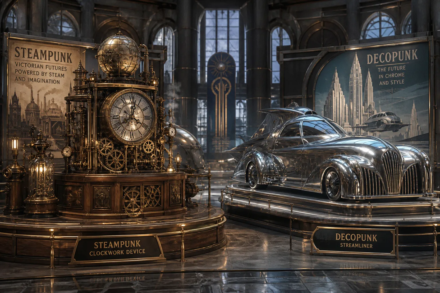
Retrofuturism is not one style with a few interchangeable accessories; it is an umbrella for distinct visual languages, rooted in different historical periods and carrying very different ideas about technology. Treat them as the same thing and the artwork will feel generic at best, wrong at worst.
Compare car rental deals in United Kingdom
See available offersPartner link — DiscoverCars comparisonHere is what artists tend to learn after a few painful revisions: choosing the subgenre is not a finishing detail. It is the load-bearing decision. It determines silhouettes, props, palette, surface treatment, the typeface on a title card, and the emotional contract of the image. Get the era and attitude right, and the rest of the illustration begins to organize itself. Get them wrong, and you will spend the whole commission trying to decorate your way out of a bad premise.
I have watched otherwise strong portfolio pieces get quietly passed over because an artist put a dieselpunk gunner in a Victorian frock coat, or gave a clockpunk inventor the goggles and copper piping of a London airship captain. One anachronism can tell an art director that the reference work stopped at a mood board.
The useful version of a retro futurism art styles comparison is not a catalogue of cool objects. It is a way of seeing what each style believes technology is for: spectacle, conquest, comfort, control, escape, or dread.
The Victorian Roots: Steampunk and Clockpunk Mechanics
Steampunk is where most artists start, and for good reason. It is the most immediately legible branch of retrofuturism: brass, rivets, exposed gears, steam plumes, frock coats, goggles, airships. But the working detail that matters is the Victorian part. Steampunk draws its visual charge from the Victorian era, from 1837 to 1901, when industrial progress arrived with soot under its fingernails and social ritual still dictated the silhouette.
The clothing is not merely “old-fashioned.” It is specific: corsets, waistcoats, top hats, lace cuffs, mourning black, military tailoring, mutton-chop sideburns. The machinery is not merely analog. It is analog as imagined through a 19th-century industrial lens: coal-fired boilers, pressure gauges, leather drive belts, brass valve wheels, heavy glass, cast iron, dirigibles held together by leather strapping and engineering confidence.
If a brief mentions Victorian society, gothic London, colonial adventure, Jules Verne, gaslight, or an empire trying to mechanize the impossible, you are in steampunk territory. Its best work has romance and grime in equal measure. The machine may be magnificent, but someone still has to shovel coal into it.
Clockpunk is not steampunk’s contemporary opposite, even though the two are often paired in casual conversation. They are historically separate subgenres. Clockpunk reaches back to the Renaissance and Baroque periods, broadly the 15th through 18th centuries, and imagines sophisticated mechanisms before industrialization remade the world.
That shift changes everything. Clockpunk technology is built from wood, iron, hand-worked brass, parchment diagrams, articulated joints, waterwheels, astronomical instruments, and intricate gear trains. Its reference points are Leonardo da Vinci’s mechanical sketches, orreries, automata, cathedral clocks, cabinetmaking, alchemy, and courtly patronage. It feels less like a factory and more like a workshop attached to a palace, observatory, monastery, or siege camp.
A clockpunk machine should look designed by a person who understands geometry, craft, and celestial order—not mass production. Its gears can be exposed, but they should feel assembled by hand. Its ornament may be lavish, but it belongs to carved wood, gilded metal, painted panels, and heraldic symbolism rather than Victorian industrial trim.
The mistake I see over and over in young portfolios is dressing clockpunk characters in Victorian frock coats and then adding a few ornate cogs to justify it. That one decision collapses two very different historical imaginations into “old stuff with gears.” Keep the silhouette period-correct. A clockpunk scholar should look as if they stepped out of a Tintoretto painting, not a Sherlock Holmes convention.
Steampunk asks what the Victorian machine age might have become. Clockpunk asks what invention looked like before the machine age arrived.
Interwar Grit: Defining the Dieselpunk and Decopunk Divide
Dieselpunk is where the mood gets heavier. Its visual territory sits around the early-to-mid 20th century: internal combustion, diesel engines, propeller aircraft, radios, mechanized warfare, industrial cities, and the confidence of modernity curdling into exhaustion. In a steampunk image, the machine is often a marvel. In dieselpunk, it is usually a tool that has already seen too much.
The aesthetic is heavier than steampunk in every sense. Riveted steel plate replaces polished brass. Leather trench coats replace lace. Soot, oil, rain, concrete, and military canvas replace filigree. Dieselpunk surfaces are worn because they have been used, repaired, field-tested, and used again. They are functional before they are beautiful.
The signature props are diesel-electric submarines, armored transports, zeppelin-styled bombers, Bakelite radios, machine shops crowded with wrenches, field telephones, flight goggles, and greatcoats that seem permanently damp. The lighting tends toward low, hard contrast: searchlights through fog, a single bulb in a hangar, pale daylight on wet steel. Characters are tired, suspicious, and competent. This is not a future anyone is enjoying.
Decopunk works with some of the same broad historical material, but it has a different relationship to it. Where dieselpunk is the battlefield, decopunk is the cocktail lounge, the ocean liner, the grand hotel, the nightclub above the city. It takes the streamlined geometry of Art Deco—sunbursts, chevrons, ziggurats, stepped facades, chrome, black lacquer, symmetry—and makes modernity look expensive.
The machines may still be enormous and engine-driven, but they are dressed for a gala. A decopunk aircraft has a polished nose cone. A decopunk laboratory has mirrored floors, graphic murals, and lamps that look like sculpture. Even menace arrives in a tailored suit.
For a commissioning editor, the distinction is blunt and useful: dieselpunk sells danger, compromise, and industrial pressure. Decopunk sells glamour, velocity, and pulp-scale ambition. They overlap in historical references, but their surfaces and social worlds are different. One smells of fuel and wet wool; the other smells of cigarette smoke, perfume, and hot electrical wiring.
| Subgenre | Historical pull | Material palette | Emotional temperature | Useful reference hooks |
|---|---|---|---|---|
| Steampunk | Victorian era | Brass, copper, leather, glass, steam | Romantic, theatrical, ornamental | Airships, gaslight, industrial invention |
| Clockpunk | Renaissance and Baroque worlds | Wood, iron, hand-worked brass, parchment | Scholarly, mystical, pre-industrial | Orreries, automata, anatomy sketches, court workshops |
| Dieselpunk | Interwar and wartime modernity | Steel, rivets, leather, soot, canvas | Gritty, militarized, exhausted | Submarines, prop planes, factories, field radios |
| Decopunk | Art Deco modernity | Chrome, lacquer, marble, geometric tile | Glamorous, streamlined, adventurous | Ocean liners, grand hotels, ziggurat skylines |
| Atompunk | Atomic-age domestic futurism | Aluminum, Bakelite, atomic motifs, vinyl | Cheerful on the surface, anxious underneath | Fallout shelters, Googie signage, suburban science |
| Raygun Gothic | Mid-century space fantasy | Polished metal, fins, rocket tubes, colored glass | Bright, exploratory, theatrical | Rayguns, domed cities, planets, serial adventure |
| Cassette futurism | Late analog modernity | Plastic, beige metal, CRT glass, switches | Institutional, tense, lived-in | Server racks, flight decks, tape media, corporate corridors |
The Atomic Age: Atompunk, Raygun Gothic, and the Transistor-Free Future
The post-war decades are often treated as one clean slab of “mid-century future,” but that shortcut loses the emotional difference that makes the work interesting. Atompunk and Raygun Gothic can share atomic symbols, rocket shapes, aluminum furniture, and impossible appliances. What separates them is not simply a prop list. It is the feeling that sits behind the clean lines.
Atompunk is the uneasy one. It imagines a world still intoxicated by atomic power, consumer abundance, aerospace ambition, and the promise that science will solve every domestic inconvenience. But the shadow is always present: fallout shelter signs, civil-defense diagrams, ominous reactors, smiling families beneath a sky that does not feel entirely safe.
Its visual language is mid-century futurism filtered through Cold War nerves. Googie architecture with its upturned rooflines and boomerang shapes. Atomic symbols on household appliances. Bright appliance colors, clean kitchens, exaggerated tailfins, and public buildings that look prepared to receive visitors from the moon. The mood is sincere, but jittery. People in atompunk art are often smiling because the culture demands optimism, not because the image is actually calm.
The palette can be saturated and cheerful—turquoise, coral, butter yellow, mint—yet a hard shadow, black outline, warning stripe, or distant plume can turn the scene. That tension is the point. Atompunk should never become merely “cute 1950s.” It needs the sense that technological abundance has become a kind of pressure.
Raygun Gothic, sometimes shortened to raypunk, takes a different route through the same broad visual period. It is less interested in domestic anxiety and more interested in adventure. The rockets are sleek and bright. The rayguns are silver, improbable, and clean. The planets are waiting to be visited. The future has no reason to apologize for being theatrical.
Think chrome helmets, bubble domes, finned spacecraft, impossible planetary horizons, colored starfields, and control panels that look more decorative than practical. Raygun Gothic is the future as vintage science-fiction serials and magazine covers wanted it to be: a place where courage, curiosity, and a good silhouette can carry you across the galaxy.
The practical distinction in a cyberpunk vs atompunk aesthetic conversation is often misunderstood because both can involve technological anxiety. Cyberpunk is dense, networked, corporate, neon-lit, and socially fractured. Atompunk is cleaner, more domestic, more public-facing, and haunted by the atomic household. Its menace is not hidden inside code. It is printed on a cheerful poster above the family bunker.
If your client wants menace under a polished suburban smile, go atompunk. If they want wonder, space adventure, and unapologetic retro spectacle, go Raygun Gothic. The same “retro rocket ship” prompt can produce two entirely different images depending on which emotional decision you make first.
Analog Nostalgia: The Visual Language of Cassette Futurism
Cassette futurism is the youngest major branch in this lineup, and it has been quietly dominating game and film concept art because it understands something digital design often forgets: interfaces have weight.
This is the late-analog future of CRT monitors, physical toggle switches, blinking LED arrays, cassette tapes, floppy disks, chunky keyboards, dot-matrix printouts, and long fluorescent corridors. Technology is visible because it has to be touched. It occupies rooms. It makes noise. It needs maintenance. A computer is not a seamless black slab; it is a cabinet with vents, warning labels, cables, and a screen that throws green or amber light onto someone’s tired face.
Cassette futurism is often called retro-futuristic, but it is not really nostalgic in a soft-focus sense. Its strongest work is institutional. It belongs to government labs, corporate research stations, cargo ships, military facilities, space freighters, sealed offices, and bureaucracies that have bought too much equipment and documented none of it properly.
The visual signature is density without elegance: cable bundles, heavy doors, intercoms, plastic housings yellowed by age, industrial carpet, printer paper, equipment carts, and panels full of controls that imply a procedure nobody has time to explain. Unlike atompunk, which sells a bright public fantasy of progress, cassette futurism is suspicious of progress. The technology works, perhaps. It does not comfort. It monitors, delays, records, and occasionally locks the door.
That is why the subgenre works so well for horror, tactical science fiction, and narratives about systems larger than the people inside them. The most important design choice is not “add a CRT.” It is giving every object a job. A cassette deck needs a reason to exist. A wall panel needs a maintenance history. A flight suit zipper should belong to a suit built for cramped work, not a generic science-fiction jumpsuit with a retro patch stuck on afterward.
If the brief asks for a government lab, retro tech noir, industrial science fiction, a corporate orbital station, or old-school tactical tension, cassette futurism is probably the right lane. Research actual period equipment before you draw. Artists who rely on memory usually get the scale wrong: monitors too thin, buttons too clean, cables too decorative, control rooms too spacious. The chunkiness is not background flavor. It is the story.
In cassette futurism, the machine should look like someone has to repair it at 3 a.m.
Strategic Selection: Matching Subgenre Motifs to Narrative Tone
Choosing a retro sci fi art style is easier once you stop treating subgenres as a costume rack. The question is not whether your character looks better with goggles, a raygun, or a chunky headset. The question is what kind of world produced those objects.
When I review a brief or a portfolio piece, I start with three questions.
1. What historical imagination is doing the work?
Start with the period, not the accessory. Victorian industrial fantasy points toward steampunk. Renaissance invention points toward clockpunk. Interwar machinery suggests dieselpunk or decopunk. Atomic-age optimism and anxiety lead toward atompunk or Raygun Gothic. Late analog bureaucracy belongs to cassette futurism. These categories are not all paired by era: steampunk and clockpunk are a stylistic contrast across separate historical foundations, while dieselpunk and decopunk draw more directly from overlapping early-20th-century territory.
2. What is the emotional temperature?
Romantic and ornate, or austere and scholarly? Gritty and functional, or glamorous and streamlined? Anxious beneath a cheerful surface, or openly thrilled by the cosmic unknown? This is where the visual language gains conviction. A dieselpunk hanger can share metal, engines, and period tailoring with a decopunk terminal, but the light, cleanliness, composition, and posture of the figures should tell radically different stories.
3. What is the narrative prop?
Find the object carrying the scene: an airship boiler, an orrery, a submarine hatch, a chrome lounge car, a fallout shelter sign, a raygun, a cassette terminal. That object is not set dressing. It is your evidence. If you render it credibly—with the right materials, ergonomics, wear, and relationship to the person using it—the rest of the scene has somewhere solid to stand.
A fourth question is worth adding when the work is for cards, covers, or game assets: what must read at thumbnail size? A trading card does not have room for a dissertation on industrial history. It needs a silhouette and a prop that declare the subgenre before the viewer zooms in. A pointed airship gondola, a Deco sunburst doorway, a squat CRT command station, or a gleaming bubble helmet can do more work than fifty scattered gears.
The temptation is to mix everything because the internet has trained us to call any brass-and-neon image “retro-futurist.” Hybridization can work, but it needs a deliberate hierarchy. If you are making dieselpunk with Art Deco influence, decide which one owns the world and which one appears as aspiration. If you are making atompunk with cassette-futurist hardware, decide whether the clean atomic fantasy has decayed into bureaucracy or whether the analog machinery belongs to a specific institution. Without that decision, the piece becomes a costume party.
The subgenre is not a costume you throw on at the end. It is the bones of the piece. Build the bones first, and the artwork stops fighting the brief.
What I tell artists still finding their footing in speculative work is simple: learn one corner deeply before branching out. A portfolio that confidently renders dieselpunk interiors, understands where the soot collects, and knows why its radio equipment occupies space will get more attention than a portfolio that dabbles equally in five retro-futurist aesthetics.
Depth shows. Dabbling shows faster.
When I commission a piece for a TCG, I am not looking for an artist who can vaguely “do retrofuturism.” I am looking for the artist who has obsessed over a particular visual logic and can make one image feel like it belongs to a world with rules. The card may show only a pilot, a machine, and a sliver of sky. That is enough—if every choice agrees about what future it is pretending to remember.
The appetite for these styles has not gone away because they offer more than nostalgia. They give artists a visual argument about progress. Steampunk makes invention tactile and romantic. Clockpunk makes it sacred and hand-built. Dieselpunk makes it brutal. Decopunk makes it seductive. Atompunk smiles through the alarm. Raygun Gothic points toward the stars. Cassette futurism makes you fill out a form before opening the airlock.
Read the brief. Pin the historical imagination. Choose the emotional temperature. Then build the machine, the room, or the character as if that world had to function after the illustration ends.