Steampunk book covers: photobashing or digital art?
Let's kill the romance right now. Most steampunk book covers on the market are not painted from a blank canvas with a single brush. They are assembled.
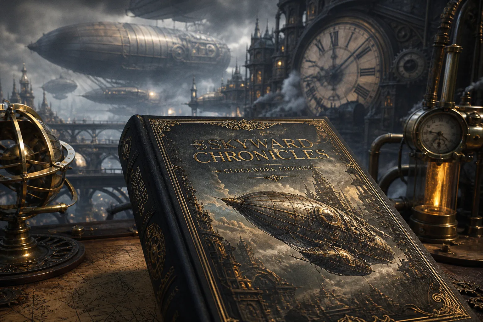
The cog, the brass pipe, the rivet on the airship's hull, the corset stitching on the heroine's bodice — half of it was already a photograph or a 3D asset before a stylus ever touched a Wacom. Pretending otherwise is a fantasy more elaborate than anything on the cover.
The real question isn't "photobashing versus digital painting" as some moral binary. The real question is how a working illustrator manages the mechanical density of steampunk — the gears, the gauges, the Victorian overload — without burning three weeks on a single brass valve and missing the deadline. Photobashing and digital painting are not rivals. They are two gears in the same machine. The mistake is thinking you get to pick one.
What follows is the honest map: where the hybrid workflow came from, what it actually does, why the painter's hand is still non-negotiable, and where the money gets lost when production gets sloppy. For a closer look at a working illustrator's portfolio built around this kind of speculative fiction work, the Craig Maher portfolio is a useful reference point — oil technique married to fantasy machinery, no fluff.
The Mechanical Complexity of Steampunk Illustration
Steampunk is, by genre definition, an engineering problem wearing a corset. Every panel asks for rivets, pistons, gauges, valves, leather strapping, soot, scratched brass, and some poor sod holding a wrench in the rain. The mechanical density is the point. It is also the bottleneck.
A pure digital painting approach treats each of those elements as a brushstroke decision. You sketch the airship. You block in the hull. You now spend four hours rendering one rivet pattern because the client specified "more industrial." Multiply that across every brass fitting on a Victorian-era warship, and you either raise your day rate into orbit or you miss the ship date. There is no third option.
This is why the cover market for steampunk skews toward assembly. Stock assets exist for a reason — clockwork textures, corsetry references, antique maps, industrial interiors. They are pre-rendered reality. A skilled illustrator can drop a stock brass fixture into a painting, integrate the lighting, and save the three hours it would have taken to paint that fixture from scratch. Multiply those three hours across thirty fixtures and you have reclaimed a working week. That reclaimed week is the difference between a profitable commission and a burnout.
Photobashing is not a shortcut. It is a workflow that respects the deadline as much as the canvas.
The cynical truth: the romantic notion of the lone illustrator summoning a steampunk cityscape from pure imagination is a marketing image. The actual job is industrial. You build the image the way a watchmaker builds a movement — one part at a time, sourcing what works, finishing what needs the hand.
Defining the Hybrid Workflow: Photobashing and 3D Blockouts
Strip the jargon away. The hybrid workflow is three layers stacked on top of each other.
The bottom layer is the structural blockout. For most working illustrators in this genre, that means Blender, 3DS Max, or whatever 3D tool they can muscle into their pipeline. The blockout is not there to look pretty. It is there to lock down perspective, camera angle, and the placement of major mechanical masses — the airship's silhouette, the placement of a character's arm against a gear wall, the depth of a cobblestone alley. Perspective is the first thing that breaks when you try to wing it in 2D. A 90-minute concept sketch in 3D prevents three days of redrawing because the cog doesn't line up with the gun barrel.
The middle layer is photobashing. Stock photos, 3D asset libraries, kitbash kits, kit-bashed geometry, and the illustrator's own reference library get composited in Photoshop. The point of photobashing is not to make a collage that looks like a collage. The point is to break the underlying structure of the source images so thoroughly that no one can identify what was a photograph and what was painted. The values, the colors, the details — they are already inside the photo. The illustrator's job is to redirect them.
The top layer is digital painting. This is where the hand comes back. Edges get softened. Color gets unified under an atmospheric lighting pass. Brushwork lays in the smoke, the steam, the rim light on a polished valve. The painter integrates, shapes focal hierarchy, and stamps the final image with a voice that no stock library can provide.
| Pipeline Layer | Primary Tool | What It Solves | Time Investment |
|---|---|---|---|
| Structural blockout | Blender / 3DS Max | Perspective, composition, mass placement | Hours, not days |
| Photobash composite | Photoshop + stock assets / kitbash kits | Mechanical density, texture realism | Bulk of the working hours |
| Digital painting pass | Photoshop / Procreate | Edge control, lighting unity, focal hierarchy | Cleanup and finishing |
That third row is where most amateur photobashers fail. They stop at the composite. The image looks like a Frankenstein's monster of stock parts glued together with a low-opacity brush. A professional cover treats the painting pass as the soul of the piece — the thing that holds the composite together and sells the illusion.
Why Digital Painting Remains the Soul of the Composition
Photobashing without painting is a mood board. Painting without photobashing is a time sink. The reason hybrid workflow wins in this genre is that steampunk illustration demands two opposing skills at once: the photorealistic detail of a mechanical object and the atmospheric mood of a living scene.
Stock photography delivers photorealistic detail cheaply. A reference photo of a real brass pressure gauge already contains the values, the highlights, the micro-texture of oxidation. To paint that from scratch is to reinvent the photograph by hand. Some illustrators do. Most do not, and they are not being lazy — they are being realistic about hours billed.
What photography cannot deliver is atmosphere. Stock images are lit for stock photography, not for the specific key light of a steampunk dirigible at dusk. They have edges that are too crisp, contrast that is too even, color temperatures that don't match the scene. This is where the digital painting pass earns its keep. The painter pushes light direction. They unify color temperature across composite layers. They soften edges where two stocks meet. They add the brushwork that makes the smoke feel like smoke and not like a cutout of smoke.
Digital painting is not the opposite of photobashing. It is the glue that makes the composite read as a single world.
Edge control is the unsung skill here. A photobashed image full of hard-edged stock parts feels brittle, like cut paper. The painter's brush breaks those edges — selective blur, repainted transitions, lost-and-found edges where the focal hierarchy demands attention. The focal point of a steampunk cover is rarely the most detailed object. It is the object with the most deliberate edge work. The painter decides that.
Brushwork is the signature. Two illustrators can photobash from the same stock library and produce radically different covers because their painting passes diverge. The way the smoke curls, the grain on the leather strap, the drag of the brush across the sky — these are the things no stock library supplies. They are the things the client is actually buying when they hire an illustrator instead of licensing a stock image outright.
Managing Production Costs and Revision Cycles
Here is where the romantic image of illustration meets the spreadsheet. Steampunk covers are expensive. They are expensive because they are mechanically dense, and mechanical density means more assets, more licensing, more working hours, and a revision cycle that punishes structural changes.
A typical base package for a steampunk book cover includes one to three revision rounds. That is the industry norm, and it is a tight window. What most clients do not understand is that revisions in this genre are not all equal. A color correction is a fifteen-minute job. A lighting pass adjustment is a half-day. Asking the illustrator to "move that mechanical arm to the other side" or "swap the city composition from London to a floating fortress" is a structural change. That is a new illustration wearing the old one's clothes. Most illustrators charge $25 to $100 or more per additional revision round precisely because late-stage revisions on mechanically dense work eat hours.
Photobashing helps here in two ways. First, it gets the structural blockout locked early — 3D blockouts mean the camera angle and mass placement are validated before any painting begins, which reduces the chance of a client asking for a full recomposition at the end. Second, because so much of the detail is sourced from existing assets rather than hand-painted, an isolated revision — say, the client wants the heroine's corset swapped for a different style — is contained to a smaller area of the canvas. The painter doesn't have to redo a fully rendered asset from scratch.
The hidden budget killer in steampunk covers is asset licensing. Stock images are not free, and high-resolution industrial interiors, antique maps, and clockwork textures command their own prices. A cover that looks like a single painting may have absorbed licensing fees from a dozen sources. When you hire a steampunk illustrator, you are not just paying for brushwork. You are paying for the workflow that assembled the image, the licensing that backed it, and the painting that hid the seams.
Balancing Efficiency with Artistic Integrity
The cynical view of photobashing — that it is cheating, that it produces soulless covers, that real illustrators paint everything from scratch — is a fantasy held by people who have never tried to deliver a steampunk cover on a two-week deadline. The professional view is colder and more useful. Photobashing is a workflow. It is neither honest nor dishonest. It is efficient.
The artistic integrity of a steampunk cover lives in three places: the compositional decision, the lighting design, and the painting pass. None of these come from a stock library. The blockout — whether done in 3D or in rough 2D — is the illustrator's compositional choice. The atmospheric lighting pass is the illustrator's design sense applied across the entire image. The final brushwork is the illustrator's signature.
What the illustrator owes the client is not a one-hundred-percent hand-painted canvas. What the illustrator owes the client is a cover that reads as a single world, lit with intention, anchored by a clear focal hierarchy, and finished with an edge that no stock library can fake. Photobashing is how working illustrators hit that bar without collapsing the timeline. Digital painting is how they make sure no one can see the seams.
The market doesn't reward purity. It rewards covers that arrive on time and look like a single artist's vision.
For illustrators working in speculative fiction — steampunk, dieselpunk, sci-fi, dark fantasy — the lesson is the same. Build a workflow that respects the genre's mechanical density. Source what can be sourced. Paint what must be painted. Lock perspective with a 3D blockout before the first brushstroke. Reserve the hand for the things that make the image yours.
The cover that wins on the shelf is not the cover that was painted entirely from imagination. It is the cover where every gear, every rivet, every wisp of coal smoke was placed with intent, lit with design sense, and finished with the kind of brushwork no stock library can replicate. Photobashing gets you halfway there. Digital painting gets you the rest of the way. Pick the workflow. Don't pick a side.