Digital painting vs traditional media for fantasy book covers
A fantasy cover can be beautifully painted and still fail the brief the moment it is reduced to thumbnail size.
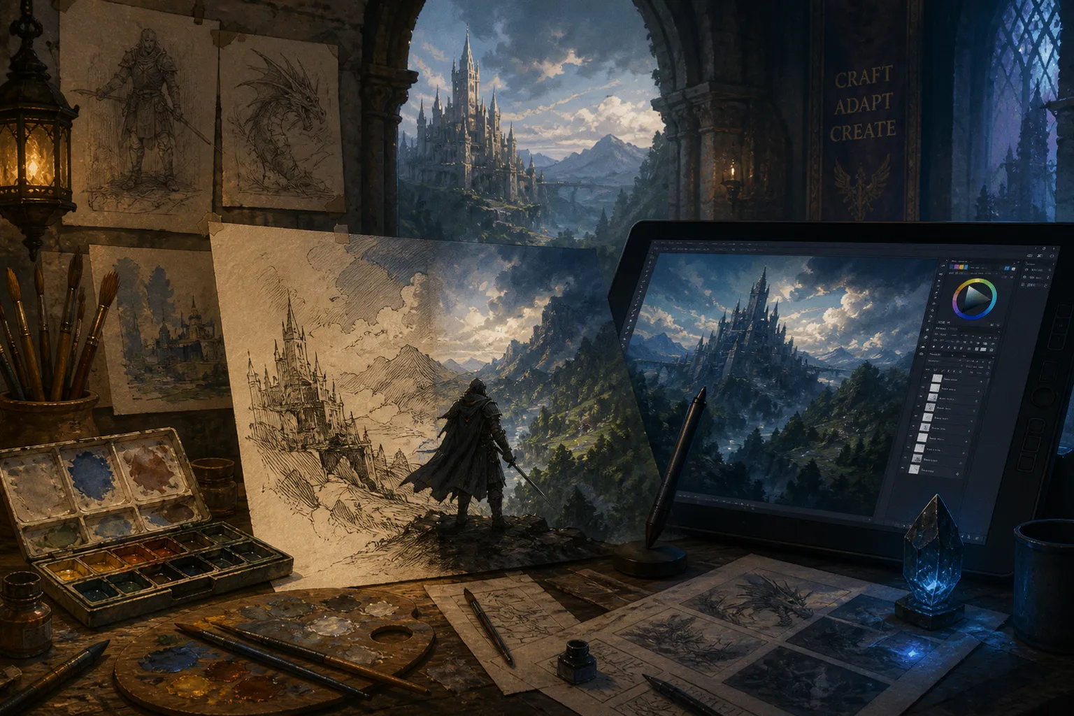
I have seen subtle oil glazing disappear, carefully drawn costume details turn into visual noise, and a wonderfully atmospheric digital painting lose all its impact because the focal point never develops enough pop.
Compare car rental deals in United Kingdom
See available offersPartner link — DiscoverCars comparisonThat is the real question behind digital painting vs traditional media for fantasy book covers. It is not simply which medium looks more impressive on a studio wall. It is which process gives you the right combination of readability, mood, revision flexibility, texture, delivery format, and production control for the cover in front of you.
If you are an illustrator building your portfolio, or an art director reviewing one, start there. Medium is a production decision and an aesthetic decision at the same time. It should serve the image, the brief, and the way the artwork will actually be used.
The medium changed; the cover problem did not
Fantasy illustration has always adapted to the tools available. Woodcut printing entered book illustration as early as the 15th century, bringing bold silhouettes and simplified value structures to a medium that could not reproduce every subtle surface effect. From roughly 1880 to 1920, watercolor and pen became closely associated with the Golden Age of children’s illustration, offering delicacy, line, and color atmosphere within the limits of print production.
Digital tools entered professional illustration in the 1990s and became mainstream during the 2010s. Photoshop, Procreate, Clip Studio Paint, and pressure-sensitive tablets changed the pace of the work, but they did not remove the fundamental demands of a successful cover:
- The image must read at a small size.
- The subject must have a clear silhouette.
- The focal point must survive typography and cropping.
- The value structure must support the title and author name.
- The mood must match the book rather than merely advertise the artist’s technique.
- The final file must be usable by a designer, publisher, or production team.
Those requirements apply whether you are working in oil on canvas, gouache on board, watercolor on paper, or a digital painting built from hundreds of layers.
The mistake I see most often in portfolios is treating visible labor as the same thing as visual communication. A cover with beautiful brushwork is not automatically a good cover. A digital painting with immaculate rendering is not automatically a good cover either. The viewer usually encounters the image first as a small rectangle, often beside other covers, sometimes on a retailer page where it competes with interface elements and poor viewing conditions.
Your medium needs to help the image make its first sentence clearly.
A cover is not judged at the size you painted it. It is judged at the size the reader encounters it.
Digital painting: speed, control, and the advantage of revision
Digital painting is particularly strong when the brief is still moving. That is common in publishing. A publisher may want the protagonist shifted to the left to make room for type, the dragon’s head turned toward the title, the sky opened up, the weapon removed, or the palette pushed from warm heroic fantasy into colder dark fantasy.
With a digital workflow, those changes can often be handled without rebuilding the entire image. Undo and redo commands, separate layers, layer adjustments, masks, transformed elements, and broad color controls make revision considerably more flexible than in most traditional processes. You can test several compositions, try alternate atmospheric effects, or change the value of a background without scraping paint from a physical surface.
That does not mean every digital change is easy. A badly designed file can become a swamp of unnamed layers and contradictory edits. If your perspective is wrong, no blend mode will rescue it. If the silhouette is weak, adding texture will only make the weakness more expensive to correct.
Still, digital painting gives you a powerful advantage: you can make decisions in sequence rather than committing every decision at once.
A practical digital workflow might allow you to separate:
1. The composition block-in, where you establish the major shapes and negative space.
2. The value structure, so the focal point can be tested in grayscale.
3. The character or creature group, kept distinct from the environment.
4. Lighting and atmosphere, which can be adjusted without repainting every local color.
5. Typography-safe areas, preserved for the designer from the beginning.
6. Final effects and texture, added only after the image already reads clearly.
That structure is not glamorous, but it is what makes a professional art drop manageable. Art directors do not need to see a heroic number of layers. They need confidence that reasonable changes will not cause the file to collapse.
Digital painting is also well suited to portfolios because one project can demonstrate several commercial skills at once. Show the final cover, but consider including a small selection of development images: thumbnail composition, grayscale value study, a color pass, and the final type-safe version. This gives the reviewer evidence that you can think beyond surface rendering.
Where digital work starts to fail
The common failure is not that digital art looks digital. The common failure is that it looks unfinished at the level of design while appearing finished at the level of polish.
Soft brushes can smooth every edge until the image loses structure. Airbrushed gradients can create a pleasant atmosphere without giving the armor, architecture, or creature anatomy convincing planes. A wide color palette can lead to too many competing accents. Layer flexibility can encourage you to postpone decisions that should have been made in the thumbnail stage.
Digital painting also makes it easy to keep adding. More sparks, more mist, more runes, more reflected light, more texture. Fantasy art invites this kind of accumulation, especially when the subject includes magic, elaborate costume, or a crowded environment. But every added mark needs to support the hierarchy. If everything glows, nothing glows.
When I review a digital fantasy portfolio, I look for control over edges and values before I look for rendering complexity. I want to know whether you can make one face, weapon, or creature readable without outlining every part of it. I want to see whether your atmospheric perspective creates depth rather than hiding weak construction. I want to see whether the image still works when the tiny details disappear.
Traditional media: physical texture and committed decisions
Traditional media brings a different kind of authority to a fantasy cover. Oil, watercolor, gouache, and pen and ink produce marks through physical contact with a surface. The tooth of paper, the drag of a dry brush, the transparency of a wash, the irregular edge of a pigment, and the pressure of a nib all leave evidence of process.
That evidence can be a major part of the image’s appeal. A traditional fantasy cover may have a tactile presence that is immediately legible in reproduction. It can feel made rather than generated, even though the final cover will eventually be scanned, photographed, color-managed, and placed into a digital publishing workflow.
Oil is especially useful when you need rich transitions, layered color, and a sense of material depth. Its glazing potential can create luminous skin, atmospheric skies, or old-world surfaces that are difficult to imitate convincingly through rushed digital effects. Watercolor can bring transparency and controlled accidents. Gouache gives you more opacity and graphic strength. Pen and ink can provide a decisive silhouette language and structural shadow placement that remains effective when the cover is reduced.
The trade-off is commitment. A traditional painting does not offer unlimited revision flexibility. You can repaint, scrape, lift, glaze, mask, crop, or alter the scan, but each intervention changes the physical object. If an art director asks for a completely different pose late in the process, the original painting may not be the right place to solve that problem.
That is why traditional artists often need to spend more time on the brief, thumbnails, reference, and value studies before beginning the final. The medium rewards preparation. A strong underdrawing can prevent hours of painful correction. A clear shape plan can protect the focal point from being buried under decorative brushwork.
For your portfolio, this preparation matters. If you only show the final scan, the reviewer can see the finish but not necessarily the discipline behind it. A few process images can demonstrate that the traditional surface is supported by commercial thinking rather than used as a substitute for it.
The limits of physical texture
Texture is not a guarantee of readability. A canvas grain that looks beautiful at full resolution may become a gray haze in a thumbnail. Fine watercolor detail can disappear. A delicate oil passage can flatten under reproduction or be pushed behind title typography.
Traditional artists sometimes assume that the physical original will carry the image. It will not. The cover is still being evaluated as a reproduction. The scan or photograph becomes part of the production chain, and that introduces its own concerns: color accuracy, lighting, surface glare, resolution, cleanup, and file preparation.
A traditional portfolio should therefore include images that show both the object and the intended use. If you are presenting a painted book cover, show the artwork in a cover context or at least in a scaled-down presentation. Let the reviewer see whether the texture supports the image at practical size.
The strongest traditional work does not rely on texture to create interest. Texture deepens an already clear design.
Digital painting versus traditional media at a glance
The best choice depends on the brief, but the contrast becomes easier to see when you separate the workflow from the final look.
| Parameter | Digital painting | Traditional media |
|---|---|---|
| Revision flexibility | High. Layers, masks, adjustments, and undo functions make composition and color changes easier to test. | Limited. Revisions are possible, but major changes may require repainting or solving the issue during scanning and editing. |
| Production speed | Often faster for complex revisions, alternate versions, and art-direction changes. | Can be efficient when the artist has a decisive process, but physical drying, repainting, and scanning add constraints. |
| Surface character | Can be highly controlled and can imitate canvas, paper, watercolor, or brush textures through software and custom brushes. | Texture is physically embedded in the mark-making and surface, producing an original artifact. |
| Small-size readability | Easy to test throughout the process and adjust through value, silhouette, and edge control. | Must be planned carefully, then checked through scans, photographs, and scaled reproductions. |
| Color changes | Broad palettes and non-destructive adjustments make experimentation straightforward. | Color decisions are more committed; later changes may alter the physical surface or require digital correction. |
| Physical original | No physical original unless the artist creates a printed or painted companion piece. | Produces a tangible artwork that may have value beyond the published cover. |
| File delivery | Usually integrates directly into digital publishing and design workflows. | Requires accurate scanning or photography and a careful transition into a digital production file. |
| Portfolio evidence | Can show layers, passes, and alternate compositions, but should avoid looking like a software demonstration. | Can show the original surface, process studies, and the way physical texture survives reproduction. |
| Best commercial advantage | Adaptability when the brief, crop, type placement, or art direction may change. | Distinctive tactile character and a sense of material specificity. |
Neither column wins by default. An art director commissioning a cover for a series with strict character continuity may value digital control. A publisher looking for a singular, tactile image may respond more strongly to traditional media. A contemporary fantasy imprint may want both: a traditional-feeling finish with digital delivery and revision capacity.
Aesthetic markers: what the viewer can actually see
When people compare digital painting and traditional media, they often talk about texture first. Texture is visible, but it is not the only marker, and it is rarely the most important one.
Gradient transitions and hard structure
Digital painting often makes it easy to create gradual transitions and soft color gradients. That can be useful for skin, clouds, magical light, distant landscapes, and atmospheric depth. The danger is allowing every form to transition softly. Without enough hard or lost edges, the scene loses its architecture.
Traditional ink and line-based approaches tend to sculpt forms through simplified structural shadow placement. The artist decides where the shadow begins, what plane it describes, and which areas can remain quiet. This can make the image feel graphic and immediately readable, particularly in a small reproduction.
Oil can occupy a useful middle ground. It can produce gradual transitions, but the physical brush also encourages decisive shape-making. Gouache can move toward graphic clarity; watercolor can move toward transparent atmosphere. The material gives you tendencies, not rules.
The question to ask is not whether the work has soft transitions. Ask whether the transitions are strategically placed.
Silhouette and focal hierarchy
Fantasy covers frequently contain a central figure, a creature, a relic, a weapon, or a monumental structure. Whatever the subject, the silhouette has to carry the first read.
A strong silhouette does not mean a black cutout. It means the main mass can be understood before the viewer inspects its internal detail. The figure should not dissolve into the background because the rim light is too subtle. The dragon should not merge with the smoke because both were rendered at the same edge strength. The castle should not become a decorative strip when the title occupies the upper third.
This is where traditional and digital processes meet. You can paint a convincing silhouette in oil and destroy it with overworked edges. You can build a perfect digital silhouette and then bury it beneath effects. The medium is not making the decision for you.
I recommend testing your cover in at least three conditions:
- At the intended display size, where you can judge the first read.
- In grayscale, where value hierarchy becomes harder to ignore.
- With a rough title and author-name block, where you can see whether the composition has room to function as packaging.
You do not need a finished typographic treatment for this test. You do need to know whether the focal point survives the basic demands of a book cover.
The commercial finish is not the amount of detail you can add. It is the number of decisions that remain clear after the detail is gone.
Edge control and visual pop
In a digital painting, pressure sensitivity curves and screen rotation can help you imitate natural drawing movements on a display. With practice, a tablet can support expressive strokes, controlled tapering, and a more physical gesture. That is useful, but tools do not automatically create a traditional mark.
Likewise, a traditional medium does not automatically create visual pop. The image may have rich surface variation and still lack a clear light-dark pattern. It may be beautifully observed and still feel quiet beside other covers.
Pop usually comes from relationships:
- A lighter face against a darker surrounding shape.
- A sharp weapon edge against a softer atmospheric field.
- A saturated magical accent against restrained local color.
- A clean silhouette against broken background texture.
- A compact focal group surrounded by enough negative space.
These relationships can be achieved in any medium. Your job is to control them deliberately rather than hoping the material will supply them.
The hybrid workflow is not a compromise
Many modern fantasy illustrators combine traditional and digital methods because the two approaches solve different problems well. A pencil or watercolor sketch can establish gesture, composition, and accidental character. A digital finish can provide revision flexibility, clean delivery, alternate crops, and controlled atmospheric effects. Digital brushes can also mimic traditional textures, while a physical underpainting can prevent the image from becoming overly smooth.
A hybrid workflow might begin with:
1. Thumbnail sketches on paper, quickly testing silhouette and placement without getting distracted by finish.
2. A traditional character or environment study, allowing the artist to explore gesture, costume, or texture through physical marks.
3. A scanned composition, cleaned and arranged digitally for scale and typography.
4. Digital painting and corrections, including value control, perspective adjustments, and art-direction changes.
5. Selective texture integration, using the original marks where they genuinely improve the surface.
6. A final cover test, checking the image as a small, reproducible piece of publishing artwork.
The point is not to make the process sound more sophisticated. Hybrid work can become needlessly complicated if every medium is used simply because it is available. You should know what each stage is solving.
Use traditional media when it gives you a gesture, edge, texture, or color behavior that you want in the image. Use digital tools when they give you control, speed, or delivery options that the commission requires. If the traditional stage is invisible in the final work, that is not automatically a problem. The process is there to improve the result, not to perform authenticity for the viewer.
What art directors want from a hybrid portfolio
A hybrid portfolio needs to communicate clarity. If the reviewer cannot tell what you actually do, the extra process may work against you.
Show:
- The final cover at a useful scale.
- A close crop where the physical mark or texture is visible.
- A thumbnail or grayscale stage that demonstrates design control.
- A brief explanation of what was traditional and what was digital.
- Alternate crops or type-safe versions if the project involved them.
Keep the explanation practical. You do not need to defend one medium as more legitimate than another. Tell the reviewer what the process enabled: a more tactile surface, faster revisions, a stronger silhouette, cleaner typography space, or a better solution to the brief.
How to evaluate a portfolio when the medium is part of the question
If you are asking how to check digital painting vs traditional media for a fantasy book portfolio, do not begin by counting the visible brush marks. Begin with the communication problem.
I use a simple sequence when reviewing work:
1. Read the image before reading the technique
Look at the thumbnail. What do you notice first? Is that the intended subject? If the answer is a decorative texture, an isolated highlight, or an equally bright background element, the hierarchy needs work.
This test is fair to both digital and traditional artists. It strips away the prestige of the process and shows whether the composition performs.
2. Check the silhouette
Can you separate the main figure, creature, vehicle, or structure from its surroundings? Does the outline remain understandable without internal rendering? For science fiction and dieselpunk concept art, this may mean checking the shape of a machine or vehicle. For dark fantasy artwork, it may mean making sure a cloaked figure does not merge into an equally dark environment.
Silhouette is often the quickest route to stronger readability.
3. Reduce the image to values
Color can hide weak structure. A cover may appear dramatic because of a complex palette, but if the values are all clustered together, the focal point will struggle at small size.
Digital artists can test grayscale instantly. Traditional artists can photograph or scan the work and perform the same check. That is one of the places where the final production stage levels the playing field.
4. Look for controlled texture
In traditional work, ask whether the physical surface supports the forms or simply announces itself. In digital work, ask whether the simulated texture has been placed selectively or spread across every surface.
Texture should help distinguish materials: skin from metal, stone from smoke, leather from cloth, old paper from polished machinery. If it does not clarify the world or support the focal point, it may just be noise.
5. Test the type-safe areas
A fantasy novel cover is not an illustration floating in isolation. It is an image with typography, branding, metadata, and sometimes a series treatment. Review the top, bottom, and side areas where text may sit.
If every part of the composition is equally important, you have left the designer nowhere to work. A successful cover often includes quiet areas that are intentionally designed, not merely unfinished.
6. Ask whether the artist can take direction
This is where the digital-versus-traditional discussion becomes a commissioning discussion. Can the artist move the subject, adjust the palette, open up negative space, or provide a different crop without losing the image’s identity?
Traditional media does not disqualify an artist from being flexible. It simply means flexibility may happen earlier in the process, through strong planning, or later through a combination of scanning and digital editing. Digital media does not guarantee responsiveness either. A disorganized file and an artist attached to every first decision can be difficult to art-direct.
The portfolio should show evidence of judgment, not just evidence of tools.
Hardware and software are part of the pipeline, not the selling point
Digital illustration commonly relies on software such as Photoshop, Procreate, or Clip Studio Paint, paired with a graphics tablet or display. Wacom Intuos tablets and digitizing displays are familiar examples, but the specific hardware matters less than whether the artist can work comfortably, maintain accurate color, and deliver dependable files.
Pressure sensitivity can support a more natural relationship between hand and mark. Screen rotation can make curved strokes and drawing gestures feel less constrained. These features are useful, especially for artists moving between traditional and digital habits. But they will not solve a weak brief response.
For a professional fantasy cover, the relevant questions are more practical:
- Can you work at a suitable resolution for the intended output?
- Can you maintain organized layers when revisions are expected?
- Can you separate elements when alternate crops may be needed?
- Can you preserve a clean master file and export usable versions?
- Can you keep your color decisions consistent across the working file and final reproduction?
- Can you provide the artwork without making the designer reconstruct your composition?
Traditional artists have an equivalent pipeline. The scan or photograph must preserve the original without introducing obvious color shifts, glare, uneven lighting, or distracting surface artifacts. Physical artwork may be the centerpiece of the portfolio, but the commissioning team still needs a reliable digital asset.
If you are building your first serious portfolio, spend less time listing every brush pack or plug-in and more time showing how your images survive production. Software literacy is useful. Production awareness is what makes it commercial.
Choosing the right approach for the brief
Some projects strongly favor one workflow. Others are open.
Digital painting is usually the more practical route when:
- The publisher expects multiple rounds of art direction.
- The cover needs several crops or editions.
- Typography placement is still being developed.
- The image belongs to a series with recurring characters or visual motifs.
- The deadline requires fast iteration.
- The brief includes complicated lighting, compositing, or alternate versions.
Traditional media may be the stronger choice when:
- The project depends on a distinctive tactile surface.
- The publisher wants an original physical artwork.
- The visual identity calls for painterly irregularity or visible material process.
- The composition can be settled early and is unlikely to change substantially.
- The artist’s traditional mark-making is the main reason they were commissioned.
A hybrid approach makes sense when:
- You want physical texture but need digital flexibility.
- The initial drawing benefits from spontaneous traditional marks.
- The final file needs precise adjustments for type and crop.
- You want to combine hand-painted focal elements with digitally constructed environments.
- The brief values an old-world or analog feel but still requires modern publishing delivery.
These are tendencies, not rules. A confident oil painter can work quickly. A digital artist can create a genuinely tactile surface. A hybrid process can be slower than either medium if it is poorly planned. The portfolio should make the result obvious enough that the process becomes a useful explanation rather than an excuse.
What to show in your own portfolio
If you are targeting fantasy novel covers, science fiction book illustration, steampunk book covers, or broader speculative fiction commissions, curate for the work you want to be hired to do.
Do not present ten unrelated experiments and expect the reviewer to build your professional identity for you. A smaller group of coherent projects can show more range than a large folder of disconnected images. Include different kinds of briefs: a character-led cover, an environment, a creature, a vehicle or machine, and perhaps a quieter image where typography has room to breathe.
For each project, make the commercial thinking visible:
- Show the final artwork in a cover-shaped presentation.
- Include a thumbnail or early composition.
- Demonstrate that the focal point survives reduction.
- Show a detail only when it adds useful information about your craft.
- Mention the medium or hybrid process plainly.
- Include alternate crops when they reveal your flexibility.
- Avoid filling every available area with process notes and software labels.
Your portfolio is not a museum catalogue and not a list of ingredients. It is a route map for the person deciding whether to commission you.
When someone searches for how to check digital painting vs traditional media for a fantasy book portfolio, they are often trying to answer a quieter question: can this artist make an image that works under pressure? Can they take a vague brief and produce a clear visual direction? Can they preserve atmosphere while making the cover legible? Can they revise without losing the original idea?
Your selection should answer those questions before the reviewer has to ask.
The practical verdict
Digital painting is not the modern replacement for traditional media, and traditional media is not a guarantee of artistic distinction. They offer different kinds of leverage.
Digital painting gives you control over revision, layers, color adjustments, alternate versions, and delivery. Traditional media gives you physical evidence of the hand, material texture, and a set of committed decisions that can make a cover feel singular. Hybrid workflows bring those strengths together when the artist understands why each stage exists.
For fantasy book covers, I would choose the medium after clarifying the brief, not before. How much art direction is expected? How important is the physical original? Will the artwork need several crops? Is the visual identity built around tactile surface, graphic silhouette, atmospheric realism, or some combination of all three?
Then test the image at the size that matters. Reduce it. Put type over it. Check the silhouette. Convert it to grayscale. Remove a few effects. If the cover still communicates its subject and mood, you are on solid ground.
The strongest portfolio is not the one that proves loyalty to oil, watercolor, Photoshop, or Procreate. It is the one that shows you can choose a process, control it, and deliver an image that remains alive after the brushwork has been reduced to a small rectangle on a screen.