Fantasy art portfolio: essential preparation checklist
Most fantasy art portfolios fail before anyone judges the painting. The work is buried under thirty interchangeable images, the link requires a password, the files are too small to inspect, or the…
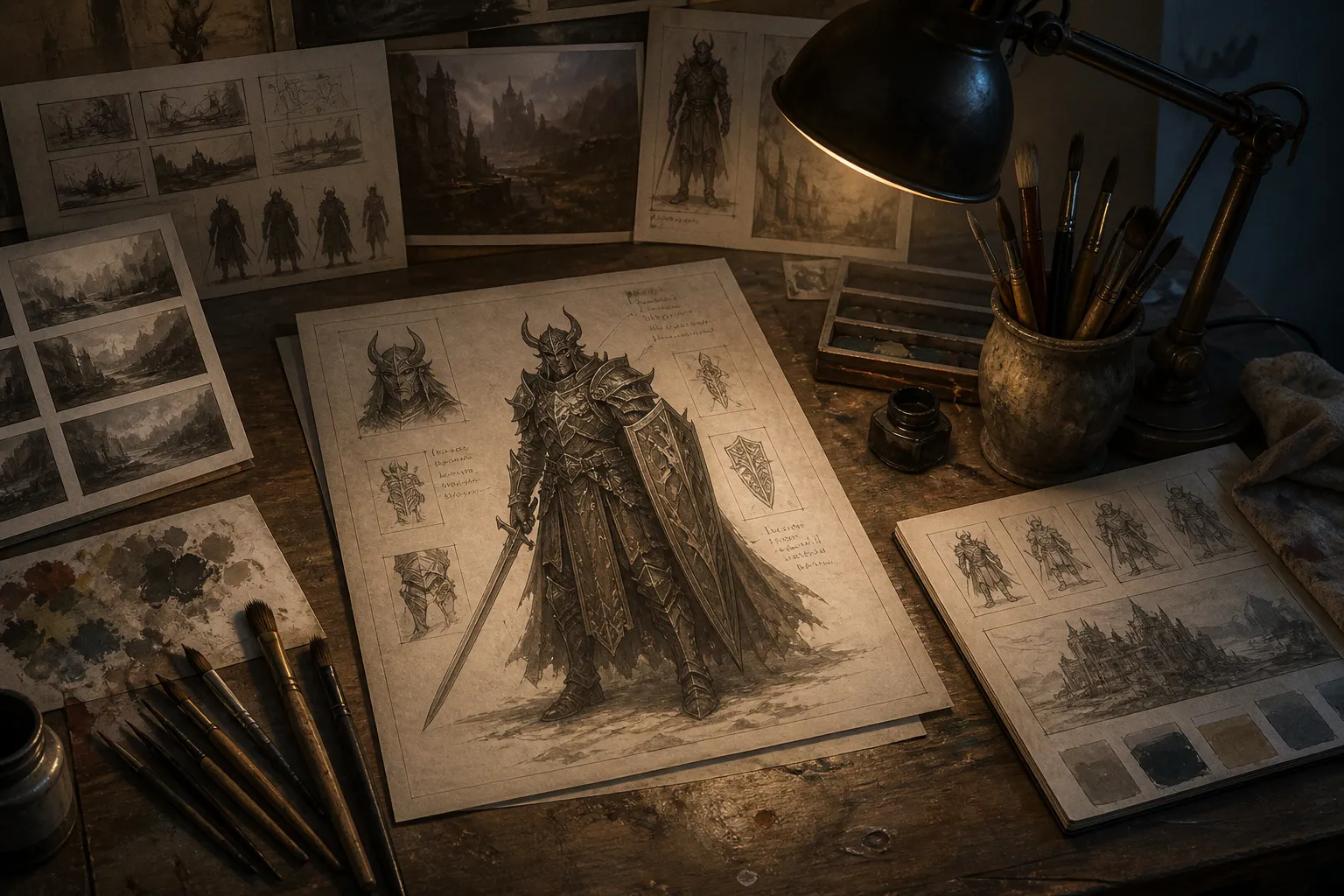
Most fantasy art portfolios fail before anyone judges the painting. The work is buried under thirty interchangeable images, the link requires a password, the files are too small to inspect, or the portfolio shows that the artist can render a dragon but cannot solve a brief.
That is the unromantic truth behind fantasy art portfolio submission requirements: the submission is not merely a gallery. It is a working document. It has to prove three things quickly — that you can make convincing images, that you understand visual storytelling, and that you can survive the practical machinery around a commission.
The fantasy portfolio is not a shrine to talent. It is a pitch deck with better monsters.
Start with the opportunity, not the artwork
There is no universal industry standard for a fantasy art portfolio. A publisher, game studio, school review, stock platform, and open-call organization may all ask for different materials, formats, limits, and rights information.
That means the first step in any illustrator portfolio preparation checklist is not “choose your best images.” It is “identify the exact submission system.” The opportunity determines the frame.
A few documented examples show how widely the rules can differ:
| Submission context | Portfolio expectation | Practical implication |
|---|---|---|
| Wizards of the Coast | At least 6 examples of the artist’s best and most recent work; no absolute maximum | Build a focused core selection, then add only work that expands the case |
| SFWA open call | 3 portfolio samples plus a main website link where applicable | Every image has to carry more narrative and technical weight |
| SCBWI Florida portfolio review | Online link or PDF with no more than 10 illustrations; cover page with name and contact information; PDF limit of 10 MB | The PDF must be edited aggressively and exported with discipline |
| Adobe Stock | JPEG, sRGB, accurate metadata, 5–50 keywords, releases where required | The image is only half the submission; technical and cataloging errors can sink it |
These are not interchangeable rules. Six pieces for a game-art submission do not become a universal professional standard, and a ten-image review PDF is not a magic number for every art director.
Read the brief as if it were a production document, because that is what it is. Extract:
- the requested number of samples;
- accepted file types and upload limits;
- whether the portfolio must be public and password-free;
- naming conventions and metadata requirements;
- licensing, model-release, or property-release conditions;
- whether fan art, AI-generated work, or previously published material is restricted;
- whether process images, studies, or written commentary are requested;
- the intended audience and visual category.
Then build the portfolio around that target. A fantasy illustration portfolio designed for a trading-card game should not be assembled like a children’s-book portfolio. A stock library wants discoverability and clean rights management. A game publisher wants evidence that you can interpret mechanics, characters, environments, and art direction. Same medium. Different battlefield.
The brief is part of the composition. Ignore it, and the portfolio starts with a broken frame.
Curate for narrative range, not decorative repetition
The most common portfolio mistake is confusing visual consistency with repetition. Ten images of armored figures standing in smoky lighting may create a recognizable aesthetic. They may also prove that the artist has one solution and intends to use it until someone turns off the lights.
A strong fantasy art portfolio should show a controlled range of problems:
1. A clear character image that establishes anatomy, costume, expression, and focal-point control.
2. An environment or world-building image that demonstrates spatial depth rather than a painted backdrop.
3. A high-action composition with readable movement, overlapping forms, and a decisive camera angle.
4. A quieter narrative image where mood and implication do the work instead of spectacle.
5. A creature, armor, weapon, or material study that proves you can distinguish surfaces through value, texture, and edge control.
6. A recent piece aligned with the target market so the reviewer does not have to imagine whether your style transfers to the brief.
For a commission-driven portfolio, the strongest selection is rarely the six images with the highest rendering density. It is the six that create the clearest argument about your usefulness.
The opening image is the hook. It should communicate the category, competence, and point of view before the viewer begins inspecting detail. The second image should widen the frame, not repeat it. If the first piece is a close character portrait, follow it with a scene that proves you can manage spatial relationships. If the first is a crowded battle, follow it with something quieter and more controlled.
Think in sequence. The portfolio has its own visual hierarchy:
- Opening: immediate authority and a legible premise.
- Expansion: another format, scale, or compositional problem.
- Proof: anatomy, materials, lighting, or environment handled without shortcuts.
- Range: a different emotional temperature or narrative structure.
- Relevance: work that resembles the opportunity without becoming a direct imitation.
- Closure: a final image strong enough to leave a residue.
The last image matters. Reviewers remember endings, especially after opening dozens of tabs. Do not bury the strongest work in the middle because the portfolio was arranged chronologically or exported from a folder without editorial judgment. Chronology is useful only when development itself is the story.
Craig Maher’s public illustration portfolio offers a useful example of range at the project level. Its fantasy-focused titles include Indigo Mystic, Blade Dancer, Scarlet Barbarian, Rose-Cloak Assassin, Emerald Archer, Edelheill the Blind Knight, Onyx Reaper, King Cobra, Argent Knight, The Parson and the Wyrm, Aeracura, and Firstborn. The value of such a project spread is not the number of names on the page. It is the implied variety of character archetypes, silhouettes, roles, and narrative hooks.
A reviewer should be able to tell what changes from one image to the next. Costume language, body type, pose, palette, setting, and story beat should not all remain locked in the same position.
Make the focal point do its job
Fantasy illustration often collapses under the weight of its own inventory. The artist includes the fortress, the moon, five weapons, seventeen belts, a flock of ravens, a magic sigil, two secondary characters, three explosions, and enough decorative trim to upholster a throne room. Then the viewer asks the only question that matters: where am I supposed to look?
Composition is not a storage system for attractive objects. It is a delivery mechanism for attention.
Before submitting an image, identify its narrative hook in one sentence. Not its lore. Not the character’s invented biography. The visible action.
- A knight recognizes the monster as someone he failed to save.
- An assassin has entered the room, but the target has already noticed.
- A blind warrior navigates a battlefield through sound.
- A sorcerer is winning the duel while losing control of the spell.
If the image cannot produce a concise hook, the scene may be illustrating a category rather than telling a story. “A warrior in a forest” is a subject. “A wounded warrior hears the forest move behind him” is a frame with pressure.
For each selected piece, inspect the following mechanics:
- Is the primary focal point obvious at thumbnail size?
- Does the value structure separate the figure from the ground?
- Do the camera angle and crop support the action?
- Are the hands, face, weapon, or other story-critical areas receiving sufficient contrast?
- Do secondary forms support the main read or compete with it?
- Does the lighting explain the materials and spatial depth?
- Are the silhouettes distinguishable when the image is reduced?
- Is the visual hierarchy still intact when viewed in the dimensions required by the client?
Wizards of the Coast’s guidance for illustration submissions specifically emphasizes anatomy, rendering, materiality, proportions, figure-ground relationships, believable lighting, and effective camera angles. That list is not decorative theory. It describes the points where a dramatic fantasy image tends to break.
A beautiful surface will not rescue a confused camera. Painterly atmosphere will not repair a bad gesture. Detail is the final pass, not the structural beam.
For Magic: The Gathering artwork, the problem becomes even more severe because the image must remain legible in a roughly two-inch viewing window. Card art also needs to support the card’s game mechanic. The scene cannot merely look like fantasy; it has to communicate what the card does or what kind of event the player is looking at.
That requirement changes the crop. It changes the scale of the action. It changes how many characters can occupy the frame before the narrative turns into visual traffic.
Show evidence of thinking, not just finished surfaces
A finished image proves that you can finish an image. It does not necessarily prove that you can solve a brief.
Art directors are not only buying a final rendering. They are buying decisions: research, ideation, revision, responsiveness, and the ability to move from a vague request toward a readable result without burning the schedule.
This is why process material can strengthen a professional art portfolio when the opportunity allows or requests it. Wizards of the Coast encourages artists to include references, thumbnail sketches, color comps, roughs, iterations, and studies. The purpose is not to expose every mark made during production. The purpose is to reveal problem-solving.
A useful process sequence might show:
- the original brief or a concise description of the intended scene;
- reference choices and what each reference solved;
- several thumbnail compositions with the selected option identified;
- a rough drawing showing gesture, camera, and spatial placement;
- a value or color study;
- one or two meaningful revisions;
- the final image.
Do not upload a museum archive of failed thumbnails. No reviewer needs to see twenty-seven versions of a sword angle. Select the stages that clarify a decision.
A good process page answers questions that the final image leaves implicit:
- How did the artist establish the focal point?
- What changed when the first composition became too crowded?
- How were the materials separated?
- Was the lighting designed or discovered accidentally?
- Can the artist respond to art direction without flattening the image?
- Does the final result emerge from a repeatable method?
The distinction matters for fantasy illustration because the genre rewards surface density. A weak process can hide beneath impressive rendering for a while. In a production environment, it will not stay hidden. A client needs to know whether the artist can adjust the pose, shift the camera, remove a character, change the mood, or make the game mechanic readable without rebuilding the entire image from the ground up.
A process page should not say, “Look how much work I did.” It should say, “Here is how I solve the problem when the first idea fails.”
Separate portfolio presentation from portfolio storage
A portfolio can contain excellent work and still be difficult to review. This is a technical failure, not an aesthetic one.
The main link should open without a password unless the submission instructions explicitly require restricted access. Wizards of the Coast asks for accessible portfolios, working links, and images detailed enough to inspect fine detail. Work covered by a nondisclosure agreement should not appear. That last point sounds obvious until an artist includes a production image with a private client logo, an unreleased character sheet, or a screenshot from a closed project.
Keep the presentation layer simple. A reviewer should not have to solve a navigation puzzle before reaching the artwork.
A practical portfolio page needs:
- the artist’s name;
- a concise discipline or specialization;
- a working contact method;
- a clear body of selected work;
- project titles and dates where useful;
- brief captions that explain role, medium, or purpose;
- links that open correctly on desktop and mobile;
- images large enough to inspect but compressed enough to load reliably.
Captions should provide production information, not decorative lore. “Character design and final illustration, personal project” is useful. “The last daughter of the ash-born kings, carrying the grief of a dead empire” may be atmospheric, but it does not tell an art director what you actually did.
A PDF portfolio has different constraints. It is portable and easy to archive, but it punishes careless export settings. If a review format allows no more than ten illustrations and limits the PDF to 10 MB, the edit must be ruthless. Do not shrink ten images until they resemble postage stamps. Remove weak work, reduce unnecessary background elements, and check every page after export.
The portfolio should also be inspected at the scale in which it will be judged. Adobe’s illustration submission guidance recommends checking work at 100% zoom or higher. That catches seams, compression damage, accidental marks, jagged edges, muddy textures, and other defects that disappear when an image is viewed as a small web thumbnail.
The technical pass should cover:
- image format;
- color space;
- file size;
- resolution appropriate to the stated submission;
- correct orientation;
- accurate file names;
- metadata and keywords where requested;
- visible or prohibited watermarks;
- release documentation for recognizable people or private property;
- licensing status and ownership.
For Adobe Stock illustration submissions, JPEG files in the sRGB color space are required, metadata must be accurate, and recognizable people or private property may require releases. The platform also asks for between 5 and 50 keywords, with the most important terms placed first. These are stock-platform rules, not universal fantasy portfolio requirements.
The same distinction applies to watermarks. Some open calls accept them. Some commissioners find them distracting. Some platforms impose their own rules. Do not invent a global standard where none exists. Read the destination.
Build separate cuts for different reviewers
One portfolio can support several opportunities. One portfolio should not be sent unchanged to all of them.
Create a master archive, then cut targeted versions. The archive can contain finished illustrations, sketches, studies, personal experiments, client work, and rejected alternates. The submission version is the edited argument.
For a game-art opportunity, foreground:
- readable silhouettes;
- character and creature design;
- environments with gameplay or world-building potential;
- action and camera control;
- material differentiation;
- evidence that the image remains legible at small scale.
For a book-cover or publishing opportunity, emphasize:
- a strong central hook;
- clear space for typography where relevant;
- controlled atmosphere;
- character identity;
- the ability to build a narrative without explaining every plot point.
For a portfolio review, include enough range to create a productive conversation. A reviewer cannot give useful advice if every image is polished to the same finish and built from the same composition. Include a few works that expose the direction you are testing, but do not confuse unfinished experiments with unresolved work.
For a stock platform, the priorities shift again. Searchability, rights, metadata, technical cleanliness, and variation control become central. Adobe recommends limiting submissions to three to five variations of the same subject, angle, or concept to reduce similar-content flags. Uploading twelve nearly identical images is not range. It is a filing problem wearing a cape.
Fan art belongs in the same strategic category. It can demonstrate fluency with an established visual world, but it should not be the entire case for your professional ability. Wizards of the Coast allows fan art while stating that it should not be the sole portfolio content. The principle travels well: show that you can interpret an existing universe, then prove that you can build or extend one without borrowing its scaffolding.
The final review: remove the excuses
Before sending a fantasy art portfolio, run one final pass with the sentiment removed. Do not ask whether you love the image. Ask whether it earns its position.
A useful final sequence looks like this:
1. Open every link in a private browser window. Confirm that the portfolio works for someone who is not already logged into your account.
2. View the selection as thumbnails. If all the images merge into one block of armor, smoke, and orange light, the range is too narrow.
3. Read the images without captions. The main action and focal point should survive without a paragraph of explanation.
4. Check the first and last pieces together. They should establish and close the argument, not merely occupy two slots.
5. Inspect every image at full size. Look for artifacts, weak edges, accidental marks, broken anatomy, and muddy values.
6. Remove anything under rights restriction. Private work, NDA material, and unclear ownership are not “just examples.”
7. Check the destination’s exact limits. Count the images. Check the upload size. Confirm the file format and naming requirements.
8. Confirm the contact path. A portfolio without a working email or clear contact method is a locked door with decorative hinges.
9. Read the submission language once more. If the opportunity asks for process, include process. If it asks for three samples, do not attach twenty.
10. Stop editing when the argument is clear. Endless adjustment is not rigor if it only delays the send button.
The final question is blunt: if the reviewer sees only the first three images, will they understand what kind of illustrator you are and why you belong in this particular conversation?
If the answer is no, more images will not solve the problem. Better sequencing might. A clearer hook might. Replacing the technically impressive but narratively inert centerpiece might.
A portfolio is a route, not a warehouse
The strongest fantasy art portfolio submission requirements are not really about decoration, file formats, or image counts. Those details matter, but they support a larger test: can the portfolio guide a stranger through your capabilities without friction?
The route should be visible. The opening image establishes the claim. The sequence expands it. The process material proves that the claim is repeatable. The technical preparation prevents avoidable failure. The final contact path makes the next step possible.
Craig Maher’s project range is useful to study precisely because fantasy illustration needs more than one costume, one pose, or one atmospheric trick. Titles such as The Parson and the Wyrm, Edelheill the Blind Knight, and Rose-Cloak Assassin suggest distinct narrative entry points before the viewer begins examining the rendering. That is the job of the hook: create pressure quickly, then let craft carry the rest.
Do not submit a warehouse of images and call it a portfolio. Make the edit. Frame the argument. Show the mechanics. Then send the version that gives the reviewer the shortest route to a confident decision.