Fantasy Art Collective Submissions: A Prep Checklist
Most fantasy portfolios die in the first thirty seconds. Not because the art is bad — because the curator cannot tell what the artist actually does. Fifty images dumped into a single PDF, no sequence, no rhythm, no argument.
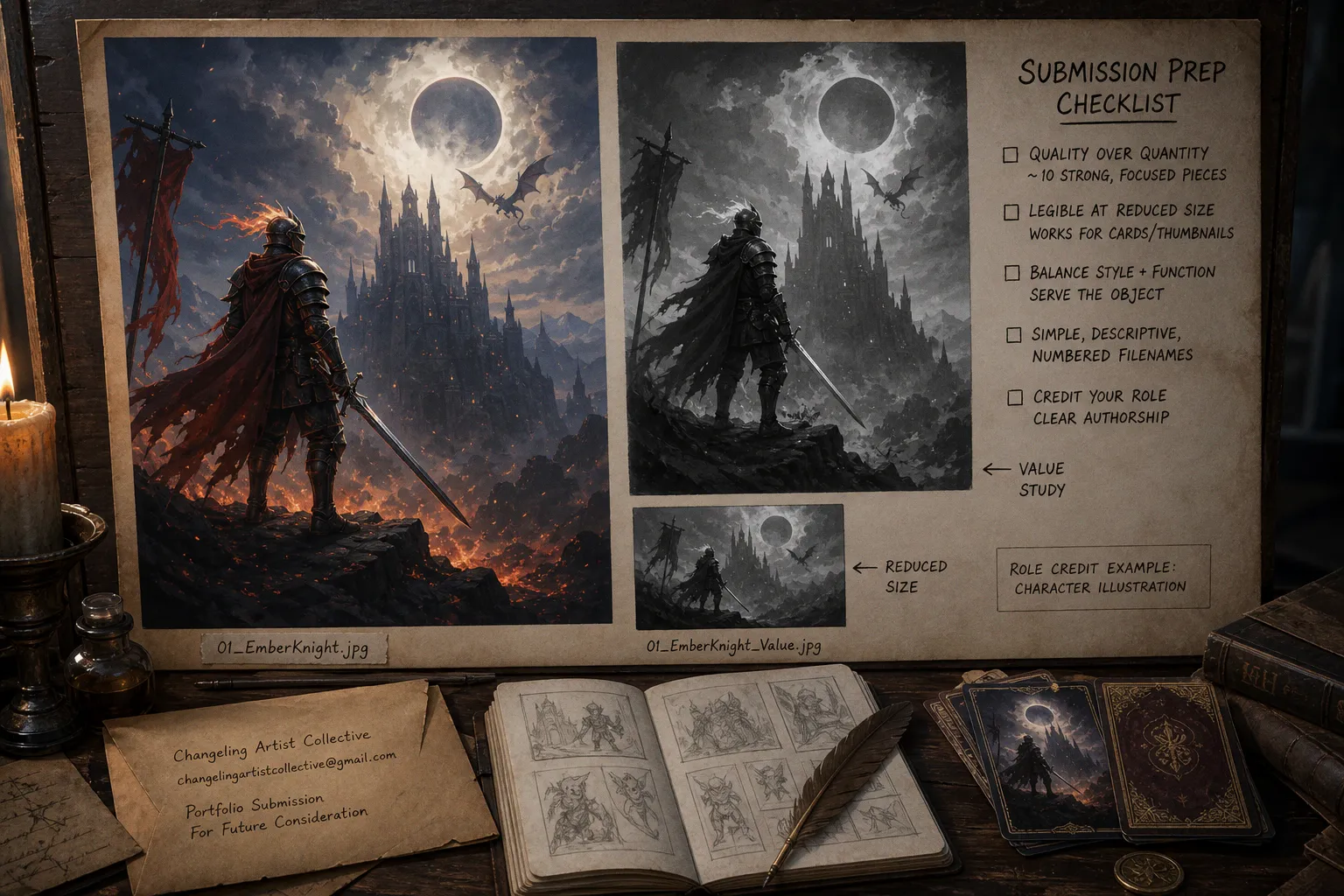
Just a graveyard of finished pieces and half-baked experiments competing for attention like contestants screaming into a reality-show cut. The Changeling Artist Collective — founded by Rachel Quinlan, now forty-plus international illustrators strong — does not have the bandwidth for that. Neither does any serious speculative art group running on volunteer review time and a shared Dropbox.
Here is the prep. It is not glamorous. It is not a "discover your visual voice" meditation. It is a checklist engineered to survive the inboxes of people who already see hundreds of submissions a year and have zero reason to be polite about it.
Curating for Narrative Cohesion: Quality Over Quantity
Ten pieces. That is the working number for a portfolio aimed at collectives like Changeling — ten excellent, focused images, not fifty documenting every phase of your development since art school. The instinct to over-deliver is wrong. It always was. Curators do not read longer PDFs more carefully. They skim. They flick. They drop out at image seven if image three already told them everything they needed to know.
The selection itself has to do work that the individual paintings cannot do alone. Three things matter:
- Narrative cohesion. Every piece should argue the same thesis — that you are an illustrator who understands story, character, mood, and finished composition. A portfolio mixing grimdark battle scenes, pastel unicorn portraits, and a single abstract shape study is not "versatile." It is unfocused. Collectives want an author, not a theme park.
- Visual voice consistency. Within the chosen thesis, the work should sound like one person. Same handling of edges, same value structure, same relationship to light. Not identical — not a clone of your last submission — but recognizable. A second viewer should be able to spot your piece on a contact sheet of fifty strangers.
- Range within the lane. Repetition kills portfolios faster than anything. Three armored heroes in similar poses, painted in similar lighting, is not range. It is one painting posted three times. Real range looks like: a single-character portrait, an environment, a multi-figure scene with a clear focal hierarchy, and at least one piece that demonstrates command of dramatic light.
Ten pieces. Focused. Sequenced. One voice. That is the spine of a portfolio built to survive a skim reader with a deadline.
The Thumbnail Test: Ensuring Legibility at Scale
Here is the part most illustrators skip, then wonder why their best work looks weak in a deck spread. Collective projects — tarot decks, oracle sets, card games, anthology covers — rarely use your art at full scale. The curator views thumbnails first. The art director crops for a card border. The printer downsamples. If the focal point disappears at 200 pixels wide, the painting has a structural problem, not a presentation problem.
The fix is a three-version review exercise before you ever consider a piece "portfolio ready." Run it on every candidate image:
1. Grayscale value thumbnail. Squint test. Five values or fewer. The focal mass should sit on the lightest third of the value range, or the eye will not find it. If everything is mid-tone, nothing is mid-tone — it is mush.
2. Simple color comp. Flat shapes only, no rendering. Focal contrast means the eye lands before it analyzes. Cool background, warm focal figure, or vice versa. If the comp reads at business-card size, the final will read at any size.
3. Reduced-size test. Shrink the finished piece to 300 pixels wide. Open it next to your thumbnail comp. Does the focal point still win? Does the silhouette still read? If not, the painting was carried by detail, not by structure — and detail is the first thing that dies in reproduction.
For collectives like Changeling, who work heavily in folklore-rooted narrative and collaborative deck projects, this is not optional. The collective's whole publishing model assumes small-format legibility. Hand them a portfolio full of paintings that only work at 4000 pixels, and you have told them you do not understand the brief.
Technical Standards for Professional Submissions
Art directors do not care that your file is 8000 pixels wide. They care that it opens cleanly, is named sensibly, and does not crash their inbox. Specific DPI targets and megabyte caps vary by collective — Changeling's email-based process does not publish hard limits, and you should not pretend it does — but the basic hygiene is universal.
File naming is where most submissions immediately look amateur. IMG_4827_final_v3_FINAL2.jpg tells the reviewer you do not respect their time. Use a simple numbered sequence: 01_EmberKnight.jpg, 02_HollowQueen.jpg, 03_SaltPactEnv.jpg. The number sets the order. The descriptor sets the subject. The reviewer can now scan in two seconds and know exactly where the portfolio starts.
Other technical points that separate serious submissions from hopeful ones:
- Resolution. Aim for at least 2000 pixels on the long edge for finished pieces. Large enough to inspect detail if needed, small enough to email without compressing into garbage.
- Format. JPEG for painted work, PNG only if you have transparency to preserve. No PSDs. No zipped folders nested inside other zipped folders.
- Sequence integrity. Image 01 should be the strongest single piece. Not your latest piece, not your favorite piece — the strongest. Curators form an impression from the opening image and revise downward, not upward.
- No watermarks across the composition. A small signature in the corner is fine. A diagonal watermark screaming across the focal point tells the collective you do not trust them, and they notice.
Navigating Collaborative Credits and Authorship
This is where credit-honest illustrators win and credit-shy illustrators lose. If you painted a character in a group project, say so. If you painted the environment and someone else handled figures, say so. Collectives — Changeling included — actively look for artists who can collaborate cleanly, which means the portfolio must make authorship unambiguous.
The minimum standard is a one-line caption under each collaborative piece: Character illustration for [Project Name], environment by [Other Artist]. That is it. Five seconds of writing that prevents hours of confusion later.
What you absolutely do not do:
- Hide collaborative work to make it look solo. Curators compare notes. They Google. They ask the other artists. Caught misrepresentation ends a career faster than a weak portfolio ever would.
- Submit work where your contribution is genuinely unclear. If you cannot describe your role in one sentence, the piece is not portfolio-ready.
- Take credit for art direction or composition another artist owns. The reverse is also true — if you did the heavy lifting, claim it cleanly.
A cleanly credited collaborative piece says: this person can work on a team. A murky one says: this person will be a problem on a team.
Strategic Outreach to Collectives Like Changeling
Here is the structural reality most artists refuse to plan around: the Changeling Artist Collective does not run a formal recruitment cycle. There is no application portal, no annual open call, no "submit between March 1 and March 15" window. There is a single email address — [email protected] — and the patience to wait.
That single fact should change how you approach the entire submission. You are not racing a deadline. You are writing a cold pitch to a volunteer-run inbox where the reviewer reads your email at 11pm after their own client work is done. Tone matters. Length matters. So does the actual content of the portfolio link.
The pitch email itself should be short. Three paragraphs, maximum:
- Who you are. One sentence. Name, location if relevant, current focus.
- Why this collective, specifically. Not "I love your work." Specific. Mention the folklore angle, the deck projects, the narrative weight of the aesthetic. Generic flattery reads as spam.
- What you are sending. A single link to the curated ten-piece portfolio, sequenced and named, hosted somewhere stable. Not a Google Drive folder you will delete in six months. Not a Behance buried under your graduation project.
Then stop. No "I would be honored." No "please let me know if you need anything else." You have given them everything they need to evaluate. The next move is theirs, and waiting months for a response is normal for collectives without formal cycles.
What the collective is actually screening for — beyond raw skill — is aesthetic compatibility. Changeling's identity is rooted in folklore, narrative-driven imagery, and a slightly melancholic mood. A submission full of neon-cyberpunk mech designs tells them you did not do the homework, no matter how good the rendering is. Read the room. Look at what the existing forty-plus artists are already making. Match the emotional register before you match the technical level.
The Pre-Submission Pass
Before clicking send, run the whole package through one final audit. Open the portfolio link on a phone. Can you still see the focal points? Open it on a laptop with a fresh browser. Does image 01 load first? Does the sequence hold up when scrolled in two seconds flat? Read the email aloud. Does it sound like a person or like a template?
If you cannot answer yes to all of those, do not send. Fix it. Then send.
Collective submissions are not a numbers game. There is no edge in blasting forty collectives with the same generic PDF. There is only the slow, specific work of building a portfolio that reads at thumbnail scale, sounds like one author, credits collaborators honestly, and arrives at an inbox that was not expecting anything close to this level of care. Most submissions fail because the artist treated the checklist as optional. It is not optional. It is the whole game.