Translating Cinematic Icons: Lessons from the Terminator 2 Board Game Campaign
If you’ve ever tried to shrink a detailed oil painting down to a two-inch card illustration, you know the heartbreak: all those subtle glazes and atmospheric effects just vanish into a muddy silhouette.
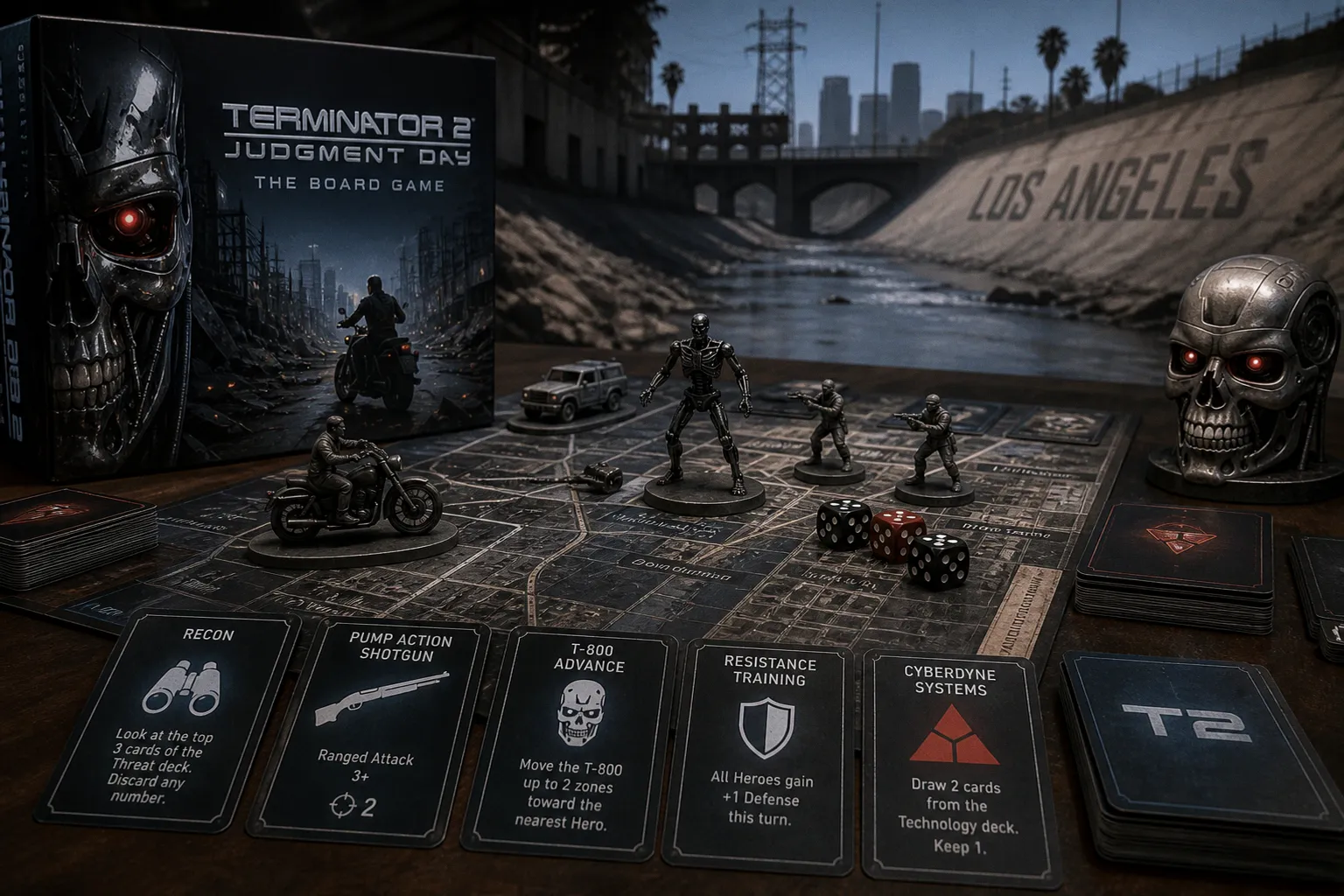
That’s the tightrope we walk in this business, and it’s why news of a major IP like Terminator 2 getting the board game treatment is more than just a product announcement—it’s a case study in translating iconic, cinematic art to the tabletop.
Why This IP Matters for Your Portfolio
The Terminator 2 aesthetic is a masterclass in contrast: the cold, blue-steel sheen of the T-800 against the fiery oranges of the steel mill, the gritty realism of 1991 Los Angeles. For an artist, this isn’t just a license; it’s a brief that demands you nail a very specific, beloved visual language. When a preview for a campaign like this goes live, it’s a signal to watch the art direction closely. How are they handling the likeness rights? Are the illustrations capturing that filmic quality, or are they defaulting to generic sci-fi tropes? Your portfolio should show you can handle such a recognizable brand with both fidelity and your own artistic voice.
The Cation Arts Factor: Reliability is a Portfolio Piece
The snippet notes that Cation Arts delivered their last campaign early. In the Kickstarter ecosystem, that’s not just a logistical footnote—it’s a massive credibility marker. For you, the artist, it means the publisher has a track record of respecting the creative process and the final product. An early delivery often indicates a well-managed project where art assets were finalized, approved, and printed without frantic last-minute changes. When you’re considering which publishers to pitch or which projects to feature as professional work, a history of reliable execution is as important as the IP itself. It tells a client you understand the business side of art.
What to Watch For in the Campaign
As the full preview unfolds, keep your practical eye on a few things. First, look at the art style—is it gritty and painterly, or more graphic and stylized? This will tell you what kind of artist they’re hiring for these kinds of projects. Second, examine the component quality in the preview images. Are the card illustrations designed to pop at a small size, with strong silhouettes and limited, high-contrast palettes? That’s the real-world test of effective game art. Finally, note the campaign’s stretch goals. Often, these unlock additional art packs or variant covers, which can be a goldmine for seeing how a single brief is interpreted in multiple ways.
This isn’t just another game on Kickstarter. It’s a live example of how a legendary film’s visual identity is being adapted for a new medium, backed by a team that’s proven it can deliver. For your portfolio, it’s a reminder to always think about context, scale, and the client’s track record. Keep an eye on this one.