Fantasy art portfolio: essential checklist before submission
Most fantasy portfolios die on arrival—not because the artist cannot paint, but because they cannot edit.
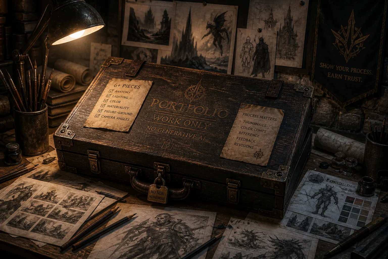
The brief is not “show me everything.” The brief is to prove that you can deliver the hook, stay on brief, meet a deadline, and work through revisions without supervision. When an art director opens your submission link, they are not taking a leisurely gallery walk. They are looking for a reason to keep going.
That reason has to appear quickly, in the work itself. A portfolio should establish your strongest qualities before the reviewer has to search for them: drawing ability, narrative judgment, control of style, and an understanding of what commissioned illustration is for.
Every bloated submission tells a similar story. The artist has confused effort with selection and history with direction. A portfolio is not a museum retrospective of every dragon painted since art school. It is an argument about the work you are ready to deliver now. Curation is part of the job. Without it, even strong images become a Dropbox folder with ambition.
The Art of Curation: Quality Over Quantity in Fantasy Submissions
The most useful fantasy art portfolio submission requirements are not about filling a page count. They are about making each image earn its place. A tight group of six to ten resolved pieces, each solving a different visual problem, will usually make a stronger case than an archive of forty images that repeat the same strengths and weaknesses.
You are not proving range through accumulation. You are proving range through contrast:
- a figure study with convincing anatomy and dramatic light;
- an environmental piece that establishes mood and scale;
- a character design with a readable silhouette;
- an action scene with clear movement and staging;
- a quiet narrative image in which the viewer has to read the situation;
- a piece that demonstrates your ability to handle a specific brief or commercial format.
The point is not to force every possible category into the portfolio. The point is to make the selection feel intentional. If you want to work on card games, a portfolio made entirely of atmospheric landscapes leaves an obvious question unanswered. If your ambition is book cover illustration, a gallery of isolated character busts may show skill but not necessarily composition, hierarchy, or the ability to carry a story at a distance.
The first image should be the piece you would defend without qualification. It needs to establish the level of finish, the kind of visual problems you enjoy, and the standard the rest of the portfolio can maintain. The last image matters too. It should leave the reviewer with a strong final impression rather than an unfinished experiment or a weaker study that happens to be newer.
The middle is where you demonstrate range and reliability. Sequence the work so that the portfolio moves between subjects, scales, moods, and compositional structures. Do not put five similar portraits next to one another simply because they were made in the same month. Break up repeated formats. Give the eye a change of pace.
A quick triage exercise before you send anything:
- Remove work that is old unless it genuinely outclasses your recent pieces.
- Remove styles you have abandoned. A portfolio can show versatility, but it should not look like a history of every visual identity you have tried.
- Remove pieces built around compromises you cannot defend. If the anatomy, lighting, or design problem bothers you, it will distract a professional reviewer too.
- Remove fan art of borrowed intellectual property unless it demonstrates a skill directly relevant to the kind of work you want.
- Remove near-duplicates. Three variations on one successful character may show persistence, but they do not necessarily show range.
- Remove unfinished work unless the unfinished state is being shown deliberately as process.
- Remove anything that needs a paragraph of explanation before it starts to make sense.
Curation is the work. The artist who can edit themselves out of a portfolio has already passed the first interview.
A useful test is to look at the portfolio as a sequence of thumbnails. At that size, the hierarchy becomes honest. Which image catches the eye first? Do the focal points move from one piece to the next, or does every composition shout with the same intensity? Can you tell the difference between a quiet narrative image and a weak image that has simply been placed beside a louder one?
The thumbnail test also exposes repetition. If every piece has a centered figure, a dark background, a rim light, and a diagonal weapon, the portfolio may technically contain different characters while communicating only one solution. Publishers and studios need artists who can make decisions, not just reproduce a preferred formula.
Demonstrating Professional Pipeline: Beyond the Final Image
Final art is the product, but it is not the whole proof. An art director is not hiring one finished image. They are hiring the ability to produce finished images on demand, under direction, inside a production pipeline. That means your portfolio should show how you think as well as what you can render.
This is where thumbnails, color comps, reference sheets, and selected revision stages earn their place. A finished piece beside its thumbnail rough suggests that you solve compositional problems before committing to detail. A reference sheet beside a character illustration shows that the costume, props, and materials were designed rather than improvised. A before-and-after revision demonstrates that you can absorb direction and improve the image without losing its central idea.
The common mistake is to treat process work like homework that needs an apology. Artists bury the thumbnails on a page labelled “process,” or hide them several clicks away from the final image. That weakens the evidence. Process material is not automatically valuable, but the right process material gives the reviewer a view of your decision-making.
Show the stages that answer useful questions:
- How did you decide where the viewer should look first?
- Did you test the silhouette before rendering?
- Can you reduce a complex scene to a readable value structure?
- Do you understand the difference between visual research and copying?
- What changed after feedback?
- Can you make a clear decision before spending hours on surface detail?
A practical layout for one portfolio entry might look like this:
| Slot | Content | Why it earns the space |
|---|---|---|
| 1 | Tight thumbnail sketch | Shows that composition is solved before rendering |
| 2 | Value study or grayscale comp | Shows control of light, grouping, and focal hierarchy |
| 3 | Reference sheet or design notes | Demonstrates organized visual research |
| 4 | Selected revision or alternate | Shows responsiveness to a brief or critique |
| 5 | Final finished illustration | Presents the deliverable at its intended strength |
You do not need to display every discarded sketch. A process page should not become a scrapbook. Choose the stages that reveal professional judgment. Three meaningful thumbnails are more useful than twenty nearly identical scribbles. A clean value study can say more about your understanding of an image than a long caption about how difficult the rendering was.
The same principle applies to card game illustration. Preparing an art portfolio for card games means showing that you understand the image as part of a larger system. The illustration may be viewed at different sizes, surrounded by graphic design, type, borders, icons, or rules text. The focal point has to survive that context. A character pose that looks impressive in a full-screen presentation may become unreadable when reduced. A complicated background may compete with the action instead of supporting it.
For card-focused work, include images that demonstrate:
- readable silhouettes at small scale;
- clear separation between foreground, subject, and environment;
- strong value grouping rather than dependence on tiny details;
- character designs that remain identifiable from one image to the next;
- compositions with enough breathing room for layout when the brief requires it;
- action that can be understood without relying on a caption.
A publisher is not only asking whether you can make a beautiful image. They are asking whether the image will function where it is placed.
Technical Fundamentals: What Art Directors Actually Look For
Fantasy is forgiving about style and brutal about fundamentals. You can paint with flat graphic shapes, photorealistic oils, anime-influenced linework, dense impasto, or a deliberately rough brush. Underneath every successful approach sits the same structural foundation: anatomy that holds under movement, lighting that reads at a glance, color that supports the mood, materials that behave differently, and a composition with a clear point of focus.
Anatomy is the one many illustrators underestimate. The genre gives you elves, orcs, dragons, demons, and demigods, but underneath the exaggeration is still a body with weight, joints, balance, and directional force. A stylistic decision can alter proportion. It cannot replace structure.
A figure does not need to be realistic in the narrow sense. It does need to feel as though it could occupy space. Look at the feet, the pelvis, the rib cage, and the line of action. Ask whether the character is actually carrying the weapon, leaning into the movement, or standing in a pose assembled from disconnected parts. A rough but accurate figure study can do more for an illustrator portfolio checklist for publishers than another polished portrait with uncertain hands.
Lighting and color operate as one system. A light source should not change direction simply because a new object enters the frame. Highlights, cast shadows, reflected light, and atmospheric effects need to belong to the same world. A finished illustration with contradictory lighting tells the reviewer that the image may become unstable during production.
Choose a dominant light direction and maintain it. Then decide what the color temperature is doing. Warm light against cool shadow can create separation and drama, but the contrast should support the scene rather than appear as a decorative preset. A red cloak is not automatically more vivid because it is saturated. It becomes effective when its value, temperature, and placement help the viewer understand the image.
Materiality is another dividing line between a competent painter and a hired illustrator. Cloth, leather, metal, fur, glass, stone, wood, and flesh should not all receive the same edge treatment or brush texture. The viewer needs to understand the surface quickly, often before they have time to inspect it.
A few useful questions:
- Does metal have a believable relationship between hard edges, reflected light, and surrounding color?
- Does leather show structure without becoming a noisy field of scratches?
- Does fur break the silhouette in a controlled way rather than dissolving into static?
- Does cloth fold according to the body beneath it and the force acting on it?
- Does stone feel heavy and irregular, or merely receive a gray texture?
- Does skin have variation in temperature and softness without becoming airbrushed plastic?
The following matrix is useful when conducting a professional art portfolio audit:
| Fundamental | What passes | What weakens the portfolio |
|---|---|---|
| Anatomy | Figures hold weight and proportion during movement | Stylization hides structural breaks |
| Gesture | The pose communicates action, intention, or mood | Limbs are arranged without a clear line of action |
| Lighting | Light direction and shadow logic remain consistent | Highlights and shadows contradict one another |
| Color | Palette supports mood, hierarchy, and readability | Hue is used decoratively without temperature logic |
| Materiality | Surfaces read as distinct at a glance | Every object shares the same painted texture |
| Figure-ground | Subject separates through value, hue, edge, or atmosphere | Subject and background compete for attention |
| Composition | Viewpoint and cropping strengthen the idea | Default front-facing arrangement lacks hierarchy |
| Story | The image implies a situation beyond the pose | Characters look impressive but have no readable context |
Do not treat this as a demand for sterile perfection. Fantasy illustration needs personality. A strange crop, distorted anatomy, or impossible color can be exactly right when it serves the image. The question is whether the deviation is controlled. Deliberate exaggeration reads as style. Accidental weakness reads as unfinished thinking.
What to Include in a Fantasy Illustration Portfolio
A strong selection gives the reviewer enough information to imagine assigning you work. That requires more than attractive subjects. Include images that reveal the problems you want to solve professionally.
If you want to work in publishing, prioritize scenes with narrative pressure. A character looking impressive against a blank background may demonstrate design, but a scene in which the character is making a choice demonstrates storytelling. Show relationships between figures, readable environments, and a sense of what happened immediately before or after the depicted moment.
If your target is concept art or game development, include design thinking. Silhouettes, turnarounds, prop variations, costume logic, and environment studies can be valuable when presented with restraint. The portfolio should make clear whether you are presenting illustration, design, or both. Confusion is not the same as versatility.
If you are preparing work for card games, consider the demands of a small format. A card illustration has to create immediate impact while remaining legible within a larger graphic frame. Test your work as a reduced image. If the character’s identity disappears, the action becomes a blur, or the value structure collapses, the problem is not solved by adding more detail.
A portfolio can include a mixture of:
1. Hero images, which establish the highest level of finish you can deliver.
2. Narrative scenes, which show that you can stage an event rather than pose a subject.
3. Character designs, which demonstrate silhouette, costume, expression, and consistency.
4. Environment work, which proves that your worlds have depth, structure, and atmosphere.
5. Process pages, which reveal composition, value planning, and response to direction.
6. Applied examples, where the image is shown in a cover, card, or other relevant context.
The selection should still feel like one artist. A fantasy art portfolio does not need to be trapped in one subject, but it should have a point of view. The reviewer should understand what kind of visual problem you solve unusually well.
Digital Presentation and Submission Etiquette
The portfolio website is part of the artwork now. Treat it that way. A slow-loading site with autoplay music, a custom cursor, and a splash page makes the reviewer work before seeing the work. The best digital portfolio behaves like a fast, quiet reading instrument: clear navigation, strong images, and no friction between interest and evidence.
A few rules of digital submission hygiene matter more than clever design:
- Put the strongest work where it is immediately visible. Do not hide it behind a “Projects” folder or an elaborate landing animation.
- Keep navigation simple. The reviewer should be able to understand the portfolio structure without learning a custom interface.
- Compress images for fast loading while preserving the detail needed to judge the work.
- Check the portfolio on a phone and a laptop. Cropping, captions, and image order should not break on smaller screens.
- Use consistent image presentation. If one piece is shown full bleed, another as a tiny centered rectangle, and a third with a decorative frame, the page starts competing with the work.
- Include a working email address or contact form. Test the form yourself before submitting.
- State your location, availability, and relevant professional information where appropriate, but do not bury the art under a résumé.
- Make sure titles and captions are useful. Identify the project, your role, and the type of work when that context clarifies the image.
- Remove password protection from public work unless a specific client or studio has requested it. If work is covered by an NDA, leave it out rather than exposing material you are not permitted to show.
- Do not use autoplay media, sound effects, animated cursors, or an “enter site” gate unless there is an unusually strong reason.
The submission email should be just as controlled. Use a clear subject line, address the recipient correctly, and provide one working portfolio link. Mention the kind of work you are seeking and any relevant availability. Do not send a manifesto about your artistic journey when three precise sentences will do. The portfolio should carry the argument.
PDFs still have their place, especially when a studio requests one or when the document needs to be downloaded and circulated. Keep the file easy to open and easy to review. Put the strongest image near the beginning, use a consistent page rhythm, and check the document at normal viewing size. A PDF that requires constant zooming is not demonstrating care.
Physical portfolios remain relevant for studio visits, conventions, and meetings. Choose a format that allows the work to be seen comfortably without becoming an awkward piece of luggage. Matte surfaces are usually easier to review under strong lighting than highly glossy prints. Check color shifts, banding, trimming, and paper handling before the meeting. The object should support the art, not become an additional technical problem.
Navigating Industry Red Flags and AI Policies
The clearest rule is simple: do not submit generative-AI artwork where the publisher or studio prohibits it. That includes finished images, work built from generated material, and process images presented as original development when they are not. It is not enough to paint over a generated base or use generated imagery to establish a composition if the submission guidelines exclude generative-AI assistance.
Major publishers, including Wizards of the Coast, have published freelance submission guidance that prohibits generative-AI artwork. Policies differ in wording and scope, so read the current requirements for the specific company or project. If the guidelines are unclear, ask before submitting rather than assuming that a disguised workflow will be acceptable.
The issue is not merely whether the final image looks polished. A professional portfolio has to communicate authorship, process, and trust. If a studio is commissioning original visual development, the provenance of the work matters. Keep your process files organized so that you can explain how an image was made when a client needs that information.
Other red flags can quietly weaken a submission:
- Fan art as the centerpiece. Existing intellectual property can demonstrate enthusiasm, but it does not replace original problem-solving. Use it selectively and make sure the portfolio shows that you can design beyond familiar characters.
- Shared work presented as solo work. Credit collaborators clearly. If you painted the figures but someone else designed the environment, say so.
- Unfinished images included without context. An unfinished piece can be useful as a process example, but it should not be mistaken for a final deliverable.
- A portfolio built around one filter or post-processing effect. The reviewer should be able to see your decisions, not only your preset library.
- Unclear role descriptions. For collaborative game or publishing projects, state what you actually contributed.
- Confidential work shown without permission. A strong image is not worth demonstrating that you disregard contract boundaries.
- Inconsistent file naming and broken links. Small failures create unnecessary doubt about how you will handle production details.
The portfolio is a contract. Every image on the page is a promise about what the studio will get if they hire you.
That promise includes more than rendering ability. It covers communication, honesty about your role, respect for confidentiality, and the ability to follow a brief. A portfolio that is technically impressive but careless about those boundaries is sending the wrong professional signal.
The Final Audit Before Submission
Before sending the link, review the portfolio as if you had never seen the artist before. Do not make changes while emotionally attached to the hours invested in a piece. Ask what the selection actually communicates.
Start with the first screen. Is the strongest work visible immediately? Does the name, discipline, and contact path make sense? Then move through the sequence without stopping to justify anything. If an image needs an explanation to survive, either improve the presentation or remove the image.
Check the portfolio at thumbnail size and at normal reading size. At thumbnail size, inspect hierarchy, silhouette, and value. At normal size, inspect anatomy, edges, materials, and technical finish. Look for recurring weaknesses rather than isolated imperfections. One awkward hand may be survivable. The same weak hand structure across several images becomes part of the portfolio’s message.
Then check the practical details:
- Are all links working?
- Does every image load?
- Are captions accurate?
- Are collaborators credited?
- Is confidential material excluded?
- Are the submission guidelines followed?
- Is any generative-AI work excluded where the policy prohibits it?
- Can the reviewer contact you without searching?
- Does the portfolio show the kind of work you want to be hired for?
The final question is the most important one: does the portfolio make a specific promise? “I can paint fantasy” is too broad to be useful. A stronger promise might be that you can create readable character-driven scenes, design distinct card-game heroes, build atmospheric environments, or carry a narrative from thumbnail to final illustration.
Open with the strongest image. Close with another piece that deserves to be remembered. Fill the middle with contrast, process, fundamentals, and evidence that you understand the intended format. Show your thinking. Maintain your light. Earn your materials. Submit clean work and respect the rules around it.
Anything else is just procrastination with a Wacom attached.