Fantasy underpainting: grisaille, verdaccio, or imprimatura
If you have ever stood in front of a half-finished painting wondering why the color has gone muddy—or why the underdrawing is beginning to ghost through the surface years later—the underpainting is usually where the story starts.
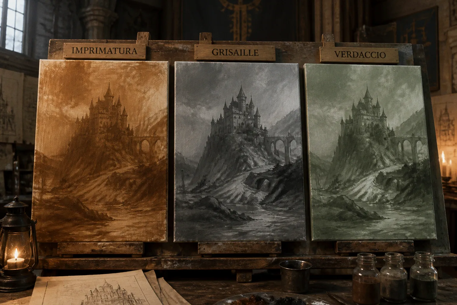
When I review a portfolio for a TCG commission, the finished glaze work catches the eye first, but the foundation tells me whether the artist understands how classical oil mechanics support fantasy illustration.
Compare car rental deals in United Kingdom
See available offersPartner link — DiscoverCars comparisonA useful fantasy art underpainting methods comparison is not an exercise in Renaissance loyalty. It is a question of function. Are you trying to establish a color key? Solve brutal, theatrical light before local color muddies it? Keep a character’s skin from turning waxy? The answer determines whether imprimatura, grisaille, or verdaccio belongs under the piece.
I have commissioned and rejected plenty of oil paintings over the years, and these three methods each solve a different problem. Picking one because it sounds Old Master-approved is a fine way to create an extra week of corrective glazing. The better move is to decide what the painting needs before the first transparent wash touches the panel.
Imprimatura: Establishing Value and Color Harmony
Imprimatura is the easiest of the three to underappreciate, which is a shame because it does a remarkable amount of work for very little labor. It is a thin, transparent layer of color—usually burnt umber, raw sienna, yellow ochre, or a related earth—applied over a white ground. Its first job is simply to kill the glare of bare gesso.
That sounds modest until you have watched an artist wrestle a whole painting against untouched white. A bright ground makes every shadow look darker than it is and every highlight feel prematurely finished. An imprimatura gives the eye a middle-value reference before the composition has even begun to settle. It also creates color harmony: every opaque passage, scumble, and glaze is quietly related to that initial tone.
For fantasy work, this matters more than painters sometimes admit. A raw sienna or warm ochre imprimatura is excellent under daylight scenes, sunlit ruins, golden dragon flights, tavern interiors, and anything where you want the final image to carry a unified ember-like warmth. It is close in spirit to the warm underpainting key James Gurney often builds from, though the exact mixture is less important than the logic of the layer.
A cooler imprimatura can change the emotional weather immediately. A restrained umber-gray, a blue-black wash, or a muted cool neutral can support moonlit crypts, underwater scenes, frostbound landscapes, and steel-heavy armor. The point is not to paint the whole picture in miniature at this stage. The point is to make the white ground stop shouting.
The limitation is equally clear: imprimatura does almost nothing to solve your value structure by itself. If the shadow design is confused, a handsome warm ground will merely give you a harmoniously confused painting. This is the heart of the grisaille vs imprimatura for oils question. Imprimatura is a key; grisaille is a map.
An imprimatura makes the whole painting speak in one key. It does not write the composition for you.
For a quick concept piece, an alla prima study, or a painting where color relationships are the main challenge, that may be enough. For a complicated narrative image with hard light, overlapping figures, reflective armor, and a dozen places for values to collapse into each other, you will want more structure.
Grisaille and the Architecture of Chiaroscuro
Grisaille is a monochromatic underpainting built in shades of gray, black and white, or a single earth pigment pushed through a full value range. It is the architectural drawing of oil painting: major lights, deep shadows, cast-shadow shapes, reflected light, edge hierarchy, and the central read are established before full color enters the argument.
When a finished fantasy painting has light that feels inevitable, the artist has usually solved the value map somewhere. It may be in a graphite study, a digital comp, a casein block-in, or a traditional grisaille. But it has been solved. Good chiaroscuro is rarely an accident of attractive local color.
For fantasy illustrators, grisaille is especially useful when the brief depends on theatrical lighting. A demon emerging from a torchlit hall. A knight whose helmet catches one blade of light. An undead king half-lost in water and shadow. A wizard’s face lit by a spell while the rest of the figure disappears into a cold room. These paintings ask the viewer to read the light logic instantly. Trying to discover that logic while also deciding how purple the skin should be, how green the oxidized bronze should look, and how warm the torchlight ought to feel is how otherwise capable painters start chasing their own tails.
In a grisaille stage, the question is mercifully blunt: does it read from across the room? If the creature, gesture, focal point, and atmosphere work without color, they have a chance of surviving color. If they fail without color, no amount of violet glazing will rescue them.
The traditional approach uses leanly thinned oil paint in the early passages, with progressively fatter handling as the work develops. Some painters use mixtures involving turpentine, linseed oil, and stand oil for later layers, but recipes should never become religion. The useful principle is straightforward: keep the first layers controlled, avoid smothering the drawing in oily sludge, and preserve enough tooth for the paint that follows.
The modern equivalent is often a fast acrylic gray wash or a casein value study on a properly prepared panel. That is not a betrayal of classical painting. It is a working illustrator’s adaptation. The visual problem is still the same: establish the light before the color gets a vote.
Grisaille does have an honest weakness in fantasy figure work. Gray below warm flesh can produce a corpse-like chill if the final flesh layers are too thin or too tentative. That can be perfect for a revenant, vampire, winter sorcerer, or exhausted battlefield scene. It is less helpful when the brief calls for luminous skin, warm hands, flushed cheeks, or a portrait where the living presence of the figure carries the image.
This does not mean grisaille cannot support convincing flesh. It can. It means the painter has to understand that the neutral foundation will influence every translucent warm passage laid over it. If you do not want to spend the final stages fighting to restore warmth, verdaccio deserves a place in your toolkit.
Verdaccio: The Renaissance Secret for Realistic Skin Tones
Verdaccio is a greenish-gray underpainting, traditionally associated with earth green or terre verte and often moderated with black, ochre, or related earth colors. It was documented by Cennino Cennini around 1400 and became a staple of early Renaissance flesh painting because it does something a neutral grisaille does not: it prepares the painting to receive warm, translucent skin color.
The visual logic is simple even if the effect feels magical. Warm pinks, reds, ochres, and flesh glazes placed over a cool green-gray foundation gain tension. Highlights can lean pinker. Halftones feel more complex. Shadows carry a subdued violet or red-brown life rather than becoming flat orange mud. The result is not “green skin.” The green has to stay quiet enough to function as a counterweight, not a costume choice.
For fantasy illustration, verdaccio is badly underused. I see artists default to gray for everything, then spend the rest of the process forcing warmth back into faces and hands. If the focal point is a character portrait, a heroic figure, a painted saint, a courtly villain, or any composition where exposed skin must feel alive under controlled light, verdaccio gives you a more sympathetic starting point.
If the brief lives or dies on faces and hands, verdaccio gives the warm layers something intelligent to argue with.
The method is especially strong for work that wants Renaissance gravity without becoming imitation-Renaissance. You can use it beneath a knightly portrait, an elf queen, a mythic heroine, a weathered sailor, or a human figure surrounded by impossible color. The underlying system remains useful even when the subject is not remotely historical.
There is a narrow line between a useful verdaccio and a sickly one. Push the green too saturated, too dark, or too visible in the wrong passages and the skin starts reading as bruised, poisoned, or undead. Again, that may be a feature for the right brief. But it should be a decision. The best verdaccio passages tend to look almost disappointingly restrained before the flesh layers go over them.
Boris Vallejo and Donato Giancola work through very different systems, but the principle carries across both: solve the foundation color of flesh before the finish stage. Do not wait until the final glazes to discover that the character’s face has no blood in it.
Verdaccio is therefore not simply “grisaille, but green.” It is a flesh-first value structure. It still requires good drawing, clean value organization, and disciplined control of the cool passages. It is not a universal default for every painting. A sprawling armored battle scene with tiny faces may gain very little from it. A portrait-led cover image may gain everything.
Modern Workflow Adaptations: Acrylic Washes and Casein
Studio reality diverges from the art-school diagram quickly. Most working fantasy illustrators I commission, or whose portfolios I review, do not spend days building an elaborate oil underpainting beneath every piece. They adapt the classical logic to materials that dry predictably and allow them to move from drawing to paint without gambling with the surface.
A common workflow looks something like this:
1. Transfer or mount the drawing onto a prepared panel. Some artists attach a detailed graphite or ink drawing to a sealed board with acrylic matte medium. This can preserve a complex design without redrawing it at final scale. It is useful for card art and cover illustrations where the approved drawing contains a great deal of narrative information.
2. Seal the drawing before building paint layers. A dry, even film of acrylic matte medium or an appropriately diluted acrylic layer helps isolate graphite from later applications. The goal is not to drown the drawing under plastic; it is to create a stable barrier while keeping the line visible enough to work from.
3. Choose the underpainting according to the image’s actual problem. A warm earth wash can serve as imprimatura. A restrained gray can establish a grisaille. Terre verte or a muted green-gray can become verdaccio. At this point, the classical names matter less than the decisions they force: value, temperature, and hierarchy.
4. Let the acrylic or casein layer dry thoroughly before adding oils. Thin applications can dry relatively quickly, but thicker or heavily worked layers need more patience. Oil paint belongs over a stable, dry acrylic or casein surface—not a layer that still feels cool, tacky, or soft.
5. Use the oil stage for what oil does best. This is where transparent shadows, soft transitions, selective opacity, broken edges, and glazing can earn their keep. If the underpainting is doing its job, the oils refine rather than rescue.
Acrylic washes are popular because they are quick, controllable, and easy to revise before oils enter the picture. They can be used very thinly for an imprimatura-like stain or more opaquely for a value block-in. The danger is treating acrylic like watercolor without understanding its film. Too many weak, chalky passes can create a dead-looking surface; too much medium can make the drawing slippery; too little can leave a fragile, uneven layer. The point is not to manufacture a technical problem beneath your oils.
Casein is another serious option. It dries matte, tends to give a handsome absorbent surface, and can create the slightly chalky, old-world quality that suits certain fantasy subjects beautifully. A casein grisaille beneath transparent oils can make a stone hall, aged armor, parchment, bone, or weathered skin feel wonderfully physical. A warm casein imprimatura can also be more visually generous than a bare acrylic stain.
But casein is not magic. It demands a deliberate hand, and it is not the place for endlessly fussed passages. Keep it clean, let it dry fully, and treat it as a foundation rather than a second finished painting.
Technical Risks: Preventing Graphite Migration and Adhesion Issues
The most expensive mistake in an underpainting is usually not choosing the wrong color. It is skipping the boring preparation step because the drawing looks fine and you want to get to the satisfying part.
Graphite deserves particular attention. Pencil particles are not automatically immobilized just because oil paint goes over them. Over time, especially where layers are thin, stressed, or repeatedly worked, an underdrawing can become more visible than intended. The risk depends on the surface, the amount of graphite, the binder, and the way the painting is built, but it is real enough that serious illustrators should plan for it.
Properly sealing the drawing with a compatible acrylic medium, wash, or other suitable isolating layer greatly reduces the risk of graphite migration and ghosting through later paint layers. It is not an absolute guarantee against every long-term issue—materials age, surfaces move, and paintings have a talent for exposing shortcuts—but it is a sensible piece of studio discipline.
Do not confuse sealing with obliterating. A heavy, glossy coat can make the panel unpleasant to paint on and can flatten the useful information in the drawing. Apply enough to isolate the graphite and stabilize the surface, then let the layer dry thoroughly. If the line has vanished completely, you have solved the wrong problem.
The other landmine is adhesion. Oil over fully dried acrylic is a standard and workable structure. Oil over acrylic that is still retaining water, feels tacky, or has been applied in a thick, poorly cured layer is where trouble begins. The result may be weak bonding, unpredictable sinking-in, or a soft foundation that undermines the controlled glazing you were hoping to achieve.
A few habits prevent most disasters:
- Keep the initial drawing clean. A drawing rubbed into the panel with soft graphite creates more material to manage than a disciplined line drawing.
- Build thin, intentional underpainting layers rather than repeatedly scrubbing and repainting until the surface becomes a mystery.
- Let acrylic and casein dry on their own schedule. The painting does not care about your deadline.
- Avoid assuming that “dry to the touch” and “ready for oil” are always the same thing, particularly with thicker applications.
- Test a complete small study on the same panel, ground, drawing material, and paint system before using it on a major commission.
The best underpainting for oil illustration is usually not the one with the most historical prestige. It is the one that gives you a stable surface and solves the dominant visual problem before expensive paint starts going down.
Choosing the Right Foundation for the Brief
When I am discussing a commission with an artist, this is the practical comparison I keep in my head:
| Method | Best for | Watch out for | Modern adaptation |
|---|---|---|---|
| Imprimatura | Unifying color, reducing ground glare, setting an overall temperature | It will not solve weak drawing or confused values | Thin acrylic or casein earth wash |
| Grisaille | High-chiaroscuro scenes, armor, stone, dramatic environments, hard light logic | Neutral gray can cool flesh too much | Acrylic gray wash or casein value block-in |
| Verdaccio | Portraits, exposed skin, hands, figure-led narrative work | Saturated green can make the figure look ill or undead | Muted terre verte acrylic or casein layer |
There are no sacred percentages here, but a few practical rules hold up in real studio work:
- If the painting is carried by a face, hands, or a figure in close view, consider verdaccio before defaulting to gray.
- If the painting is carried by silhouette, hard light, armor, architecture, or a deep environment, grisaille gives you the cleanest structural advantage.
- If the image needs to stay quick, direct, and color-led, an imprimatura may be all the underpainting you need.
- If you are working from a graphite drawing, treat isolation as part of the painting process rather than optional housekeeping.
- If you have not used a particular acrylic, medium, casein brand, panel, and oil combination before, test the stack on a small study. The studio has a way of making theory humble.
The important thing is to stop treating monochromatic underpainting options as three aesthetic costumes. They are three different answers to three different questions. Imprimatura answers, “What atmosphere should this picture begin in?” Grisaille answers, “Does the light actually work?” Verdaccio answers, “Will these warm flesh layers have depth underneath them?”
Learn all three. Make small studies. Paint the same head over a gray ground, a green-gray ground, and a warm earth stain. Paint the same armored figure with a grisaille and with a simple imprimatura. The difference becomes obvious in the brush long before it becomes obvious in a finished portfolio.
The underpainting is the part nobody sees once the illustration is complete. That is exactly why it matters.