Wood panels vs stretched canvas for fantasy oils
When a brief lands in my inbox asking for a "tight, readable silhouette that holds up at two inches tall," the surface matters as much as the brushwork.
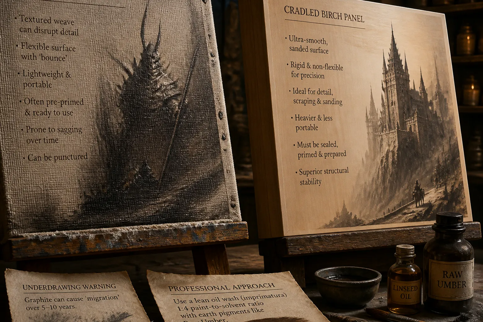
I've sat across from artists who spent twenty hours on a beautiful oil sketch — confident, atmospheric, full of life — and then watched the weave of the canvas fight them when we scale that image down for a print card or a token icon. The highlights bloom, the shadows go fuzzy, and what read as fine glazing in person looks like noise at thumbnail size. That's the moment most fantasy illustrators first start asking whether wood panels might be a better bet than stretched canvas, and honestly, for the kind of detailed commercial work TCG clients keep commissioning, the answer is almost always yes.
Compare car rental deals in United Kingdom
See available offersPartner link — DiscoverCars comparisonA stiff surface doesn't make you a better painter — but it does stop the weave from fighting your finest work.
Precision and Surface Tension: Why Fantasy Detail Wants a Rigid Backing
The first thing to understand about wood panels is what they don't do: they don't give. Stretch a primed canvas over a frame and you've got a trampoline — a beautifully textured trampoline, but still a surface that flexes under every brushstroke. Press a loaded brush into canvas and you can feel the weave push back. Try to scrape a sharp highlight into wet paint for a glint of armor, and the canvas tooth catches your palette knife unevenly. None of that matters if you're painting loose alla prima skies across a 30x40-inch landscape. It matters enormously if you're rendering the edge of a runic blade, a strand of elf-hair catching light, or the readable silhouette of a creature card that has to land at thumbnail scale.
Wood panels flip that equation. Birch plywood, MDF, and Masonite all give you a flat, unyielding substrate. You can lay a dry brush across wet paint and pull a crisp scumble. You can sand back an area you overworked without damaging the support. You can glaze thinly over a dried passage without the weave telegraphing through. For fantasy illustration specifically — where the work often depends on fine ornamental detail, magical sigils, filigree armor, and clean negative space — that rigidity is not a luxury. It's what lets the brushwork stay legible.
I notice it the moment I open a submission. An oil painting on a 1/8-inch birch panel feels different under the portfolio satchel. The piece doesn't ripple when you pick it up. The edges stay square. The surface reads as part of the artwork rather than as a separate decision the artist happened to make about support. That kind of quiet confidence in a portfolio submission signals that you understand what the work actually needs, and it makes me want to keep flipping through the rest of your book.
The Structural Trade-Off: Portability vs Stability
That said, the rigid surface comes with a real cost, and it's worth naming honestly: weight. A 16x20-inch cradled birch panel can easily weigh two to four kilograms once you've sealed, primed, and painted it. A stretched canvas of the same size feels like a feather by comparison. If you're painting life-size portraits, large atmospheric landscapes, or shipping finished work across borders for a gallery show, that weight difference matters — a lot.
Here's where the practical comparison gets useful:
| Factor | Stretched Canvas | Wood Panel |
|---|---|---|
| Weight at 16x20″ | Light, easy to transport | 2–4 kg, awkward to ship |
| Surface texture | Visible weave, can disrupt fine detail | Smooth, tooth-free, ideal for glazing |
| Rigidity | Flexes under pressure | Rigid, supports scraping and sanding |
| Prep needed | Usually pre-primed, ready to paint | Must be sealed, then primed |
| Long-term stability | Prone to sagging and puncture | Structurally stable, resists impact |
| Best for scale | Large works (24″+), loose painting | Small to mid (under 24″), tight detail |
Notice how the strengths sit on opposite sides. Canvas wins on portability and scale. Wood wins on precision and longevity. That's the trade-off I want you to internalize before you commit to either one — and it's the trade-off I weigh every time a brief lands asking for art at collector scale.
A third option splits the difference, and Craig reaches for it constantly when he's working on travel pieces: canvas panels. These are thin sheets of MDF — typically around 3mm — pre-mounted to a canvas-style backing. They give you the rigidity of a panel for surface work while staying light enough to slip into a flat folio. They don't ship as confidently as a stretched canvas rolled in a tube, but for working sketches and small finals they are a smart compromise that more fantasy artists should keep in their kit.
Archival Preparation: Sealing Wood and Priming Right
Here's where a lot of promising paintings quietly fail before they ever get a brushload of color. Raw wood is thirsty. It will pull moisture out of your oil paint unevenly, and over time — sometimes within a year, sometimes within five — the panel can cup, bow, or split along the grain. That doesn't mean wood is a fragile surface; it means it's a surface that demands respect in the prep stage.
The standard sequence I look for when a working artist drops a portfolio on my desk:
- Seal the wood first. A coat of acrylic medium, diluted PVA size, or shellac seals the pores and creates a barrier between the panel and your oil layers. Don't skip this on birch or MDF — both are notorious for moisture migration if left bare.
- Prime with thin, sanded coats. Two to three thin layers of acrylic gesso, lightly sanded between applications, give you a familiar painting surface without the long-term acidity issues of old-school rabbit skin glue. If you want the historical gold standard, oil-primed linen glued to a sealed panel is the move.
- Build a cradle for anything over 12 inches. A 1/8-inch birch plywood face glued to a pine frame — what most suppliers call a "cradled panel" — prevents warping and lets the piece hang flat on a wall without a frame. For smaller studies, an uncradled 6mm multiplex panel works fine and saves weight.
The unsealed panel is the silent portfolio killer. I've opened submissions where the artist clearly had the chops — confident drawing, atmospheric color, a strong concept — but the support had visibly bowed corner to corner, and the moment I tried to photograph it flat, the digital capture went out of focus in the middle. The painting was the problem and the solution at once: a coat of sealer the day before priming would have saved the entire piece.
The Graphite Migration Trap: Protecting Your Long-Term Investment
If sealing is the silent killer of wood panels, graphite migration is the silent killer of oil paintings — full stop, regardless of support. I bring this up in every portfolio review where I see a pencil underdrawing peeking through translucent oil glazes, because what looks fine in a 2024 studio visit can turn into a soft gray haze by 2034, and that's not the kind of long-term problem collectors are patient with.
Here's the chemistry, briefly. Graphite is carbon. Carbon migrates through drying oil films over time — a process that typically takes somewhere between five and ten years depending on paint thickness, layering, and the specific pigments involved. The carbon particles travel up through the binder and settle on or near the surface, muddying whites, dulling blues, and casting a veil over anything light. Some artists never see it; others lose entire passages of high-key glazing. The unpredictability is exactly what makes it a portfolio risk you don't want to take on a paid commission.
If your underdrawing is graphite and your painting is oil, you're running a five-to-ten-year clock you can't see.
This is why almost every working illustrator I trust has moved away from graphite as an underdrawing medium under oils. Some have switched to ink or watercolor pencils that don't migrate. Some have abandoned underdrawing altogether and gone straight to paint. And the ones who love the feel of a working drawing beneath their brushwork have learned to do it with an oil-based imprimatura — which is the next section.
Mastering the Imprimatura: Lean Washes for Compositional Layouts
An imprimatura is a thin, translucent oil wash you lay down before any real painting begins. It's your compositional sketch in paint, and it solves three problems at once: it gives you a tonal ground to work against, it establishes your value map in seconds rather than hours, and — this is the key bit — it doesn't migrate, because it's oil all the way down.
The working ratio is simple: one part oil paint to four parts solvent. That's a lean wash — enough binder to dry properly, but lean enough to dry fast and stay workable for revisions. For the pigment itself, stick to earth tones. Raw Umber, Yellow Ochre, and Burnt Sienna are stable, they dry predictably, they don't fight subsequent layers, and they create a warm mid-value ground that flatters almost any fantasy palette you put over them. A cooler-leaning Burnt Umber or a chromatic Indian Red works beautifully for moodier briefs; the principle stays the same regardless of hue.
Lay the wash on with a broad soft brush, let it set for ten or fifteen minutes, and then draw into it with a brush handle, a rag, or a soft eraser. You can lift highlights. You can push darks. You can wipe back an entire figure and start the composition again without damaging the panel underneath. It's sketching, but in the same medium as the final painting, so you don't introduce a foreign material into the oil film. That single fact is what protects your work decades down the road.
One caveat from the studio: once you switch from a solvent-manipulable underdrawing to an acrylic one, you've locked in your composition. Acrylic dries fast, which is why some illustrators love it for value studies under oils — you can block in a full grayscale underpainting in an afternoon. But acrylic cannot be lifted with solvent once it's cured, so if you like to revise aggressively in the first hour, stick with the lean oil wash. If you paint decisively and want a quick-drying ground, acrylic underpainting will save you a day.
Where I Land on Canvas vs Panel
After twenty years of reviewing submissions and commissioning fantasy oil work for card sets, illustrated editions, and character art drops, here's my honest position: if your brief is small, tight, and detail-heavy — anything that will live at trading card scale, token size, or printed below five inches — paint on a wood panel. The silhouette will stay sharp, the glazing will read clean, and the piece will survive a decade on a collector's shelf without bowing or fuzzing.
If your brief is large, atmospheric, and meant to live at room scale — gallery pieces, oversized book covers, narrative paintings meant to be seen across a room — stretched canvas is still your friend. The portability, the forgiving tooth, the way canvas holds a wet edge across a wide passage — none of that is wrong. It's just a different tool for a different job, and pretending one surface solves every brief is how you end up fighting your own materials.
What I want you to walk away with is this: the surface is a decision, not a default. Pick it the way you pick a brush. Match it to the scale, the brief, and the lifespan you want for the piece. Seal your wood panels properly. Skip the graphite under oil. And when in doubt, reach for a Raw Umber imprimatura — it's the closest thing to a free redo your painting will ever get.