Sketch transfer to canvas: grid vs carbon paper
I've reviewed more opening portfolios than I can count, and the sketch transfer tells me almost everything I need to know about how an artist will handle a brief.
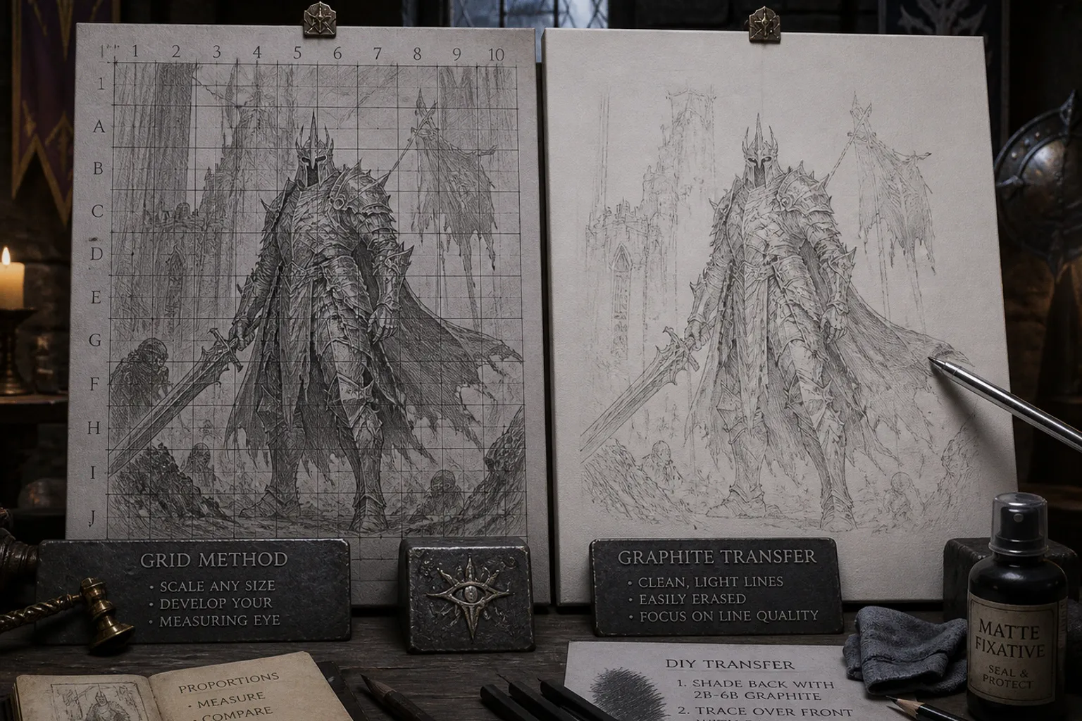
You can usually spot the tell on the first piece: a smear of graphite blooming through the underpainting where the artist's thumb dragged across the canvas, or a faint waxy outline refusing to take pigment along the silhouette of a hero's gauntlet. These aren't catastrophic flaws, but on a commission submission, they read as carelessness before the brushwork has even had a chance. If you're building a portfolio that needs to survive close inspection under gallery lighting and art director scrutiny, your transfer stage matters far more than most tutorials admit.
Compare car rental deals in United Kingdom
See available offersPartner link — DiscoverCars comparisonThe question isn't really “grid or transfer paper” as a binary — it's which tool fits the job in front of you, and how to keep either method from sabotaging your paint layers downstream. Transferring sketch to canvas grid vs carbon paper is, at heart, a choice between measured reconstruction and fast replication. Both can be professional. One of them can also quietly ruin a painting before the first proper layer goes down.
A clean transfer isn't about hiding your scaffolding — it's about ensuring the scaffolding doesn't bleed into the finished piece.
The Proportional Discipline of the Grid Method
The grid method is the older of the two approaches, and it remains the gold standard for any transfer where scale is in play. If your sketch is a 4×6 inch thumbnail and your target canvas is 24×36 inches, the grid method is essentially your only practical option. You're drawing a measured lattice over both your reference and your canvas, then transposing the contents square by square. Done well, it trains your eye in a way no other method quite replicates.
Here's what I mean: when you sit down with a 1-inch grid on your reference and a 2-inch grid on your canvas, you're forced to make proportional decisions constantly. Does the dragon's horn actually extend halfway into the third square, or only a third of the way? Is the far shoulder really as broad as it felt in the thumbnail, or did the cloak make you overstate it? That question, repeated across an entire composition, builds the kind of observational muscle memory that distinguishes an illustrator from a tracer.
I've watched junior artists who relied exclusively on transfer paper for a year struggle with basic foreshortening on their first unaided sketch — because they had never developed the measuring eye the grid demands. The grid is not glamorous. It does not feel clever. It simply makes you look again, and then look harder.
For a highly detailed fantasy sketch with subtle facial expressions, costume folds, and layered background elements, I typically recommend 1/2 inch squares on the reference. For a simpler composition — a silhouette study, a weapon design, a single character pose with minimal background — 1-inch squares or larger keep the process efficient without sacrificing accuracy. The grid isn't fast, and that's part of its value. It slows you down at exactly the moment when you need to read the reference rather than guess at it.
There is also a useful distinction between drawing a full grid and using only a few structural guides. A full lattice is worth the effort when the composition has several overlapping figures, architecture in perspective, or a creature whose anatomy has to land exactly right. For a single portrait or a card-game character with a clean central silhouette, a vertical centerline, an eye line, and a few horizontal landmarks may do the job. The point is not to turn the canvas into graph paper. The point is to establish enough measured information that your drawing does not drift while you work.
The trade-off is real, though. A full grid transfer on a 16×20 inch canvas with 1-inch squares means hundreds of individual decisions about where each line falls. For a quick study or a working sketch where the drawing itself isn't the deliverable, that's overhead you may not need.
Still, if you are learning how to transfer a fantasy sketch to canvas and your proportions routinely change between thumbnail and final surface, the grid is not punishment. It is the corrective.
Precision and Speed: The Case for Graphite Transfer Paper
Graphite transfer paper is what most professional illustrators reach for when they need a faithful 1:1 reproduction of a finished drawing. You place the graphite-coated sheet between your sketch and your canvas, trace over your lines with a ballpoint pen or stylus, and the pressure deposits graphite on the canvas in the exact pattern of your original. It takes minutes rather than hours.
The appeal for fantasy illustrators is obvious: you've spent three days refining a knight's armor with all its rivets, chainmail texture, and layered pauldrons. You don't want to gamble that reconstruction through a grid. You want that drawing on the canvas intact, so you can get to the actual painting.
This is where traditional media illustration sketch transfer becomes less about craft romance and more about production discipline. If the approved drawing already contains the decisions — the gesture, the costume design, the placement of the sword hand, the expression the client signed off on — there is no virtue in redrawing it poorly. Transfer paper protects a good line drawing from the fatigue and distortion that can creep in when you reconstruct it by hand.
Transfer paper preserves line quality. The grid preserves proportional judgment. Know which one your piece needs.
There is, however, a meaningful difference between artist-grade graphite transfer paper and the old-school carbon paper many beginners grab from a stationery store. This is where portfolios fall apart, and it's worth pausing on. Traditional carbon paper is often wax-based, designed for typing and form-copying — it is meant to make permanent marks that will not lift off. That permanence sounds useful until you realize that wax and oil paint are not friendly neighbors.
The wax can resist subsequent paint layers, causing adhesion problems, and the lines are notoriously difficult to erase or cover. I've seen pieces where the carbon outline ghosts through several layers of glazing because the wax has effectively sealed itself into the ground. A clean contour around a helmet becomes a faint blue-black halo after the paint dries. Once you see it, you cannot unsee it.
Artist-grade graphite transfer paper is a different animal entirely. The better sheets are wax-free and grease-free, producing a lighter graphite line that erases cleanly with a kneaded eraser and sits more comfortably under paint layers without interfering with adhesion or coverage. The line may feel almost too delicate at first. That is usually a good sign. Your transfer should guide the brush, not fight it for visual dominance.
| Parameter | Grid Method | Graphite Transfer Paper |
|---|---|---|
| Best for scaling | Yes — any enlargement or reduction ratio | No — limited to 1:1 transfer |
| Time investment | High; often several hours | Low; minutes for most drawings |
| Line quality | Reconstructed by hand | Direct from the original drawing |
| Skill developed | Proportional measurement and observational discipline | Tracing accuracy and stylus control |
| Reversibility | Pencil marks erase easily | Wax-free lines erase; waxy lines resist erasure |
| Risk to paint layers | Low if drawn lightly | Low with wax-free paper; problematic with carbon paper |
| Cost | Essentially free | Commercial sheets generally cost more than DIY graphite sheets |
The honest summary: if your drawing is finished, your canvas size matches, and you trust the linework, graphite transfer paper is faster and more faithful. If your drawing needs to change scale, or if you want to sharpen the proportional eye that separates working illustrators from production tracers, the grid earns its time.
Avoiding the Wax Trap: Selecting the Right Transfer Materials
I'll say it plainly because I wish someone had said it to me fifteen years ago: do not use typewriter carbon paper on a canvas you intend to oil paint over. The wax content in traditional carbon paper is designed for permanence — that's the entire point of the product in an office context — but permanence is exactly what you do not want under oil paint.
Wax can resist pigment, encourage beading or crawling in the first paint layer, and create lines that ghost through glazes for the life of the piece. Even if the paint initially appears to cover the mark, a change in sheen can reveal the transfer later. The problem is especially ugly in pale passages: skin, cloud banks, moonlit armor, mist, or a white horse’s neck. Those are the places where an underlying carbon contour has nowhere to hide.
What you want is wax-free graphite transfer paper marketed specifically for artists. The lines are softer, yes, but that softness is a feature, not a bug. A hard, dark line on a white canvas looks reassuring at the transfer stage and becomes a liability the moment you start glazing. Softer graphite integrates more cleanly under thinned paint layers and lifts with minimal ghosting when you need it gone.
If you're sourcing materials, look for products labeled “grease-free” or “wax-free” on the packaging. Test a corner before committing a full drawing: make a few marks on a primed scrap, erase one, seal another, and paint over a third. That tiny trial tells you more than a product description ever will. You are looking for a mark that transfers with moderate pressure, does not leave a greasy shine, and can be softened without scuffing the ground.
There is a practical reason to be fussy here. Canvas texture changes how transfer material behaves. A very smooth acrylic-primed surface takes a light graphite impression easily; a rougher weave may tempt you to press harder, depositing too much material in the valleys of the texture. Pressing harder is often the moment a supposedly harmless transfer becomes difficult to control. If the canvas tooth is fighting you, do not simply bear down with the stylus. Reinforce the critical contours after a light transfer, or reconsider whether the drawing needs a smoother ground.
A practical note from the commissioning side: when a portfolio arrives with visible carbon residue or waxy outlines bleeding through the underpainting, it signals one of two things — either the artist did not know the difference between stationery carbon and artist graphite paper, or they knew and used the wrong product anyway. Neither reads well. It is the sort of quiet technical error that can make a strong painting feel less trustworthy.
Securing Your Sketch: Preventing Smudges and Paint Adhesion Issues
Even wax-free graphite transfer paper can create problems if you do not lock the lines down before you start painting. The most common failure I see is the artist who transfers the drawing, sets up their palette, and begins laying in the underpainting — only to drag a forearm across the canvas halfway through and smear the entire transfer into abstract graphite clouds.
The fix is straightforward: seal the transferred lines before any paint touches the surface. There are three approaches that work reliably, and which one you choose depends on your ground and your paint medium.
1. Use a light spray fixative. Apply light coats from the recommended distance rather than soaking the surface. Two restrained passes are better than one heavy pass, which can pool, darken the drawing, or shift loose graphite into unintended areas. Let the surface dry fully before painting.
2. Use a matte spray sealant where appropriate. Some artists prefer a matte surface because it retains a touch of tooth for the first paint layer. The key word is light. You are fixing a drawing, not laminating it under plastic.
3. Brush on a thin, compatible clear layer. Transparent gesso or a suitable medium can give you more local control when used carefully with a soft brush. This approach is useful if only certain transferred passages need reinforcement, but it requires a gentle touch. Scrubbing a brush over graphite is simply another way to make a smudge.
Whichever method you choose, the underlying principle is identical: once you've committed your drawing to the canvas, the drawing needs to become part of the ground, not a fragile overlay waiting to be smudged. I treat the sealing step as non-negotiable on any commissioned piece, regardless of how light the transfer lines appear.
Seal your transfer the way you'd seal a contract — before anything else can change it.
There is another habit worth building: work around the canvas with a clean sheet of glassine, tracing paper, or plain copy paper beneath your hand. This does not replace sealing, but it prevents your palm from polishing graphite into the weave while you paint adjacent passages. On a detailed card illustration, where you may return repeatedly to a character’s face or a cluster of small costume shapes, that barrier earns its place quickly.
Also resist the urge to keep every transfer line visible throughout the painting. Once a passage is established, let the construction drawing disappear under the work. A traditional painting should not look as though the artist was afraid to lose the map. Keep only the landmarks you genuinely need: the tilt of the eyes, the edge of the mouth, the rhythm of fingers, the major silhouette breaks. Everything else can be rebuilt with paint.
One caution worth flagging: certain acrylic fixatives can yellow over time, particularly in heavy applications or poor storage conditions. For archival work or pieces intended for long-term display, test the product on a scrap canvas first. Paint over it, let it settle, and see how the surface behaves. If you are working on a piece with a known buyer or a gallery placement, this kind of pre-check is worth the extra afternoon.
DIY Graphite Sheets: Customizing Your Transfer Tools
Commercial artist transfer paper works well, but it is not the only option. For artists who transfer frequently or work at scale, making your own sheets is a practical skill. The process is simple enough to fold into a studio afternoon, and it gives you control over line weight that commercial products do not always offer.
To make a DIY transfer sheet, take a sheet of drawing paper or tracing paper and coat one side with soft graphite. A softer pencil produces a darker, more generous transfer; a firmer pencil gives you a quieter line. Compressed graphite sticks are useful when you need broad, even coverage over a large sheet. Coat the surface thoroughly, then place your sketch face-up on top, graphite-side down against the canvas, and trace with a ballpoint pen or stylus. The pressure transfers graphite to the canvas in the pattern of your original drawing.
The advantage of DIY is customization. Need a very faint line for a piece where you'll be doing extensive glazing? Use a restrained graphite coat and a light hand. Need a more legible line because the sketch contains fine patterning, subtle value separations, or a complicated arrangement of armor plates? Build up the graphite coverage slightly before you begin. You are not locked into the middle-weight mark that many commercial sheets are designed to produce.
DIY sheets also make economic sense for a busy studio. Commercial transfer paper is convenient, consistent, and usually the better choice when you need dependable results straight out of the package. Homemade graphite sheets, by contrast, use ordinary studio materials and can be prepared as needed. If you are transferring drawings regularly, that difference adds up — and you are less likely to discover, late at night before a deadline, that the last usable sheet in the pad has already gone pale.
The limitation is consistency. A commercially prepared sheet will usually transfer evenly from corner to corner. A homemade one can leave pale patches if the graphite coat is uneven, or overly dark marks if you have loaded it too heavily. That is not a reason to avoid DIY. It is simply a reason to test it before placing it beneath a finished drawing. Make a few trial strokes in the margin, vary your pressure, and decide whether the mark is appropriate for the painting to come.
One practical tip: store your DIY sheets with the graphite side protected by a sheet of plain paper, and do not stack them under heavy books. The graphite can transfer prematurely under pressure, and you'll open your storage envelope to find a set of mysteriously smudged blanks. A simple interleaving with scrap paper solves this entirely.
The Choice That Matters
Here is how I frame the grid method vs transfer paper art question for artists submitting to briefs or building a portfolio with an eye toward professional work: the grid method is training. Every hour you spend measuring, comparing, and transposing proportionally is an hour your eye gets sharper. If you are early in your career, or working on pieces where the drawing itself is part of the value — a finished graphite sketch, a tight concept piece, a large painting built from a small thumbnail — the grid is the better investment even when it is slower.
Graphite transfer paper is production. When the drawing is locked, the canvas matches, and your time is better spent on paint than reconstruction, transfer paper lets you preserve line quality without the overhead. It is the right tool for commission work where the client has approved a sketch and you are executing to a deadline.
The mistake is not choosing one over the other. The mistake is using office carbon paper because it was in the desk drawer, skipping the seal step because the lines “look light enough,” or treating either method as a substitute for actually understanding the drawing you are transferring.
The transfer is the foundation, not the drawing. The drawing still has to be good. But a clean, well-sealed, properly scaled transfer gives that drawing its best chance to survive the painting process and arrive in your portfolio looking like the work you actually made.
Build your transfer process the way you'd build any other professional habit — with intention, with the right materials, and with respect for what the finished piece needs to do. Your portfolio will thank you for it.