Oil paint glazing: a pre-session prep checklist
Most failed glazes are not painted badly. They are prepared badly.
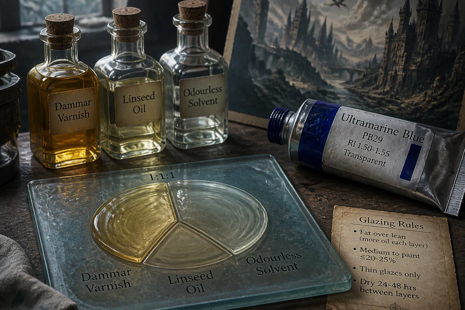
The artist sees a dull passage in the underpainting, grabs a brush, floods it with medium, drops in a dramatic transparent red, and waits for Rembrandt to send a congratulatory telegram. Instead: a tacky surface, a muddy shadow, or a layer that starts behaving like cheap wrapping film. Oil paint glazing is not a magic filter. It is a controlled optical layer, and the control happens before the brush touches the panel.
A useful oil paint glazing preparation checklist is therefore less about collecting mystical ingredients and more about locking down five things: the pigment’s transparency, the surface state, the medium’s oil content, the layer’s thickness, and the waiting time nobody enjoys.
Get those right and a glaze can push atmosphere, depth, and focal hierarchy without repainting the entire image. Get them wrong and you are not glazing. You are gambling with a painting that may remain sticky long after the dragon has stopped looking impressive.
1. Confirm that the underpainting is actually ready
A glaze belongs on a dry, stable painting layer. Not a layer that feels dry at the surface but still shifts under light pressure. Not a passage that looks dry because the studio radiator has been working overtime. Dry means dry enough that the new application will sit on top rather than disturb, dissolve, or drag pigment from beneath.
This matters especially in traditional fantasy illustration, where an underpainting often carries the full structural work: the drawing, value pattern, edge map, and the first statement of the focal point. The glaze is there to alter colour temperature, deepen selected shadows, or unify a local passage. It is not there to rescue an unresolved composition.
Before beginning oil glaze layer preparation, run through the surface in order:
1. Check for movement under the brush. Lightly stroke an inconspicuous area with a clean, dry soft brush. If it picks up colour or creates a visible drag, wait. A glaze over a vulnerable underlayer turns a clean adjustment into a smear campaign.
2. Look for sunken passages. Matte, chalky-looking areas are common after the lower layer absorbs oil unevenly. They can make a transparent glaze appear patchy and prematurely dead.
3. Inspect the value design before changing colour. A rich blue glaze over a weakly designed spaceship hull does not create drama. It creates a blue spaceship hull. The hierarchy must already work in grayscale.
4. Clean the surface. Dust, loose fibres, and dried brush fragments become very visible under a thin transparent layer. Glazes have no mercy because they do not have body.
5. Decide what the glaze is supposed to do. One job per pass: cool a distant mountain range, deepen the turn of a cheek, redden a reflected light, unite an armour plane. If the answer is “make it better,” put the brush down.
A glaze should revise the light logic, not conceal the absence of it.
A fully resolved underpainting does not need to be visually finished in every detail. It needs to be structurally finished. In narrative illustration, that means the focal point reads at thumbnail size, the silhouette is holding, and the largest value masses are doing their job. The later colour layers should sharpen the narrative hook, not invent one after the fact.
2. Select pigments for optical behaviour, not tube-label romance
“Transparent” on a paint tube is useful information, but it is not a commandment carved into a stone palette. Different brands grade transparency differently, and pigment load changes how a colour behaves. Still, the underlying optics are real: transparent pigments allow light to travel through the layer, bounce from the lighter paint beneath, and return through the coloured film. That is the engine of a true glaze.
Refractive index gives a more technical way to think about the choice. Pigments suited to transparent glazing are typically below a refractive index of 2.0. Ultramarine Blue, PB29, sits around 1.50–1.55 and can produce a convincing transparent film when applied thinly. By contrast, Cadmium Yellow, PY37, has a refractive index around 2.55–2.65. It scatters more light and reads as opaque far sooner.
That does not ban opaque pigments from the studio. It simply assigns them a different role.
| Paint behaviour | Best use in a layered painting | What it does to the image |
|---|---|---|
| Transparent pigment, thinly applied | Classical glazing over a dry light passage | Shifts colour while preserving the light structure below |
| Semi-transparent mixture | Velatura or moderated colour adjustment | Adds atmosphere with more body and less optical depth |
| Opaque pigment, scrubbed thinly | Scumble over a dry darker layer | Creates haze, texture, broken light, or a dusty surface effect |
| Opaque pigment, heavily mediumed | Usually a bad shortcut | Risks a weak, cloudy, over-lubricated film |
The important distinction is brutally simple: a glaze is clear enough for the underlayer to remain visually active. A scumble is a broken or semi-opaque veil that sits visibly on the surface. Both are useful. Both can be beautiful. Calling every thin layer a glaze is how technique becomes decorative fog.
For transparent oil paint selection, build a small, dependable range rather than buying every seductive jewel tone at the shop. The exact palette can vary, but the working logic is consistent:
- Use a transparent blue to cool recessive forms, establish nocturnal distance, or deepen a shadow without flattening its existing drawing.
- Use transparent warm colours to push blood flow in skin, ember light, weathered copper, sunset atmosphere, or the dangerous bits of a fantasy scene that must read first.
- Use transparent darks with restraint. A dark glaze can create astonishing depth; it can also suffocate a passage that already had enough value weight.
- Keep opaque lights for a later scumble or corrective pass. If you need moonlit dust, edge sparkle, mist, or a worn metal bloom, opacity is not the enemy. It is the correct tool.
A practical test beats theory. Make a swatch over a dry black-and-white value scale. Apply the paint at the thinness you would actually use in a picture. If the white stays luminous and the black remains distinct through the colour, you have a candidate for glazing. If the entire scale turns into a pastel smear, it may be asking to become a velatura or scumble instead.
3. Mix the medium with a purpose, then stop adding it
The classic glazing medium recipe is equal parts dammar varnish, linseed oil, and odourless solvent such as mineral spirits or turpenoid: a 1:1:1 ratio.
It is a traditional formula, not a sacred relic. It creates a medium with resin for gloss and handling, oil for flexibility, and solvent for workable flow. The trap is obvious: because it feels beautifully slick, painters keep adding it. The paint becomes slippery, thin, and treacherous. It may look elegant for twelve minutes. Paint has a talent for charging interest later.
Use the formula as a controlled starting point, not an excuse to drown every mixture.
A sensible palette setup for a glazing session
Prepare only what the planned pass requires:
- A small cup of the glazing medium, mixed before painting rather than improvised in random puddles.
- Transparent pigments laid out separately, so the colour decisions stay visible.
- A clean mixing area for adjusting value or temperature.
- A dry soft brush for feathering edges and catching excess material.
- A lint-free rag or paper towel for wiping the brush almost dry between passes.
- A test strip primed and painted with a spare underpainting colour if the main piece matters. Which it does. That is why we are doing this.
Commercial alkyd media can make the workflow more predictable, particularly when a deadline is looming and the painting cannot sit around for a week contemplating its emotional availability. With Liquin, a practical starting point is roughly 1:1 medium to paint. With Galkyd, start more conservatively at around 1:2 — one part Galkyd to two parts paint.
Those are starting ratios, not an invitation to invent a pond on the palette. In standard paint layers, exceeding roughly 20–25% medium relative to paint can lead to curing trouble, excessive tackiness, or wrinkling. Glazes are thin by nature, but “thin” refers to the film on the panel, not to infinite medium poured into the mix.
The mixture should flow under a soft brush and leave a coherent, almost stain-like film. It should not bead up, separate, or pool into shiny ridges. If it runs into every crevice and refuses to stay where placed, there is too much liquid. Wipe it back, remix, and spare yourself the performance art.
The best glaze is usually the one you can barely see while applying it — until the whole passage suddenly starts breathing.
4. Oil out sunken areas without turning the painting into an oil slick
Oiling out is a preparation technique, not a final varnish and not a cure for every dull passage. Its job is straightforward: restore a more even surface sheen where dry paint has sunk in, so the next glaze spreads smoothly and reads consistently.
The process is almost offensively simple:
1. Apply a very thin film of oil or appropriate medium to the fully dry painting area.
2. Work it gently across the surface so the sunken passages regain their colour depth.
3. Wipe off the excess thoroughly.
4. Leave only the slightest revived film — not a visibly wet coating.
5. Apply the glaze once the surface is even and receptive.
The wiping stage is where artists either behave like professionals or start making future conservation problems. The surface should look revived, not freshly fried.
Why oil out at all? A sunken underpainting can pull unevenly at the new glaze. One section absorbs the application and turns dull; the adjacent area holds the film and becomes glossy and saturated. The colour may be technically correct, but the surface breaks apart. In a face, that can fracture the transition across a cheek. In a science-fiction landscape, it can make one area of sky look damp while another looks powdered. Neither is a thrilling narrative choice.
Oiling out also helps the brush travel with less drag. That matters when working wet into dry boundaries: the soft transition under a creature’s jaw, the subdued glow around a control panel, the distant band of violet haze behind a castle silhouette. But smoother handling is not permission to overblend. A glaze should preserve the decisive edges already built into the underpainting.
If the image needs a hard edge, leave it hard. Every edge softened in the name of atmosphere weakens the framing. Soon the hero, the monster, the ruins, and the expensive clouds all receive equal visual voting rights. Democracy is lovely. It is terrible composition.
5. Build fat over lean into the session plan
The fat-over-lean rule is not an antique superstition. Each successive paint layer must contain more oil — be “fatter” — than the layer beneath. Lower layers with less oil and more solvent tend to dry faster and become less flexible; upper layers need enough oil content to remain flexible as the entire paint film cures.
Ignore that hierarchy and the painting can crack because the surface layer becomes less flexible than the layer underneath. The image may look perfect when it leaves the studio. Paintings are patient. They do not always complain on the day you finish them.
For glazing, the rule translates into a practical sequence:
- Lean underpainting first. Early layers can use paint with modest solvent handling, provided they are not reduced into fragile, underbound stains.
- Fatter glaze later. The glaze medium adds oil or a more flexible binder component above the established underpainting.
- Do not reverse the logic. Do not lay down a fat, oily paint layer and then attack it with a solvent-heavy wash because you want it to dry faster.
- Keep later corrections compatible. If you return with opaque paint after glazing, do not suddenly use a drastically lean mixture over a rich surface. The layer order still exists, even when the painting schedule has become messy.
The phrase “fat over lean” can sound like a slogan that gets repeated without being understood. Think of it as layer flexibility. The paint film is a stack. The upper part must not cure into a brittle shell over a more mobile lower part. That is the whole plot. No dragons required.
In a fantasy oil sketch, it is tempting to move rapidly between opaque passages, transparent shadows, and brilliant accents. That is often exactly how the image gains energy. But rapid does not mean random. Keep the material logic in the same visual hierarchy as the composition: broad structure first, controlled colour shifts after, high-impact accents last.
6. Schedule drying time like it is part of the painting
A glaze layer needs time to dry before the next one goes on. With commonly used alkyd glazing mediums, allow roughly 24 to 48 hours per layer. Studio temperature, humidity, paint thickness, pigment, and the amount of medium will all alter the real result, so the clock is not a substitute for touching the surface carefully and observing it.
The key point: do not treat the 24-hour mark as a ceremonial bell that grants automatic permission to continue.
A layer can appear dry, feel dry, and still be vulnerable. Before adding the next pass, look for these warning signs:
- The surface feels tacky rather than firm.
- A clean finger placed very lightly against an unimportant edge leaves a mark or catches.
- The prior glaze shifts when brushed gently.
- Gloss varies wildly because some areas are still absorbing or moving differently.
- The new colour requires too much rubbing to spread, which will disturb what is beneath.
If any of that appears, wait. There is no cinematic shortcut where the hero defeats drying time with more solvent. Solvent does not solve the structural issue. It can weaken the layer and violate the fat-over-lean progression.
This is where a disciplined session plan helps. Rather than trying to complete six glazing passes in one ecstatic weekend, divide the work by visual function. One session might cool the distance and unify the sky. The next might deepen the local shadows around the figure. The following pass can add selective warmth to the focal point. Each layer has a reason. Each gets time to settle.
That pacing also exposes bad decisions early. If the image only looks dramatic while wet, the problem is probably not a missing fifth glaze. It is more likely a weak value design, a confused light source, or a focal point that has been given the same saturation as everything around it. Harsh, yes. Also cheaper than repainting the whole panel.
7. Apply the glaze in a film, not a puddle
With prep done, application should feel almost disappointingly controlled. Load a soft brush modestly. Place the mixture where the colour shift belongs. Spread it thinly. Then soften or remove excess with a cleaner, drier brush or a gentle wipe.
The most effective glazing pass often follows this sequence:
1. State the colour shift clearly. Lay the transparent mixture into the intended zone with enough confidence that the shape remains readable.
2. Control the edges. Feather only where form or atmosphere demands it. Keep narrative edges crisp where the eye needs to land.
3. Wipe back highlights. If a glaze muddies a highlight, lift it while fresh. Do not wait and hope transparency will somehow become brighter by itself.
4. Step away and check the focal point. Does the new layer drive attention toward the face, weapon, creature eye, ship cockpit, or other narrative anchor? Or did it make the entire image equally glossy and colourful?
5. Stop before the film becomes physical paint. A glaze should be thin enough that the underpainting still performs. Once it starts creating raised brush ridges, it has become another paint layer. That may be useful, but it is no longer doing the same optical job.
For traditional painting, this restraint is where the real craft shows. Thick impasto announces itself. A clean drawing announces itself. A glaze can be almost invisible in isolation, yet it can redirect the entire emotional temperature of an image. That is precisely why it needs discipline. Its power comes from operating inside a structure that is already sound.
The session starts before the colour goes down
Oil paint glazing is not difficult because the brushwork is mysterious. It is difficult because it punishes casual sequencing.
Choose a pigment that can transmit light. Prepare a medium with a known ratio. Keep the application lean enough to behave. Oil out only when the dry surface needs reviving, and wipe back the excess. Build fatter layers over leaner ones. Give every glaze time to dry before adding another. Then use the resulting transparency to sharpen the painting’s visual hierarchy instead of coating the whole composition in expensive atmosphere.
That is the working method. No muse required. Just a stable paint film, a clear narrative target, and enough restraint not to turn every shadow into a glossy swamp.