Oil sketching on paper: prep checklist to avoid rot
An oil sketch can look perfectly healthy while the paper underneath is already doing the wrong kind of work: taking in binder, darkening unevenly, losing flexibility, and turning a quick color note into an object you hesitate to handle.
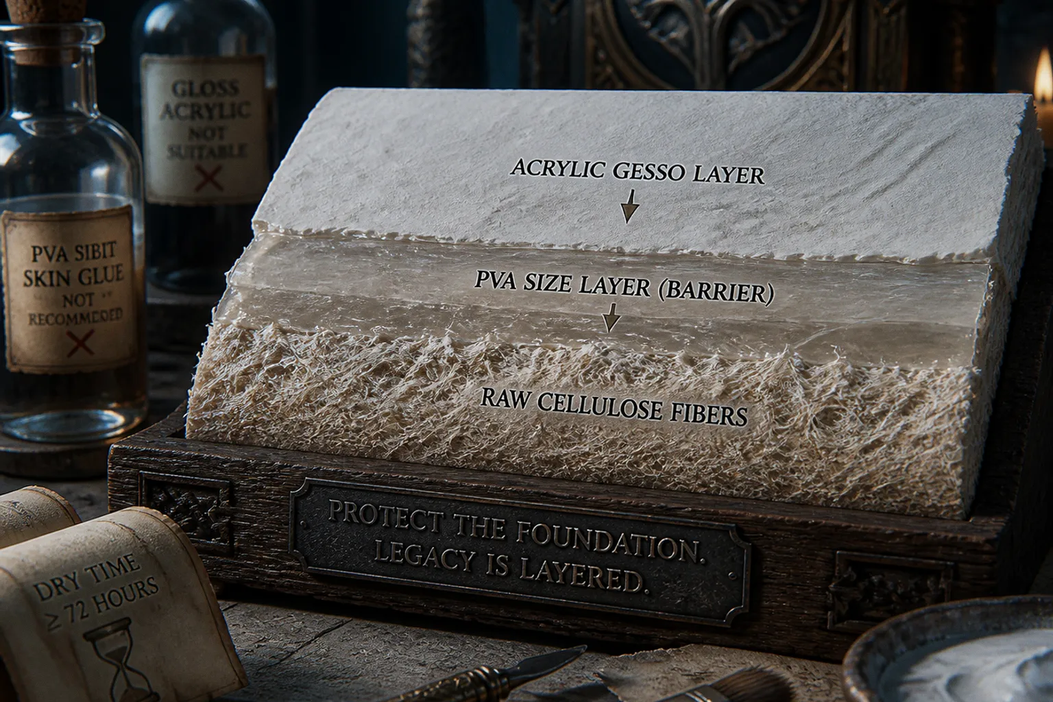
The first warning is rarely dramatic. It may be a translucent stain around a thin wash, a stiff corner, a surface that suddenly feels more fragile than the drawing deserved to be.
That is the practical problem behind an oil sketch on paper prep checklist. Oil paint is not inherently hostile to paper, but raw paper is a poor partner for it. Cellulose wants a barrier between its fibers and an oil binder. Give it one, and paper becomes a fast, responsive, surprisingly serious painting surface. Skip it, and you are asking the sheet to absorb more than it was made to absorb.
The Chemistry of Decay: Why Raw Paper Fails with Oils
Linseed oil is the familiar binder in traditional oil color. As it oxidizes and forms a paint film, it can migrate into an unprotected paper support. Raw paper is porous: a brushstroke does not simply sit on top of it. It wicks downward and outward through the fibers, often leaving a darker halo beyond the visible edge of the mark.
That migration matters because paper is cellulose, and cellulose does not improve when repeatedly saturated with oil. The affected area may become more translucent, darker, less flexible, and more prone to damage from handling. Thinly painted studies are especially deceptive here. They can retain their original look for a long time while the support has quietly become more brittle than the untouched margin.
None of this means every unprimed oil doodle immediately falls apart. The rate depends on the paper, the paint, the thickness of the application, storage conditions, light, humidity, and how often the work is bent or handled. But there is no reason to make preservation harder than it needs to be. A fantasy art oil sketch paper study may begin as a throwaway note for a dragon wing or a card-frame color test; it may also become the piece you return to when the larger painting goes wrong. Treat it accordingly.
Oil paint belongs on a prepared surface. On raw paper, the paper becomes part of the paint layer—and it is not built for that job.
This is why illustrators who use oil for thumbnails, palette experiments, and compositional studies keep a stack of prepared sheets ready. The preparation is not ceremony. It is how you preserve the quickness of paper without accepting paper’s weakest behavior.
Sizing vs. Priming: Establishing the Chemical Barrier
Sizing and priming are related, but they are not interchangeable words. One controls what happens inside the paper; the other establishes the surface you paint on. Good oil painting on paper preparation considers both.
Sizing seals the fibers
A size is applied to paper to reduce absorbency and isolate the cellulose from the oil paint system. In practical terms, it keeps the first lean paint passages from vanishing into the sheet like spilled tea. It also helps preserve a more even working surface: your paint sits where you place it instead of spreading through the support in unpredictable directions.
Modern PVA sizing is a common choice because it is flexible, relatively simple to apply, and does not bring the humidity sensitivity associated with traditional animal-glue sizing. The goal is not to lacquer the paper into a plastic card. The goal is an even, continuous film with no thirsty islands left behind.
Pay attention to the edges. They are where rushed brushwork, thin application, and pooling tend to reveal themselves. A sheet that is beautifully sealed in the middle but left absorbent around the perimeter has not been fully prepared.
Priming creates the painting ground
Acrylic gesso is the usual next layer. It gives the oil paint a ground with tooth, absorbency, and visual character. It can also contribute substantially to the protective barrier when applied in sufficient, even coats. The old blunt claim that gesso merely “covers the surface” and cannot reduce oil absorption is not useful. A properly applied acrylic gesso ground is part of the barrier system.
The distinction is still worth keeping in your head: sizing is designed to isolate the paper fibers; gesso is designed to create a paintable ground and, depending on the product and application, further limit penetration. On a sheet intended for meaningful work, using both is the more conservative route.
| Layer | What it does | What failure looks like when it is weak |
|---|---|---|
| Paper support | Provides texture, flexibility, and structure | Buckling, staining, fibers becoming vulnerable to oil penetration |
| PVA size | Reduces absorbency and isolates cellulose | Uneven darkening, oil sinking into the sheet |
| Acrylic gesso | Creates tooth and a stable painting ground; adds protection | Slick or patchy paint handling, inconsistent absorbency |
| Oil paint film | Holds the image | Sinking-in, poor adhesion, uneven sheen if the ground is poorly prepared |
A painter who prefers a very absorbent, chalky surface may be tempted to cut corners here. Resist the romance of the thirsty ground. You can have tooth without offering the paper itself to the paint.
Size protects the sheet from within; gesso gives the brush a surface worth working on. The strongest preparation lets each layer do its own job.
Selecting the Right Materials: PVA Size and Acrylic Gesso
The materials do not need to be exotic. They need to be compatible, applied evenly, and allowed enough time to settle into a coherent surface.
PVA size: the practical first coat
Neutral-pH PVA size is a sensible modern option for paper. Gamblin PVA Size is widely used for this purpose, but the important thing is not the label alone—it is using a product intended as an artist’s size rather than improvising with a household adhesive.
Brush it on with a broad, soft brush and work methodically from one side to the other. The first coat may raise the paper fibers slightly; that is normal. Let it dry flat under clean conditions, then assess it in raking light. If you can see dry-looking, more absorbent patches, address them before gesso goes on.
Two thin, even coats are generally easier to control than one aggressive application. Heavy puddles can leave a stiff, shiny patch that behaves differently under paint. You want consistency, not armor plating.
Traditional rabbit-skin glue has a real history in painting, and there is no need to pretend otherwise. But history is not a reason to use it casually on paper studies that will travel, live in portfolios, or sit through seasonal changes in a studio. Animal-glue sizing is sensitive to humidity and can introduce a different set of tensions into a flexible support. For contemporary illustration work, PVA is the less dramatic choice—which is exactly its virtue.
Acrylic gesso: build a surface, not a crust
Professional acrylic gesso is the standard companion to PVA-sized paper. Apply it in thin coats, changing brush direction from coat to coat if that helps you see coverage. A vertical first coat followed by a horizontal second coat makes missed areas easier to spot than repeating the same stroke pattern out of habit.
Three light coats are a reliable working approach when you want a robust ground. They give you enough body to shape the texture without burying the paper’s character under a lumpy white wall. Let each coat dry before the next. If the paper starts to cockle, do not keep adding wet material in the hope that it will flatten itself through optimism. Pause, dry it flat, and adjust your application.
For a first coat, a modest amount of water may help a thick gesso brush more evenly across the sized sheet. Do not over-dilute it. Once gesso is watered down too aggressively, coverage weakens and the coat can become more like a wash than a ground. Later coats are better used closer to the consistency intended by the manufacturer.
The surface you choose should match the work you plan to make:
- Cold-press watercolor paper retains visible texture and is good for broken brushwork, dry-brush edges, and atmospheric studies.
- Hot-press paper gives a calmer starting point for line-led illustration, small facial passages, and card-art details where a rough grain would interfere.
- Unsanded gesso keeps brush tooth and encourages a more painterly mark.
- Lightly sanded gesso suits controlled blends and fine drawing, but sanding too far can create a surface with less grip than you expect.
A prepared sheet should feel intentional before the paint arrives. Run the side of your hand across it. Look at it under angled light. If the texture changes wildly from one area to another, the painting will report that inconsistency back to you.
The 72-Hour Rule and Surface Texture Requirements
“Dry to the touch” is not the same as ready for oil paint. Acrylic materials lose water as they dry and continue to settle after the surface no longer feels wet. The exact timing is shaped by temperature, humidity, coat thickness, airflow, and how heavily the ground was applied.
A cautious studio habit is to allow at least 72 hours after the final gesso coat before starting an oil painting. That waiting period is especially sensible when you have built several coats, worked in humid weather, or mounted the paper to a rigid panel where airflow is limited. If the sheet still feels cool, rubbery, or unusually soft under pressure, give it more time.
The point of the 72-hour rule is not superstition. It is to avoid trapping an incompletely dried acrylic layer beneath a comparatively slow-setting oil film. A rushed surface can complicate adhesion and make later behavior harder to predict. For a casual test, you may accept that uncertainty. For a portfolio piece, there is no prize for painting twelve hours sooner.
Texture is part of the painting, not a technical afterthought
Paper is attractive for oil sketches because it gives you something canvas often does not: a quick, immediate resistance under the brush. The grain can break a scumbled sky, catch the edge of a dry-brush cloak, or make an underpainting feel less manufactured. In fantasy illustration, that slight irregularity can be useful. Stone, weathered leather, dragon scales, fog, tarnished armor—paper grain can carry more atmosphere than a perfectly polished panel.
But the texture must be chosen, not inherited by accident. If you sand every gesso coat to a glassy finish, then paint with bristle brushes expecting the interrupted mark of cold-press paper, you have prepared against your own hand. Conversely, if you leave an aggressively rough ground and try to render a tiny card-game portrait with clean, narrow transitions, the texture will begin making decisions for you.
Oil paint over a matte acrylic ground may initially look duller or more absorbent than the same mixture on a less absorbent surface. This is usually a handling issue to observe rather than a reason to flood the paint with medium. If the paint feels too lean or drags excessively, adjust your working method gradually: use more paint, avoid scrubbing, or introduce a compatible medium in restrained amounts according to the paint manufacturer’s guidance. Too much added oil can create its own problems, including a paint film that is overly glossy or slow to set.
Avoiding Common Pitfalls: Glossy Mediums and Shellac
The most expensive mistakes in paper preparation tend to begin as attempts to save time. A bottle on the shelf promises “seal,” “gloss,” or “protect,” and suddenly it becomes a substitute for a tested ground system. This is how an oil sketch gets built on a surface nobody can fully describe later.
Glossy acrylic mediums are not automatically a better oil ground
Gloss medium, GAC products, and acrylic varnish have legitimate uses in acrylic painting and mixed-media work. That does not make every glossy acrylic layer an ideal foundation for oil paint. A glossy film can be very smooth, low in tooth, and awkward for paint adhesion. It may also change the way the oil layer levels and dries, leaving you with handling that is more slippery than deliberate.
The issue is not that a glossy acrylic product will follow a universal, guaranteed timetable toward cracking. Aging is not that obedient. The issue is compatibility and surface behavior: a slick film gives oil paint less mechanical grip than a well-made acrylic gesso ground, particularly on a paper support that may still flex in handling.
If you want a smoother finish, build it through thin gesso layers and careful sanding. That route is slower, but it leaves you with a ground designed to be painted on rather than a glossy sealing layer pressed into a different job.
Shellac is seductive—and usually the wrong kind of traditional
Shellac has a beautiful amber authority in the studio. It smells historical. It dries quickly. It makes a sheet look transformed. None of that is a sufficient reason to put it under oil paint on a flexible paper support.
Shellac can darken with age and becomes less forgiving when the support bends. It is better understood as a specialized material with specific uses than as a universal old-master shortcut. For oil studies that will be stacked, transported, taped to boards, or revisited years later, a flexible modern sizing-and-gesso system is the more practical choice.
“Oil paper” is a description, not a guarantee
Not every sheet marketed for drawing, mixed media, or painting is prepared for direct oil use. Some papers are sturdy enough to survive a wet wash or an experimental sketch, but that does not mean they have an internal or surface barrier intended for oil paint.
Read the manufacturer’s specification rather than trusting the vibe of the pad. Terms such as “mixed media,” “heavyweight,” or “acid-free” do not automatically answer the oil question. Acid-free paper is good starting material; it is not, by itself, a finished oil-paint ground.
Arches Oil Paper is a familiar purpose-made option for artists who want to work directly without preparing every sheet themselves. Its appeal is obvious for travel, deadlines, and batches of thumbnails: it arrives intended for oil painting, with a surface designed to accept the medium. It is typically more expensive than ordinary watercolor or drawing paper, but the comparison should include your time, storage space, and tolerance for prep—not just the price of a single sheet.
Before committing a finished illustration to any factory-prepared paper, make a test. Use the same paint consistency, the same palette, and the same type of mark you expect to use in the real piece. A material can be technically suitable and still be wrong for your brushwork.
When Pre-Sized Oil Paper Is the Right Call
Preparing paper yourself is satisfying when surface control matters. You can choose the tooth, tune the absorbency, leave a visible brush texture, or sand toward a near-panel smoothness. That control is valuable in studio work, especially when the oil sketch is likely to become more than a sketch.
But pre-sized oil paper earns its place in an illustrator’s kit. It is the answer when the image needs to begin today: a color key before a client call, a creature silhouette study before a larger board, a run of card-art thumbnails that need real oil handling without a week of surface preparation.
Keep both routes available.
1. Use self-prepared paper when the surface is part of the design. If you need a particular drag under the brush, a specific grain, or a controlled gesso texture, make the ground yourself.
2. Use purpose-made oil paper when speed is the real constraint. It lets you work directly while retaining a support designed for the medium.
3. Mount prepared paper to a rigid board for more demanding work. This reduces flex during painting and handling, particularly with multiple gesso layers or detailed passages.
4. Prepare in batches, not one sheet at a time. A small stack of ready sheets turns the waiting period into background studio maintenance instead of a creative blockage.
5. Label the back. Note the paper, size, ground, and date of preparation. Future-you is part of the conservation plan.
The best prepared surface is the one you understand well enough to paint without second-guessing every stroke.
Closing Position
Preventing oil paint paper rot is less about finding a magical product than building a sensible sequence: good paper, an even size, a real acrylic gesso ground, enough drying time, and paint handling that respects the surface underneath.
For most studio studies, neutral-pH PVA size followed by several thin acrylic gesso coats is a durable, controllable system. Let the final ground dry thoroughly before oil touches it. Choose cold-press or hot-press paper according to the marks you need, not because one sounds more professional. Avoid treating glossy mediums, varnishes, or shellac as interchangeable shortcuts simply because they create a sealed-looking film.
Paper is not a lesser support for oil. It is a different one—lighter, quicker, more intimate, and unforgiving of lazy preparation. Get the barrier right, and a small oil study can remain what it was meant to be: a living piece of thought, not a fragile accident waiting at the bottom of a portfolio.