Oil wash over pencil: a pre-session checklist for fantasy artists
Most failed oil washes do not fail at the brush. They fail ten minutes earlier, when the artist decides that a handsome graphite drawing on whatever panel was nearby is “good enough.”…
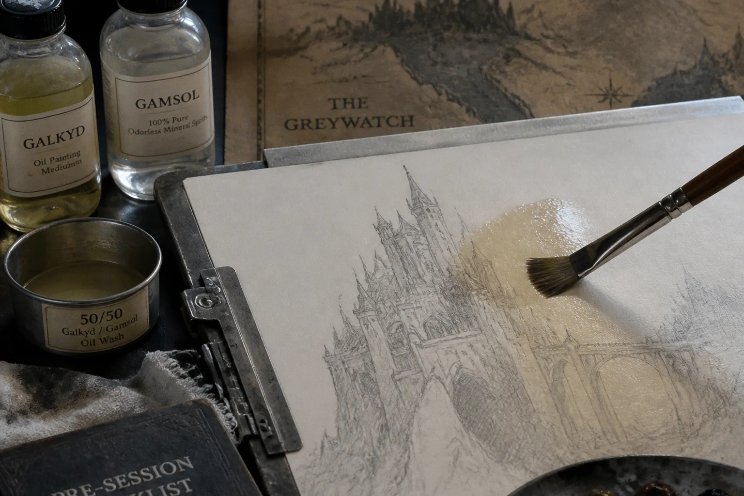
It is not. A transparent oil wash over pencil is an exposure test for every lazy choice in the setup: a thirsty ground, a dark sketch, paint stripped down with solvent until it barely qualifies as paint. Then the shadows sink, the pale dragon hide goes gray, the graphite joins the party uninvited, and the fantasy scene acquires the charm of damp cardboard.
Oil wash over pencil drawing preparation is not glamorous. Good. Neither is stretching canvas or cleaning a palette, and both separate repeatable illustration from expensive improvisation. Before building a spectral sky, a knight’s brass armor, or twenty feet of reptilian anatomy, lock down the surface, the drawing, and the first lean layer.
A wash is not diluted paint. It is the first structural decision in the painting.
Start with the ground: the support decides whether the wash survives
Fantasy illustrators often want the speed of a toned sketch and the control of an oil drawing. That usually means a pale ground, a graphite layout, then a thin transparent pass that establishes the lighting architecture before opaque paint takes over.
The problem: “thin” does not mean “free to soak into anything.”
A raw or poorly prepared support pulls oil out of the wash. The immediate result is familiar: passages dry matte, colors lose depth, and a once-clear transparent shadow looks chalked over. The longer-term issue is less theatrical but more serious. The paint film needs enough binder to hold itself together and adhere properly. Letting an absorbent surface drink the oil from it is not a technique. It is a materials failure wearing an artist’s beret.
For fabric or paper supports, seal the fibers before applying the painting ground. PVA Size is designed for precisely this job: it isolates porous fibers from the ground and oil paint above. A rigid panel is less complicated. It can be prepared with an oil ground without that sizing step.
Oil ground is especially useful for a reductive workflow. Its relatively low absorbency lets us lay in a wash, wipe out the lights with a rag or soft brush, and recover the clean ground beneath. That is a powerful move in narrative illustration. It lets the focal point emerge early: moonlight on a visor, an eye in a monster’s skull, the hot edge of a portal. No need to render the entire apocalypse before we know where the viewer should look.
Apply oil painting ground in one or two thin coats rather than building a padded white mattress. A commercial ground’s coverage figures are useful only as a rough planning guide; surface texture, application pressure, and panel edges consume more material than the arithmetic suggests. The operational point is simpler: create an even, continuous painting surface. No exposed thirsty patches. No accidental craters masquerading as “tooth.”
The support route depends on the scene you want to build
| Support route | What it gives the illustrator | Where it bites back |
|---|---|---|
| Sized paper or canvas with a suitable ground | Lightweight studies, portable compositions, economical sketch development | Fiber supports need proper isolation; a shortcut here can turn the wash uneven |
| Rigid panel with oil ground | Stable drawing surface, crisp detail, controlled wipe-backs, clean whites | Less forgiving of casual transport and edge damage |
| Highly absorbent acrylic-primed surface | Fast grab and a matte look | Can pull oil from thin washes and make transparent passages look dead |
| Low-absorbency oil ground | Longer open handling, stronger wipe-out potential, richer-looking wash passages | Demands deliberate brush control; the paint does not instantly lock itself in place |
For a fantasy oil sketch, panel plus a properly prepared oil ground is usually the least argumentative route. Not the only route. Just the one least likely to sabotage a transparent underpainting while you are trying to stage a cavalry charge under green fire.
Before the session, inspect the support under raking light. A practical preflight means:
- The ground is fully dry and evenly covered, including the panel edges if they are part of the painting object.
- There are no glossy contamination spots from fingerprints, oils, or silicone residue.
- The surface has the absorbency you intended, not whatever happened after three rushed coats.
- The composition size leaves room for the hierarchy: a small study can survive broad wash marks; a book-cover-sized face with filigree cannot survive a surface that grabs at every correction.
- You have tested a corner or separate primed scrap with the exact wash mixture planned for the painting.
That last point is not paranoia. It is cheaper than discovering, halfway through a witch-queen’s pale cloak, that your “transparent umber” has vanished into the ground like a witness entering a police station.
Keep graphite on a leash
Graphite does not magically migrate upward through a cured oil film. That story gets repeated because artists see old underdrawing marks and need a villain. The real culprit is more immediate: heavy graphite can mix into the first paint layer, stain light passages, and become more noticeable as oil paint grows more transparent with age.
So the pre-session question is not, “Do I need to eliminate every pencil mark?” It is, “Which marks are allowed to influence the color above them?”
For a fantasy illustration, graphite should carry structural information, not perform as a finished black-and-white drawing trapped beneath paint. Save the strong lines for compositional hinges:
- the silhouette break that identifies the character at thumbnail scale;
- the horizon, architecture, or weapon angle that drives perspective;
- the focal facial features;
- major value boundaries that will survive the wash;
- landmarks needed to preserve anatomy after broad paint handling.
Everything else should be lighter than your instinct wants it to be. Artists often overdraw because the pencil sketch looks satisfying. Of course it does. It is controlled, tidy, and has none of the risk of paint. But a lovely graphite drawing can become sludge the moment the first brush drags through it.
Do not obsess over finding a universal pencil grade. There is no authoritative one-size-fits-all answer—HB, H, 2H, whatever the internet’s weekly oracle recommends. The usable choice depends on the tooth of the ground, how much pressure you use, and whether the drawing will remain visible in the final image. The relevant standard is physical: the line must register clearly enough for the brush, yet lift no dirty cloud when you make a test stroke over it.
A kneaded eraser is more useful here than bravado. Lift broad graphite masses before painting. Preserve decisive contours and proportional anchors. Reduce the rest until the drawing reads like a map for the paint rather than a second painting demanding equal billing.
Do not confuse fixing graphite with solving a drawing problem
Some artists spray-fix every pencil underdrawing before oils. Others never do. Neither ritual is universally required, and no universal fixative brand deserves to be treated as law.
If you choose to fix graphite, test it on the same prepared support first. The variables are not abstract: does the spray darken the drawing, change the tooth, repel the wash, or interfere with your intended wipe-back? A fixative that locks the pencil down but turns a responsive oil ground into a slippery inconvenience has won the wrong battle.
In most cases, the cleaner solution is brutally unromantic: draw lighter, remove excess graphite, and make the first wash stroke with a controlled hand.
The graphite should steer the painting, not tint every cloud, cheekbone, and bone-white banner.
Build a wash with paint still in it
Solvent has one job in an oil wash: increase fluidity and reduce the body of the paint. It does not replace the binder that holds the paint film together.
That distinction matters because many artists prepare their first wash as if the goal were to make colored turpentine. It looks elegant for about five minutes. Then it dries thin, weak, or sunken, and the painter wonders why the image has lost its pulse.
A reliable underpainting wash contains oil color, solvent, and enough binder-bearing medium to preserve cohesion. One manufacturer’s specific recommendation for this purpose is a 50/50 blend of Galkyd and Gamsol used to extend the oil color. Treat that as a tested product-system recipe, not a sacred industry ratio carved into an easel. The broader lesson travels well: solvent-only thinning can push the layer too lean and compromise adhesion and permanence.
The best solvents for oil wash technique are therefore not defined by odor, brand prestige, or how quickly they turn a brush into a limp noodle. They are selected as part of a complete handling system: compatible medium, controlled ventilation, sealed storage, and a paint film that still contains binder.
For a typical fantasy art oil wash, work from the visual job backward.
| Visual job in the underpainting | Useful pigment behavior | Handling consequence |
|---|---|---|
| Block a warm, earthy value map | Transparent or semi-transparent earth colors | Easy to wipe back; keeps a restrained value scaffold under later color |
| Establish cool nocturnal depth | Transparent dark blue or blue-green passages, moderated rather than overloaded | Keep the mixture thin but not solvent-starved; darks should remain lucid, not dead |
| Indicate firelight or magical glow | Transparent warm accents reserved for directional light | Place sparingly; a wash cannot carry the whole lighting effect by itself |
| Separate foreground silhouette from atmosphere | Transparent neutral or chromatic darks | Preserve edges around the focal point instead of fogging the entire painting evenly |
Pigment selection deserves more attention than the phrase “transparent oil pigments for washes” usually gets. Transparency is not automatically an advantage. A transparent dark may make a wonderful atmospheric veil and a terrible first statement for a face that needs opaque correction later. A warm earth wash can unite a scene, but if it occupies every passage equally, the painting starts with a brown prison sentence.
Use no more paint than the composition can defend. In a cover-style image, the wash should establish the narrative hook: who acts, what threatens them, where the light points, and what must be read first. It is not supposed to illustrate every rivet, cloud, rune, and regrettable design note from the manuscript.
Sequence the layers before the layers start sequencing you
“Fat over lean” is not a mystical incantation. It is a flexibility rule. As layers build, the upper layers should be at least as flexible as those beneath them. Alongside it sit two other practical rules: thick over thin, and slow-drying over fast-drying.
For the initial oil wash, the takeaway is clean. Keep it thin, controlled, and materially coherent. Then allow that layer to dry fully before adding the next layer. “Fully” is not a calendar number. Drying time changes with pigment, film thickness, medium, temperature, humidity, and how enthusiastically the studio radiator has decided to impersonate a forge.
This is where a production-minded illustrator gets ahead of schedule. Instead of asking, “Can I start the next pass tonight?” ask, “What is the next pass supposed to do, and will this layer support it?”
A useful order for a single-character fantasy scene might look like this:
1. Map the value architecture. Use the wash to place the big dark mass, the primary light field, and the negative space that separates silhouette from background. If the composition does not read here, later texture will merely decorate the confusion.
2. Wipe back the focal light. On a suitable low-absorbency oil ground, remove paint strategically. Lift the forehead plane, the illuminated hand, the dragon’s eye ridge, the edge of a blade. This creates a focal point through subtraction, which is both efficient and pleasingly ruthless.
3. Let the wash settle and dry. Do not bury an unstable or wet layer beneath a more elaborate passage because the deadline has become theatrical.
4. Add body selectively. Opaque paint belongs where the story needs solidity: a face, a weapon plane, a crest, a creature’s leading edge. Keep secondary atmosphere quieter.
5. Reserve wet-into-wet handling for its actual purpose. Alla prima means direct painting in a single layer, usually on a white ground. If you work wet into wet, artist-grade colors and a small amount of a slow-drying painting medium can improve fluidity. That does not mean turning the entire painting into a permanent wrestling match with soft paint.
The common error is treating a transparent underpainting as a disposable stage. It is not. Every mark remains part of the optical stack. If it is muddy now, it will not become noble after five layers of heroic effort. It will become muddy with more expensive paint on top.
The palette should be organized around hierarchy, not ingredient collecting
Traditional illustration prep checklists tend to become shopping lists. Brushes, cups, rags, mediums, pigments, panel, confidence. None of that guarantees a coherent wash.
Organize the palette around what the image needs to say first. Limit the opening wash to a value-driving family and one temperature counterpoint. You can always expand later. You cannot easily unmix a purple-black swamp after it has colonized the entire sky.
For a grim castle scene, a restrained warm earth and cool blue-green may be enough to establish the split between masonry, weather, and torchlight. For a desert necromancer, a red-brown shadow map with a muted cool gray can stage the heat without pre-painting every gold ornament. In both cases, the drawing remains legible because the first pass has a job.
Keep a clean dry brush, a wiping cloth, and a tool for lifting paint within reach before you mix anything. The early wash moves quickly. If you pause to hunt for a rag while the value pattern spreads across the character’s face, that is not creative spontaneity. That is bad framing with solvent.
Treat solvent and rags as part of the composition’s logistics
The studio hazard is not outside the painting process. It is inside it, sitting beside the palette in a jar that may or may not have a lid.
Oil-soaked rags must never be left crumpled in a pile. They can generate heat and may spontaneously combust. Put them in water or hang them individually to dry according to your disposal practice. The cinematic version of studio life contains dramatic moonlight and a heroic silhouette at the easel. The actual version includes a metal container, labeled jars, and not setting the building on fire. Try to preserve the building.
Use sealed glass or metal jars for brush-cleaning solvent. Label every container. Do not rely on recognizing liquids by smell after six hours of painting; that is a remarkably poor system even before fatigue enters the room.
Ventilation needs a real plan, not an open window performing decorative labor across the studio. A recommendation cited for studio ventilation is ten air changes per hour. In a modest workspace, improve air exchange with open windows and a fan positioned to exhaust air outward. The objective is to move contaminated air out, not merely to make a fan feel busy.
Before opening the solvent, the working station should answer these questions:
- Is there a designated, labeled cleaning jar with a secure lid?
- Is the wash medium in a separate container from brush-cleaning solvent?
- Are oil rags going directly into water or being hung flat to dry, rather than accumulating beside the easel?
- Is air being exhausted from the room rather than stirred around it?
- Is the painting surface positioned so a spill cannot run across the graphite drawing before the first brushstroke?
A dramatic illustration can survive a broken spear, a collapsed tower, or a corpse king on a throne. It cannot survive a studio fire with much dignity.
The real pre-session test is a small one
Before committing to the full panel, run a miniature version of the workflow on a prepared offcut: graphite line, intended wash mixture, a wiped highlight, and a drying observation. This reveals more than another hour of online advice ever will.
Look for three things. First, whether the graphite contaminates the lightest wash passages. Second, whether the ground leaves the wash rich and controllable rather than sunken and desaturated. Third, whether the paint mixture behaves like paint—coherent, movable, responsive—not merely colored solvent racing toward a deadline.
That test is the difference between control and superstition. A stable oil wash does not require mystical talent, proprietary ritual, or a heroic tolerance for failure. It requires a sealed and suitable support, disciplined graphite, a lean mixture that still contains binder, sensible layer order, and a studio setup that will not sabotage the session.
The fantasy belongs in the image. The preparation should be cold, practical, and almost boring. That is precisely why the dragon gets to look convincing.